 Before beginning a photography session with a female model (they're not professional models - mostly students of mine or people I know), various issues already have been addressed and mostly resolved. Included are:
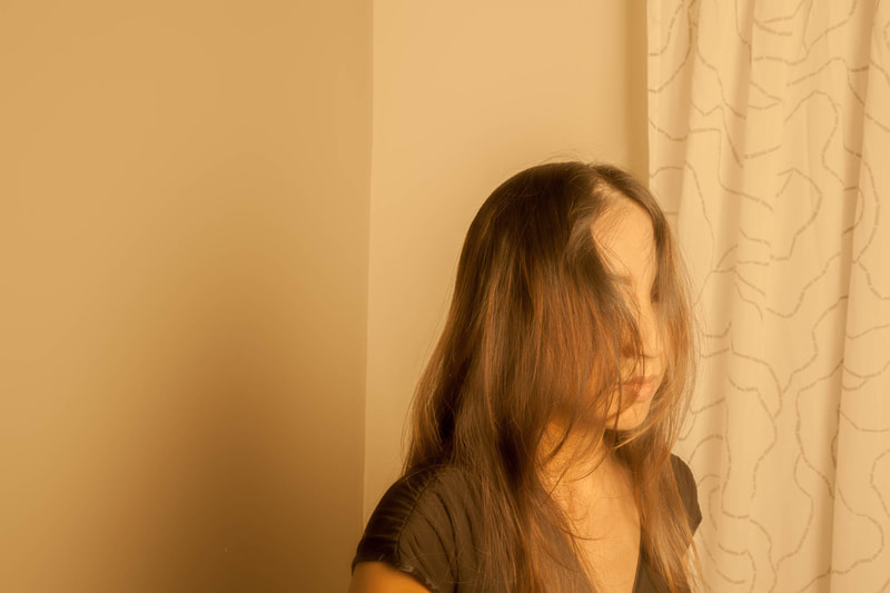
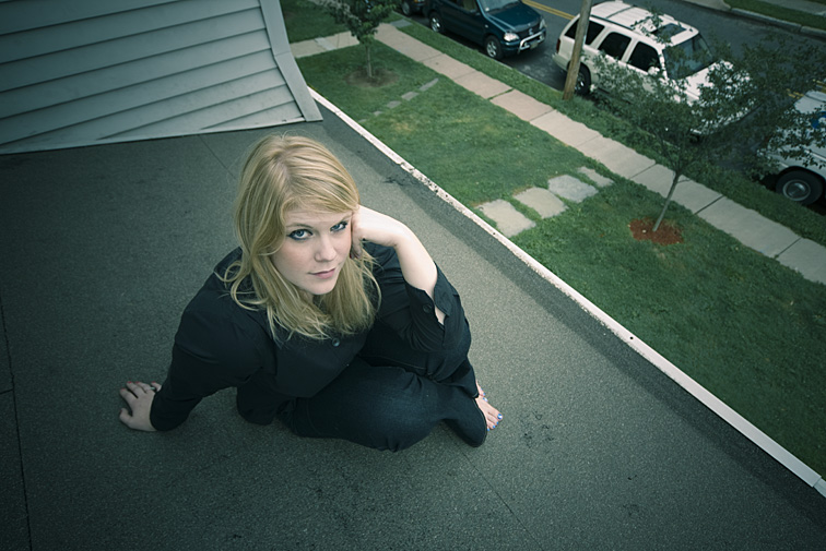 I photographed Deborah on the roof of her apartment. As she experimented with a variety of poses, these were some of my “be sure” concerns: - be sure her head and body are backed only by the dark area of the actual roof - be sure her hair is arranged well - be sure her head is tilted up enough for skylight to illuminate her eyes - be sure nobody on the ground wanders into the shot - be sure any slight compositional changes I make from shot to shot don’t contain any distracting elements - be sure she does not slide off the roof - be sure I do not slide off the roof - and, of course, be sure her expressions and body positions are interesting 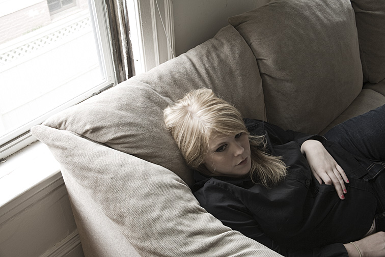 Here’s something I often miss. Deborah was moving around on the sofa, trying out some poses. As she slid down the pillow, friction kept the back of her hair from moving with her. The result was this odd hairdo. When I do notice this problem, I’ll have the model tilt her head forward, smooth down her hair with my hand, and then have her return her head to the pillow.  Meredith was standing between her two living room windows. This meant me keeping an eye on what was happening outdoors, being sure no changes occurred that might hurt the shot. I also had to be careful how I positioned my camera so that reflections from the strobes would not appear in the windows.  This was one of the few times I used a tripod to photograph a model. I had liked the placement of the camera and knew I wouldn’t want to move it for the remainder of the time we'd be shooting here. With the camera on a tripod, therefore, the composition would be set. I could then focus my attention more fully on the model and to other elements in the scene. Adeline, mostly on her own, was coming up with some great poses and expressions. My concern was her placement in the frame. First, I wanted nothing but the wall behind her. Second, I didn’t want the shower caddy or hanging brush, on the right, to appear to be touching her body. Third, I wanted to control what proportion of the shower door was covering what proportion of her body. Not having to handhold the camera allowed me more time to attend to these concerns.  It’s my palm Joanna is touching. That meant I was holding the camera and photographing with only one hand. As I shot, I kept watch on all that surrounded her, being sure that: - her legs stayed between the toilet paper and toilet tank - a good view of her face appeared in the mirror - her hand was positioned gracefully on my hand - the camera was held fairly level 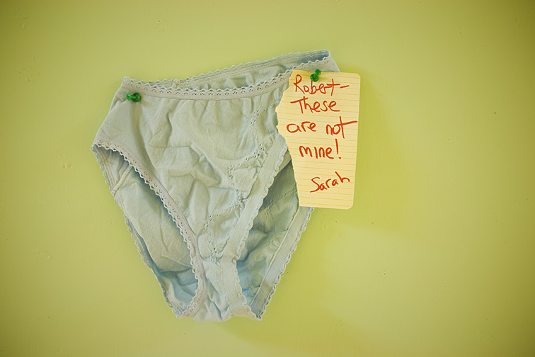 When wandering through a public school or college, looking for things to photograph (because I teach photography classes at these places, I'm allowed to do this), I keep my eyes peeled for bulletin boards. They’re usually scattered throughout the building, often in hallways and classrooms. Most bulletin boards are made from cork board (or sometimes burlap cloth) and are enclosed in a wood frame. They range in size from very tiny to huge. I've seen all sorts of things pinned to them - staff or faculty notices, announcements about upcoming events, postings by students looking for roommates, or even pieces of artwork. Occasionally, the contents of these bulletin boards can be interesting enough to photograph. But not very often. So, using one or more of the props I carry with me, and sometimes including a note I've written, I’ll try creating something that’s hopefully intriguing, humorous, and realistic enough to seem legitimate. Coming up with these phony bulletin boards is a lot of fun. I highly recommend trying it yourself. If you don't have access to a bulletin board, they can be purchased inexpensively online or at office supply stores. Or, an empty wall can work just as well, using tape instead of pins. Here are a few examples of my work. 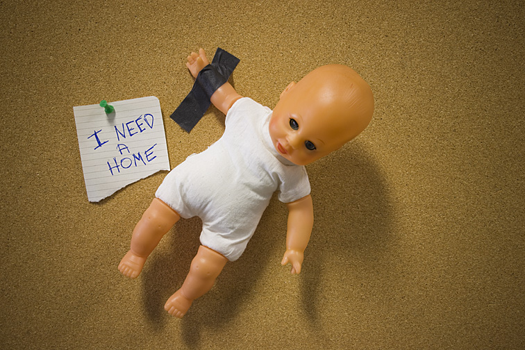 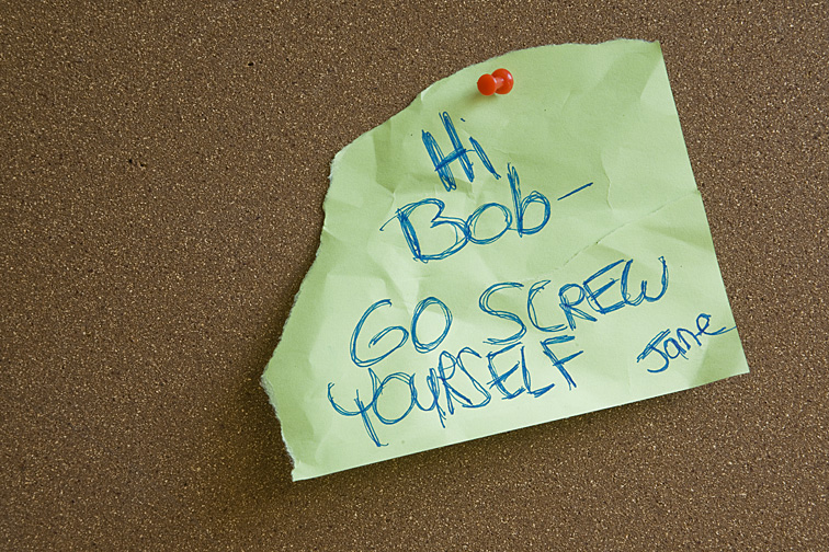  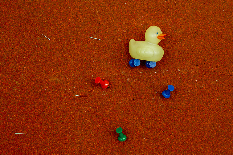  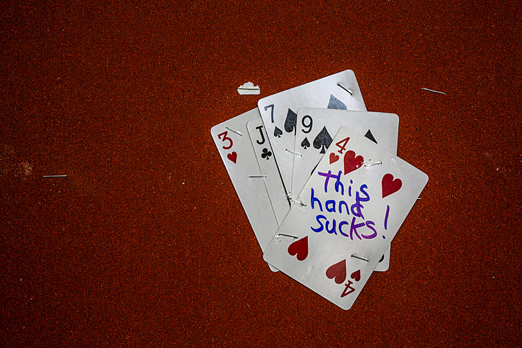  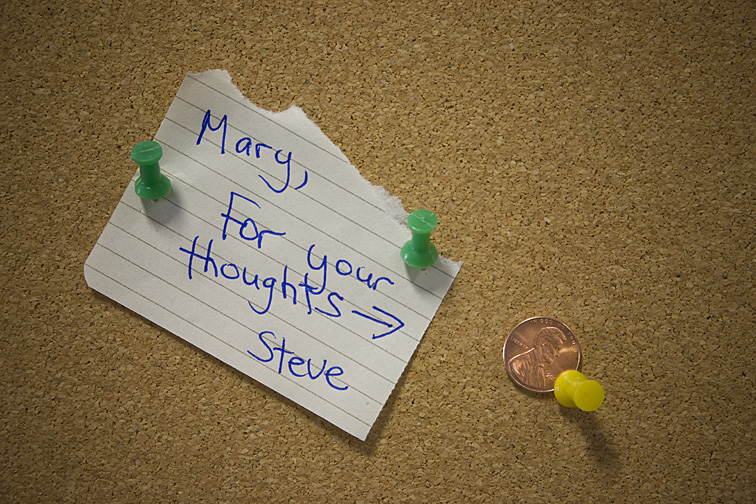 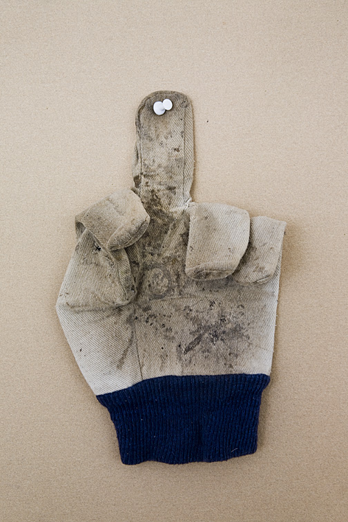 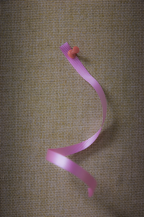  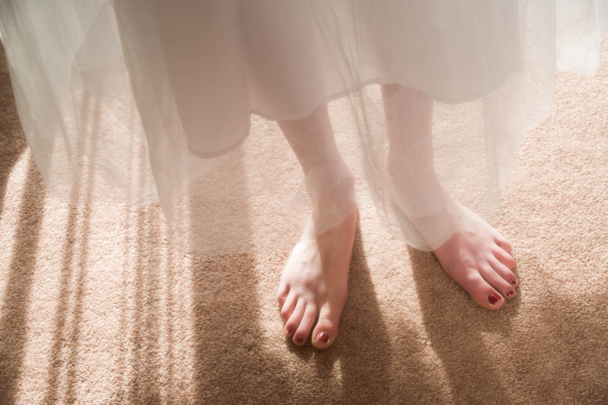 Occasionally, students will pull out an image they shot and ask what I think about the exposure-is it too light, too dark, or just right. I’ll study the photo for a few moments and then ask what their opinion is. I do this so we can take a deeper dive into the question, since it’s usually not something that can be easily answered. There are issues to consider when determining what a photograph’s appropriate exposure should be. Perhaps most critical is to avoid very bright or very dark areas in the image that may cause clipping, since that can cause problems for the monitor displaying the picture or for the printer printing it. After that, and similar to other compositional elements such as framing, camera angle, focal length, depth-of-field, etc, the photographer must determine how a specific exposure will impact the look of the photo. I would assume that most photographers strive for a “normally” or “properly” exposed image most of the time. But intentionally over-exposing or under-exposing can create a very different dynamic that often produces a more interesting and exciting image. The photos below, hopefully, will help illustrate this. The first set of images below shows a college cafeteria. Keep in mind that the outside illumination is significantly brighter than the inside lighting. Photo 1 has been exposed for the outdoor lighting, making the greenery easily recognizable. This keeps the indoor lighting dark, but in a positive way. The reflections on the tables subtly highlight them, providing just enough illumination to render their shapes pleasingly. The more brightly exposed photo 2 shows those same interesting reflections, but with greater intensity. And though still rather dark, the cafeteria can be seen in more detail than in photo 1. In addition, the windows become grossly overexposed with the increased exposure, hiding what is outside and causing a wonderful eerie glow. 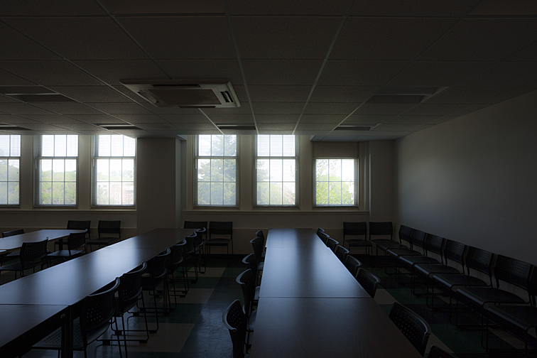 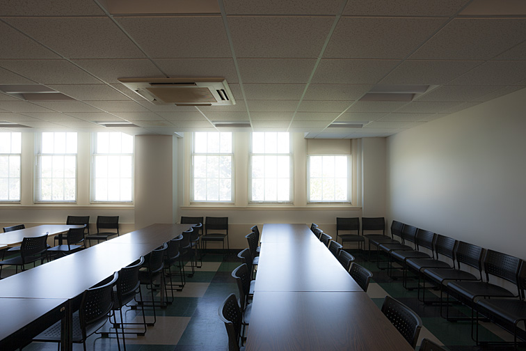 The second set of images was taken in a college classroom. I was drawn to the chairs’ tight, perfect alignment, as well as the starkness of the surroundings. For me, the precision of this scene is both inviting and off-putting. Dark objects, like these chairs, can open up interesting lighting possibilities. That’s because they can be photographed at a variety of brighter exposures without becoming overexposed. The first picture shows the chairs and room normally exposed. This is how the room would appear to someone standing within. The second photograph is overexposed. That’s apparent when looking at the ceiling, walls, and floor. But, again, because the chairs are made from such dark material, we’re now able to see them in much greater detail. In addition, the chairs are pleasingly framed by the bright areas of the room. 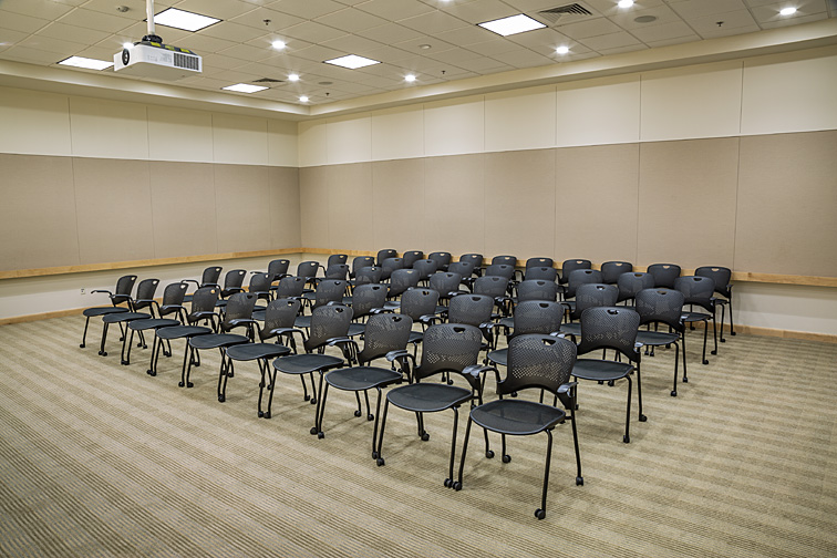  Barring technical problems caused by the lighting, it’s impossible to say which exposure is correct or which is preferable. That decision is solely within the realm of the viewer and the photographer. I don’t find one picture preferable to another. I think each one offers a different but equally interesting interpretation.  There are times when changes are needed for improving a shot I’m working on. It may involve repositioning the subject or camera, removing a stray object, adding a prop, switching lenses, or some other thing. It may be a minor change or one that’s more involved. However, my problem, at times, is that I'll get too lazy to fix the issue. I know an alteration is needed, but I can’t muster the energy to do anything about it. I’m not sure why this happens. Perhaps it's just a mood that hits me. In these instances, I'll simply ignore the needed changes, continue shooting, and hope some magic occurs that will save the photograph. That magic, if it’s to happen, usually comes when I reevaluate the photo later at my office. I’ll examine the RAW file on my large, high-quality monitor. This gives me a much better read than the small, low-quality JPG image that appears on the camera’s monitor (Note: whether shooting in RAW or JPG, the image on the camera’s monitor is most likely a JPG). Also, my frame of mind will be different from what it was during the photo shoot. I’ll no doubt be more relaxed and able to see possibilities I previously may have missed. What I might ultimately discover is that I really like the picture. If not, I’ll search for ways to fix the problems using one of my digital editing programs. So, it’s more or less of a crap shoot. If I end up liking the photograph as is or with some post-production changes, I’ll keep it. If not, it's trashed.  The high-angle position of the camera works well. The elements of the shot I wanted to emphasize are clearly visible - the model, sign, various locks, and the disproportionately large door. Initially, I planned to remove the extension cord, which was powering my strobes. However, laziness won out. Luckily, after viewing the image in my office later on, I realized how much I liked the cord snaking around under her. I think it’s an attractive design element. 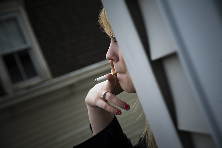 Deborah was sitting behind a wall smoking, as if trying to stay out of view. I wanted to position myself a few inches to the left so that more of her face would be visible. As in the previous picture, I was too lazy to move. But, I’m glad I stayed where I was. I feel what’s shown is perfect. In fact, seeing more of her face might have taken the emphasis off both her cigarette and the dramatic bend of her wrist.  I noticed the lopsided blinds on the left window and said to myself, “Oh, I should straighten them before I shoot.” And again, I did not make the effort. And again, after viewing the picture a day later, I was happy I didn’t. The tilt of the blinds adds to whatever else is “off” in the picture - the darkness of the image, the slight angling of the camera, the extreme headroom, and the fact she is wearing sunglasses indoors. 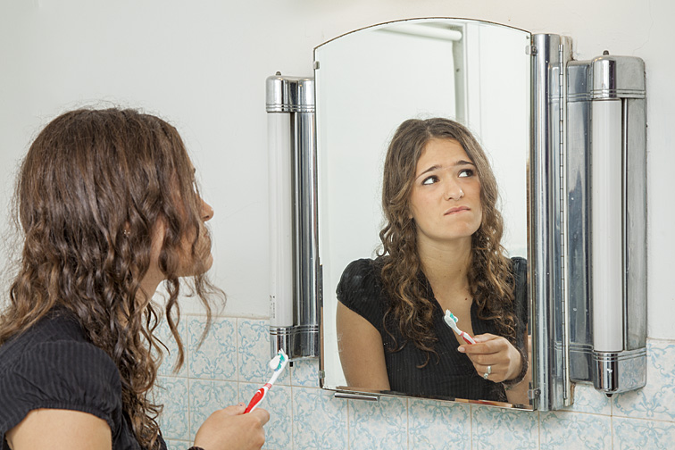 In a very, very general way, I think I can divide my portrait photography into four types: 1 - Portraits that look posed and that were posed 2 - Portraits that do not look posed but that were posed 3 - Portraits that do not look posed and that were not posed 4 - Portraits that do not look posed but that were a combination of posed and not posed I hope that made sense. What I want to address in this blog are the "portraits that do not look posed..." (types 2, 3, and 4 above). For a picture to appear not posed, it should look as if the photographer caught the model in the midst of performing some task - as if the photographer just happened by with his or her camera and quickly snapped a picture. Let's address #2 above. This could be challenging for the model to achieve for two reasons: It may be difficult conveying the look the photographer wants to the model; it may be difficult for the model to come up with a believable pose, even if she understands what it is the photographer wants. Let's look at #3 above. The photographer can keep an eye on the model throughout the photo shoot, hoping she'll do something that will result in an interesting non-posed look. The problem is that there's no guarantee this will ever happen. So, let's go to #4 above. This offers the photographer the best chance of getting quality portraits that do not look posed. What I’ll do is to give the model a specific physical task to perform - something that requires her to move her body and, hopefully, vary her expressions. Because she’s undertaking a real chore, her actions generally will appear more normal and realistic. And since I’m usually using strobes for illumination, and if her actions aren't too quick, the photos can be taken while she's moving. In addition, I can have her repeat what she’s doing a few times, perhaps suggesting a slight modification for each repetition, until I end up with the images I want. This is an excellent technique for both the photographer and the model. It allows the photographer to shoot and the model to act continually, with only minor interruptions, for at least a little while. And it can be a nice change of pace, even if not done for the reason discussed above. Both get a break from having to move from static pose to static pose, normally the de rigueur of portrait photography. 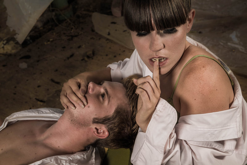 I asked the man to lie on the floor. I then told the woman that she, as a governmental secret agent, was sent to rescue him. And that it was imperative to be as quiet as possible. She took it from there. 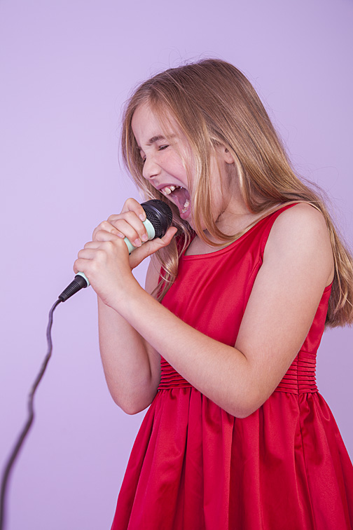 Gretel was high energy and very entertaining even without the microphone. But with it, she was at a whole other level. The only direction I gave was, "You're a rock star!".  I had asked Hannah and her husband to change positions with each other. She began to move almost immediately, while Albert remained motionless, considering what to do next. With one person moving and the other staying still, this charming contrast was created. 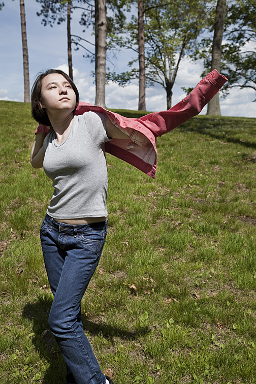 I asked Esther to put her jacket on slowly. This allowed me to shoot about six photographs while she did so. The twisting of her body, enhanced by her lean figure and flung-out arm, formed a beautiful dynamic pose. The bright sun added shadows, which produced definition and contrast to her clothing. Her head aimed at the sun meant her face was lit well and had no harsh shadows.  I’ll sometimes return to a location I’ve previously photographed and discover it has irrevocably changed. What I mean is that what I had shot is no longer there. I'm not necessarily devastated by that, but I’ll often feel sad. Something that I thought was worth photographing - something others should have had a chance to see or photograph - is now no more. What makes me happy, on the other hand, is knowing that at least I have pictures of what was once there, and that others, hopefully, will get to see them. 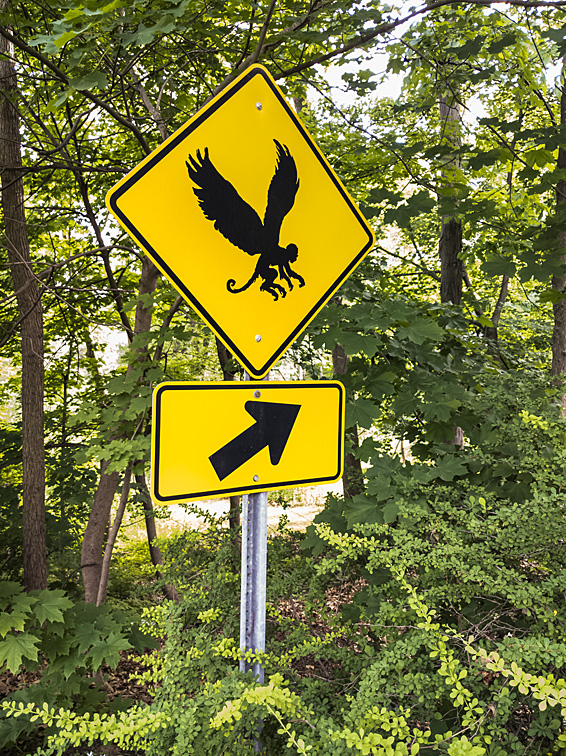 This brings back memories of the flying monkeys from the film, The Wizard of Oz. The sign, now gone, was located on Main Street in Glastonbury, Connecticut, USA. It was positioned between the sidewalk's end and the beginning of a wooded area. It advertised the Flying Monkey Farm in Glastonbury. I suspect that those who saw the sign for the first time must have done a serious double take. 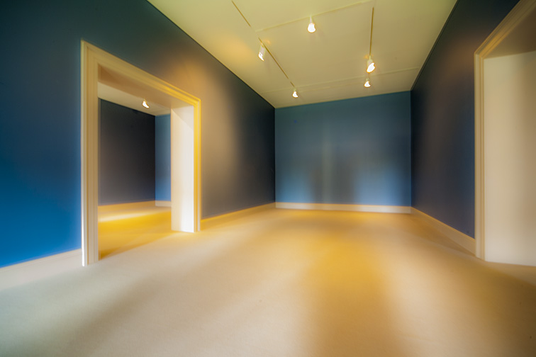 Since this museum gallery was being refurbished, all the paintings had been removed. Viewing the room this way puts the emphasis on it rather than on the artwork that normally would be hanging on the walls. To me, this image shows that even an empty space can have a beauty of its own. I found myself wishing that the room would remain as it was - bereft of any paintings. I really enjoyed seeing this portion of the museum in its raw state. Note: This picture was shot with a wide-angle lens and with an intentional slight blur. 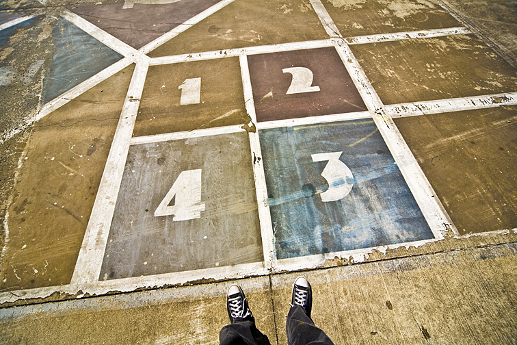 I was photographing in a skate park that also included walls of gorgeous graffiti paintings (I think the graffiti was actually encouraged by the city). When I saw these Art Deco type numbers on the colored squares, I knew I wanted to photograph them. I also thought that adding a human element might make the picture even more interesting, so I made sure my legs and feet would be visible in the shot. When I returned to the skate park some months later, I was dismayed to discover that this entire section had been completely painted over. 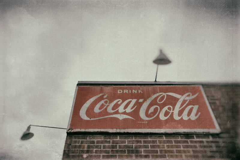 Unlike the previous images, what you see in this photograph (at least as of this writing) still exists. What does not exist is the era that this picture hopefully represents - the 1930s or 1940s. With a bit of Photoshop finagling, I think I gave the picture an appearance of an America long since gone. 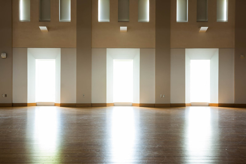 There’s a belief in photography that the eye is drawn to the brightest part of an image. This assumption most likely is correct. In fact, photographers and other artists have long used dark and light areas in their work for directing the eyes of their viewers. Think of a picture - a photograph or a painting - where the edges are darker than the interior portion. That dark area acts like a frame, subtlety telling the viewer where their eyes need to go, which is towards the interior where the subject lies. So it would seem self-defeating to take a picture that includes bright and especially grossly overexposed areas that may distract the viewer from the photo’s main subject. But many photographers and artists do take pictures this way, including myself. It’s something that's always appealed to me. I’ve never been able to explain why and certainly have never been able to present a cogent argument rationalizing its inclusion in an image. But that is unimportant. I think the bottom line is that bright and ultra-bright areas, though they may be competing with the subject, can be dynamic in a photograph. I believe it’s the sheer intensity of the light, independent of whatever the subject is, that helps capture and hold my attention. The subject is still there and just as important. It’s just that now the whole image is more vibrant and exciting.  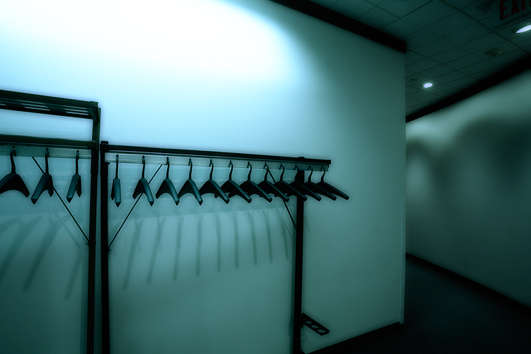  There are times when a bright light has a more practical purpose in a photograph. That's when it provides the illumination for the image. Without that light, there would be no picture. Of course, the light itself doesn’t have to be in the photo. Just the areas being lit can be included. But, as I’ve mentioned before, that bright area could be responsible for making the picture that much more appealing. 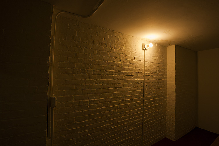   In addition, bright light can be used to hide an ugly or intrusive background. In the photos below, there were elements outside that I felt would hurt the photographs. Blowing out the backgrounds prevented this from happening. 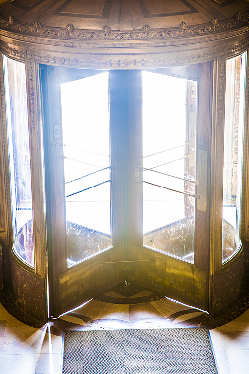 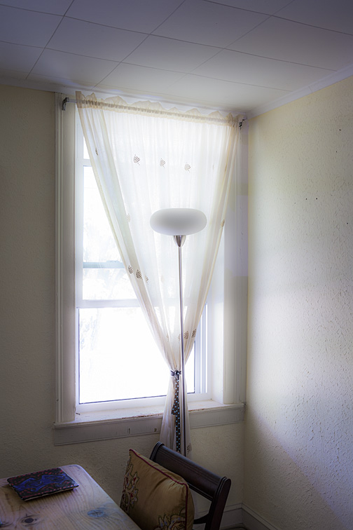 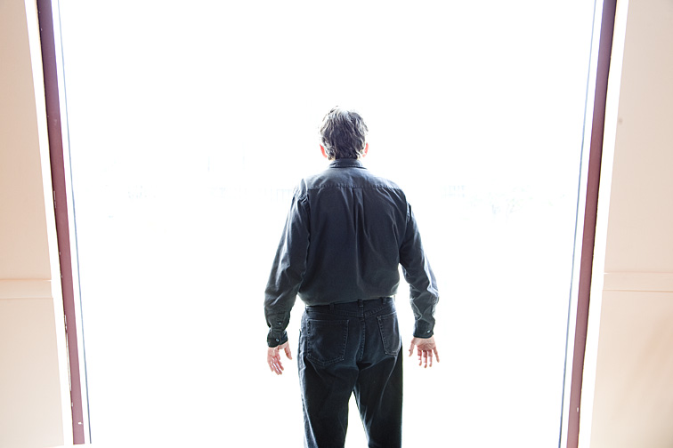 Bright light works well as a clean, white, nonintrusive background for the subject. As seen in the image below, that and the odd highlighting around each chair help to define and separate each one. In addition, the overexposed areas adds some diffusion that softens the picture a bit. 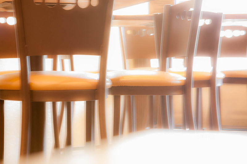 I’ve seen many photographs where tunnels, corridors, passageways, and footpaths have ended in scary, mysterious, darkness. There seems to be a natural connection among those three qualities. It’s as if each one depends on the other two. However, replacing a dark area with a very bright one can often produce an equally scary and mysterious image. I think it’s the fact that whether an area is very dark or very bright, we just don’t know what awaits us there. But it’s interesting to consider how a grossly overexposed area also can connote heavenliness. It’s like people on the verge of death who see a bright light that pleasantly beckons them forward. 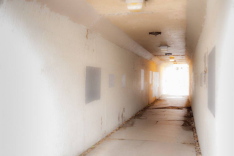 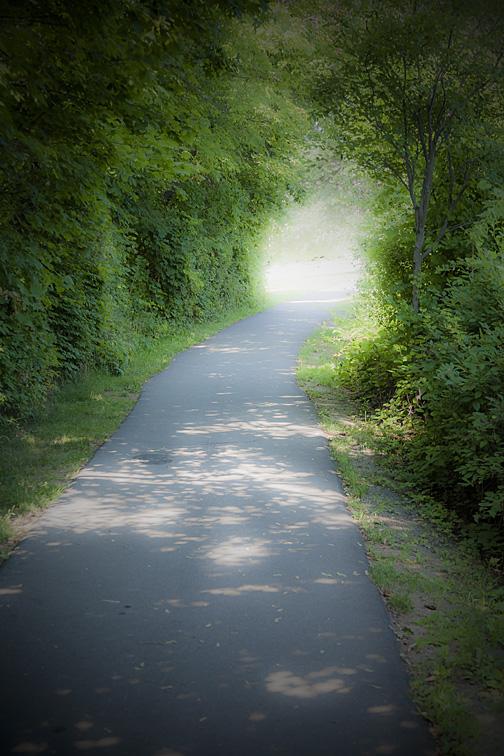 When photographing someone, veils and gauzy curtains can cover a multitude of sins such as messy hair, facial blemishes, bad lighting, lack of posing ability, and so on. And, depending how they're used, these accessories can help make images appear mysterious or even ghoulish. I’ve never purchased actual veils for my subjects. Instead, I visit local craft supply stores for veil type material, in various colors and patterns, with weaves ranging from course to fine. The pieces I purchase are large so that there's enough material to cover the subject's head and upper torso. Also, I’ll iron or steam the cloth before the shoot to remove any wrinkles and creases. 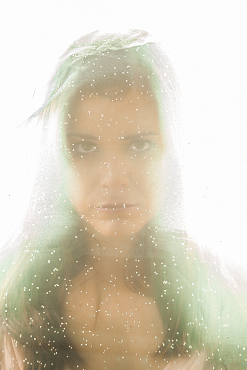   Here’s Anabel wearing veils prepared from three very different materials. Each was carefully arranged after being placed over her head and shoulders. The veil was positioned so no opaque portion of it covered anything I wanted visible. I also made sure the material was not doubling up, but rather laying down as a single layer. I made a final check and, if necessary, adjustment just before taking each picture. With the materials being so different, with the variety in Anabel’s poses, and with the help of Photoshop, she almost appears to be three different people.  I had Elspeth sit on this window ledge, then covered her with the sheer curtain. I threw the lens a bit out-of-focus, thereby softening the picture. Tilting the camera meant Elspeth wouldn’t have to wait while I aligned the vertical and horizontal lines of the window panes, which I would have done had the camera been held in a normal horizontal manner. Barely visible, her expression shows a sweet smile. 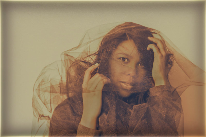 Jaida appears to be struggling with an out-of-control veil, as if it's windy and she's trying to prevent it from blowing away. Actually, we were inside her house, and there was no air movement. Her convincing demeanor was the result of some good acting! 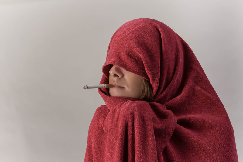 Linda is draped with a blanket instead of a veil. The covering serves the same purpose as a veil but evokes, perhaps, more humor than drama. The cigarette sticking out of her mouth adds some extra oddness to the picture. 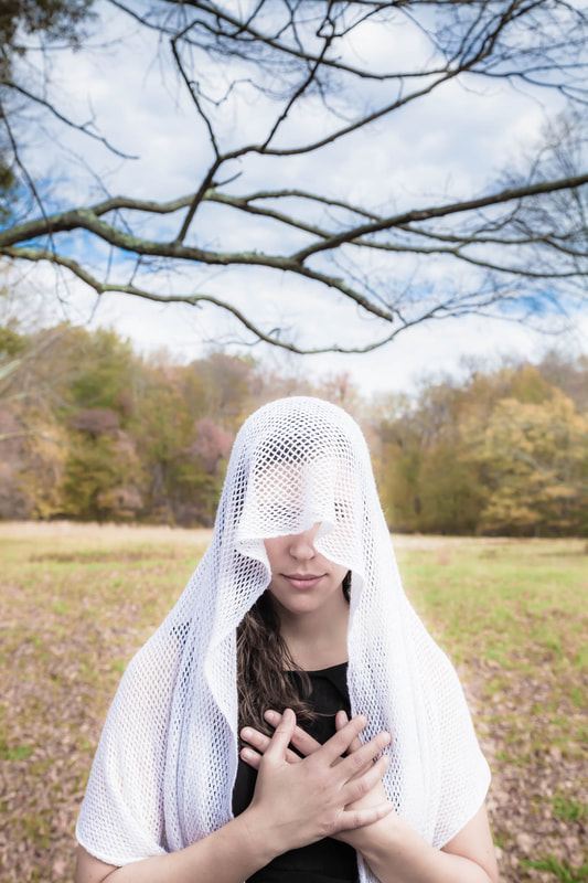 Makenzie’s eyes are completely covered by her veil, and bare branches hang above her. Together, these details infuse the photo with a sense of mystery. After not viewing the photograph for several months, I found two details I’d never seen before. First, the picture appears to be divided equally into two sections - the model and far background trees in one and the horizontal tree branch and sky in the other. Second, the very bottom tree branch lines up almost perfectly with the top of the tree line in the far background.  I’m very happy when my models (or anyone else on the set with us) make suggestions about clothing, hair, makeup, and the like. In addition, when an interesting posing idea is brought up, I’m very happy to try it. However, in the past, if it was something that did not seem to have a chance of working, I’d quickly discard the suggestion. I was convinced I was the final authority on what poses would or would not work. I still react that way occasionally. When it comes to positioning the model and helping her achieve an interesting facial expression, I pretty much know what I’m looking for. But this belief obviously has limitations. Making a snap judgment means I’ve thought little about what was suggested to me. Instead, if I spend a few moments fully considering the suggestion, I’ll often find that it indeed does have merit. The end of our photo shoot was drawing near. Lexi had been a great model, and I wanted to reward her by taking some shots of a setup she had designed; something she’d been considering for a while. So, after she posed herself, I took a few pictures. I hadn’t been crazy about the setup and was sure none of the images would have any value for me. Boy, was I wrong! There’s so much I like about this particular photograph - the strong diagonal created by the tree branch, the angular bends of her arms and left leg, the contrast between her red dress and the green background, and her intense stare into the camera. 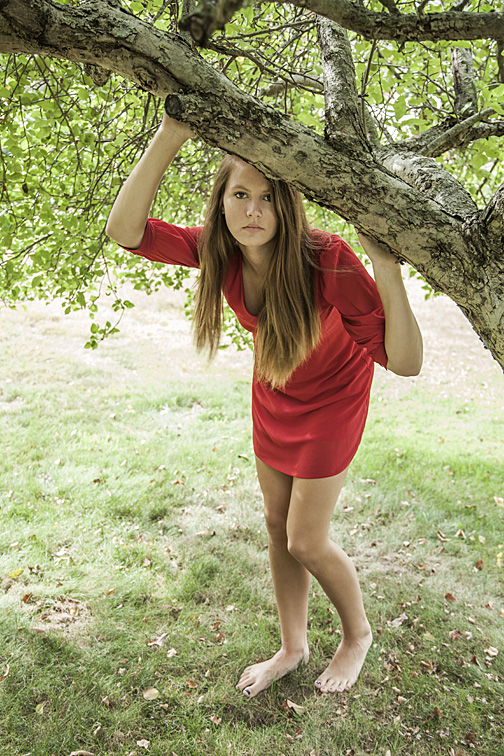 I had asked Cynthia to sit down. She did, but not the way I figured she would. I was about to ask that she move to the seat, but decided not to. This was our first time working together, and I didn’t want her thinking I was the dictatorial type. So I took a few shots, assuming none would be very good. I changed my mind when viewing the pictures on the full size monitor in my office. One of the things I really like is the bend of the knees, with one slightly below the other, and how that matches the bottom of her dress, with one side being a little lower than the other. In addition, I love the soft shadow surrounding her legs and chair, produced by the ring light attached to my camera. And I finally realized how charming it was that she had decided to sit on the chair this way. 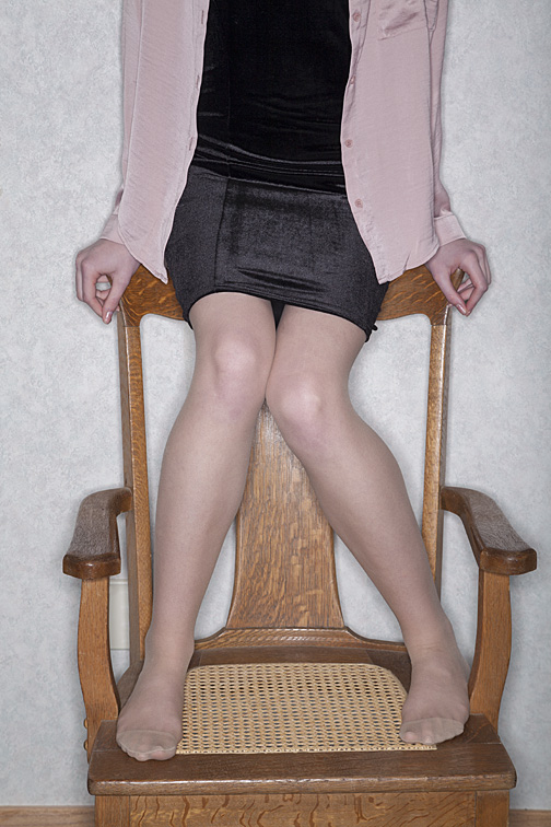 Here’s another setup I was positive would fizzle. The young couple and I had spent a few hours photographing at a city park. They had been a delight to work with but now were itching to try a few setups of their own. After completing the shots I wanted, they led me to this merry-go-round. To the uninitiated, this old-fashioned device spins by having someone hold onto its railing while running. Once the ride gets moving, the runner jumps on. My role, of course, was to document this process. So, I hopped onto the device, and Kevin began spinning it while Ariana ran alongside. Though they were savvy enough to be aware of the camera and knew the importance of good expressions, I could tell they were genuinely excited and having a grand time. They never came aboard the spinning disk, but I was still getting some great images. It was also satisfying knowing I didn’t have to set up the shots, since I was now shooting documentary style - following and photographing what was directly in front of me. I was very happy with the results. 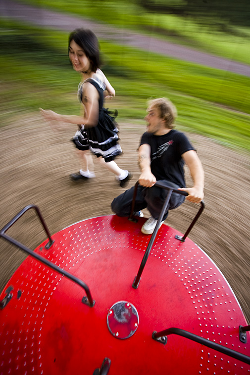 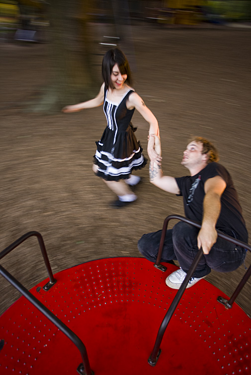  When searching for non-human subjects to photograph, I’m not usually drawn to the same objects or scenes that others may find appealing. Rather, I’m more attracted to the ordinary - things other photographers might never consider shooting. What I love photographing is the nondescript, the unremarkable, the plain. Things lacking visual appeal. It’s with these sorts of subjects that I can apply my trade, which is trying to make the commonplace interesting. I do this by playing with subject positioning, camera placement, camera angle, focal length selection, depth-of-field, lighting, and, sometimes, prop placement. I’ll also be considering what post-production changes to apply later on. I find this kind of photography far more appealing and challenging (in a good way) than merely recording the pretty things I come across. Let me address that last point for a moment. I’m certainly not criticizing photographers, amateurs or professionals, who enjoy shooting sunsets, architecture, animals in the wild – the visually stunning items that easily catch the eye. I understand the appeal. But for me, it’s being able to take something most people would consider not worth shooting and coming up, hopefully, with a quality photograph. I think many photographers don’t consider the possibilities of photographing the ordinary. They don’t realize the wonderful images that can result. That certainly makes sense if they’ve never done this type of shooting before. For me, this shooting process involves two general steps:
After a while, the photographer will become more comfortable with this process – both with selecting the subjects and using the camera to mold them into appealing photographs. Then, instead of avoiding the mundane, they’ll be embracing it, knowing they have the ability to transform their subjects into wonderful images. It’s really a satisfying feeling, coming up with quality photographs that started with something very ordinary. Here are some images I believe demonstrate this: I sometimes wonder if those tasked with installing utility objects, such as these metal pipes, are aware of the beauty they’re creating. I’m intrigued by the straightness of the pipes and the angles produced by the various fittings (the joints that hold the pipes together). The brick background adds an interesting uniformity, color, and background to the pipes. I thought shooting straight-on would best show the pipes’ relationship to one another as well as emphasize the strong horizontal and vertical elements in the image. And then there’s this odd thing. The two diagonal pipes in the middle, bottom of the frame remind me of a person’s lower legs as he/she walks to the right. 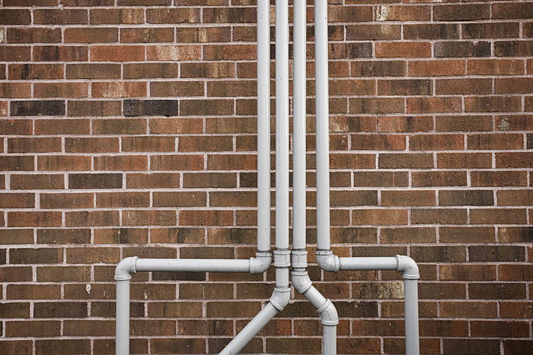 I was wandering through a college cafeteria when I spotted this basket of apples. With nothing but the dark silver enclosure and the gray surrounding the apples, their roundness and saturated color really make them pop. I arranged the apples to my liking and darkened the edges of the picture in post-production. 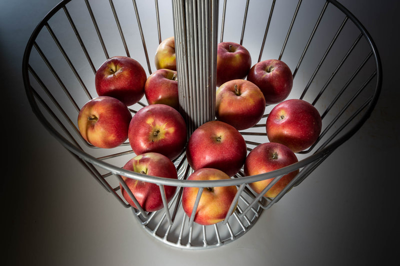 I’ve come across many clotheslines in my wanderings, but none as perfect as this one. That’s because of the following elements: nothing in the background to pull the viewer’s attention away from the subject; colorful clothes with no distracting logos or printing on them; interesting arrangement of shirts and pants; lots of empty sky, helping to highlight the clothing. Furthermore, I like the balance created by having the clothes toward the left side and most of the empty lines toward the right side. 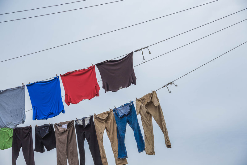 It’s important to keep one’s head up when wandering. Realizing these poles and crane could produce an engrossing photo, I searched for a spot to stand where all the elements would be visible - none being blocked by another. I was lucky that the poles, from my perspective, were all different heights, making them more interesting than if they had not been. Additionally, I was fortunate having beautiful soft and fluffy clouds as a backdrop. 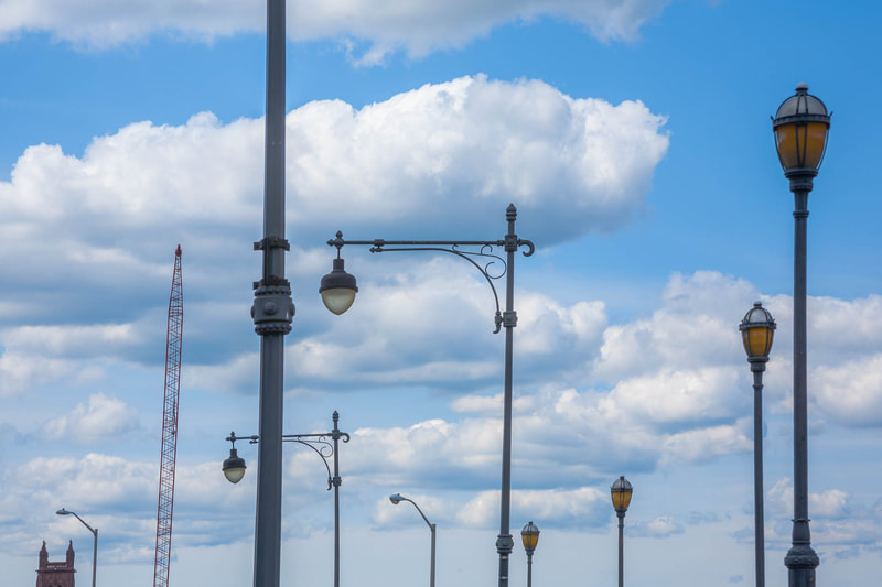 This was shot from a city sidewalk through the window of a clothing store. It was the weird finger positioning of the right hand as well as the unnatural positioning of both hands that caught my attention. 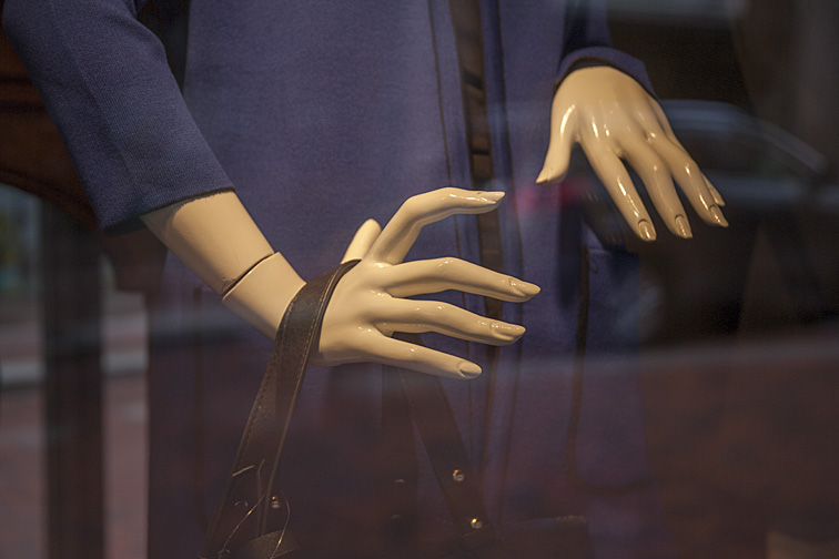 |
CategoriesArchives
July 2024
ALL BLOGS
Camera Settings Composition Depth-of-Field Finding The Shot Focus And Blur Image Editing Laziness Lighting The Subject Offbeat Ordinary Objects Reflections The Portrait While Shooting |
 RSS Feed
All Images © 2024 by Peter Glass. All Rights Reserved.