|
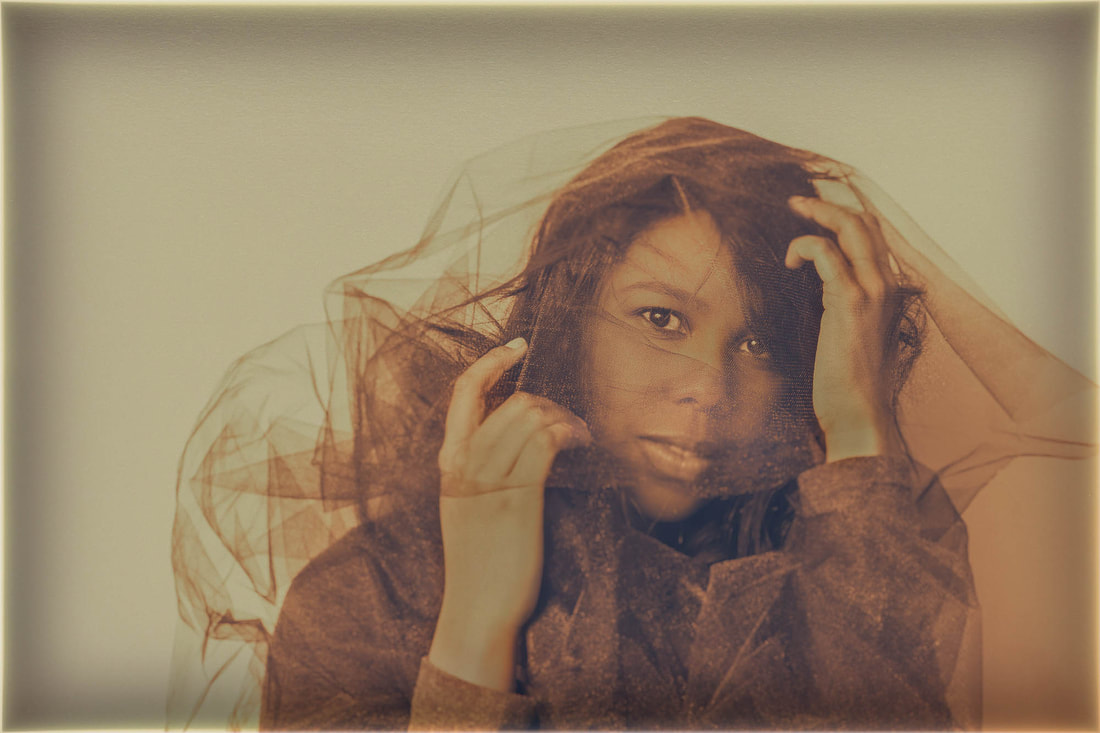
(click on photos to enlarge) I believe achieving accurate portrait skin color is not always necessary. In fact, if I’ve taken a few hundred pictures of the subject (which I often do during a photo shoot), I’d find it quite boring if I rendered every image with a “normal” skin color. Changing the skin hue can often dramatically improve even the most ordinary photograph, making it far more interesting. It's one of those transformations that can make an image "pop". Additionally, changing the color can change the photo's mood. For example, blue can imply coolness, sadness, melancholy, or depression; red can denote rage, danger, heat, love, or passion; yellow can symbolize sickness, glory, splendor, or power; green just seems to make the picture weird. My color changes are almost always done in postproduction. I primarily use Adobe Camera Raw, the program included with Adobe Photoshop. In addition, I may make a few more changes to the image using Nik Software. I initially will view the subject with her normal color. This is usually the default hue because I've already white balanced my camera before taking any pictures. However, if I want the color to be more precise, I'll click on something in the picture that’s white, gray, or black, using the White Balance Tool in Adobe Camera Raw. Or, if I’ve taken a few pictures of her holding a gray or white card, I’ll click on that instead. This should produce the most precise (or close to it) hue. It’s at this point that I may consider making changes to the subject's color. The twelve pictures above are just a few of those I've colored over the years. As you can see, the hue change on some is subtle and more extreme on others. I colored them for one of three reasons:
|
CategoriesArchives
July 2024
ALL BLOGS
Camera Settings Composition Depth-of-Field Finding The Shot Focus And Blur Image Editing Laziness Lighting The Subject Offbeat Ordinary Objects Reflections The Portrait While Shooting |


 RSS Feed
All Images © 2024 by Peter Glass. All Rights Reserved.