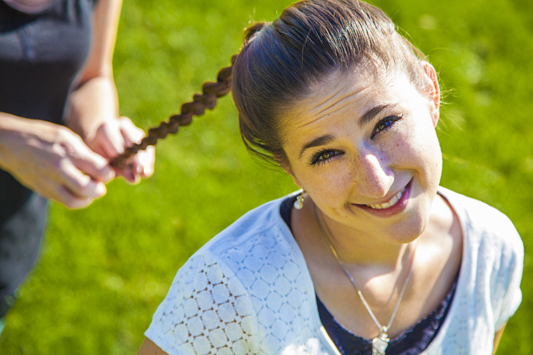
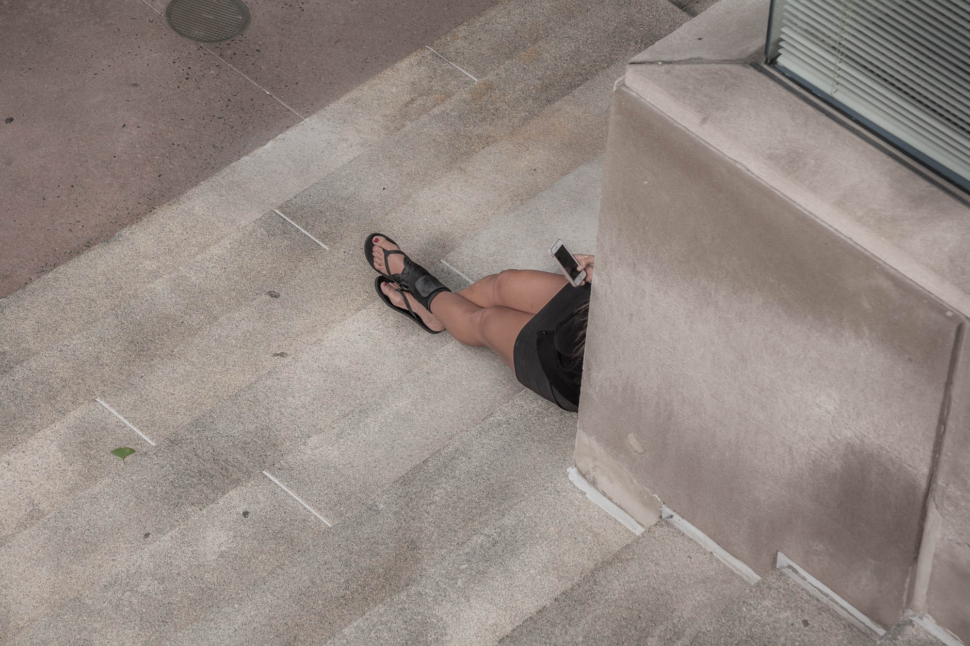
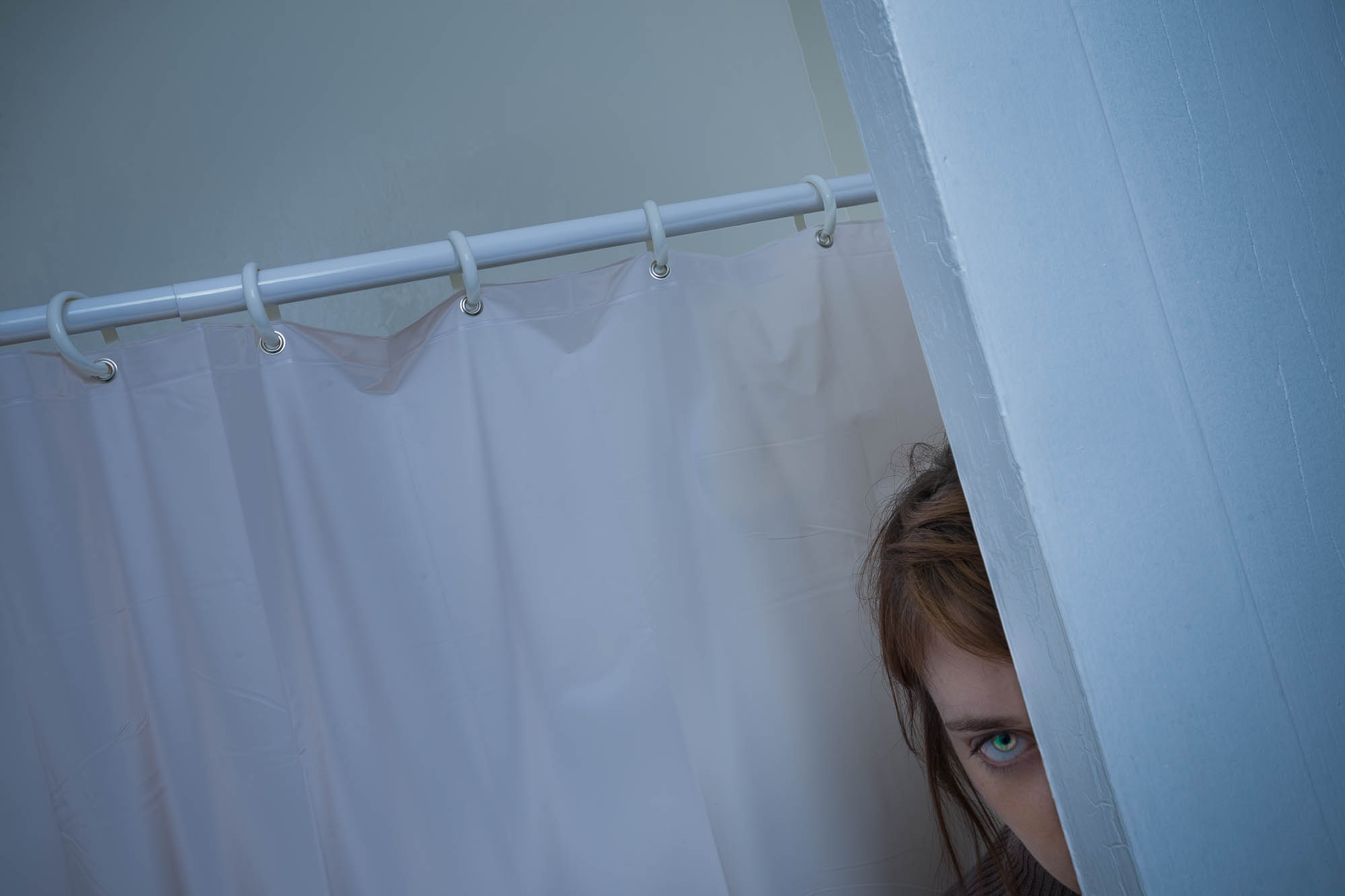
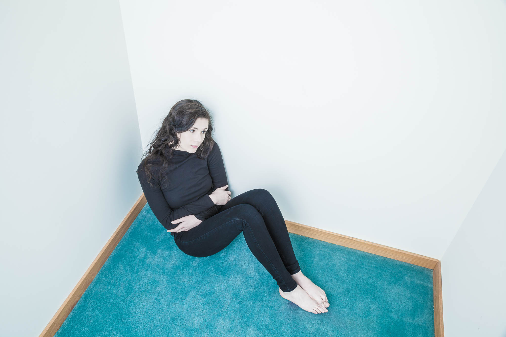
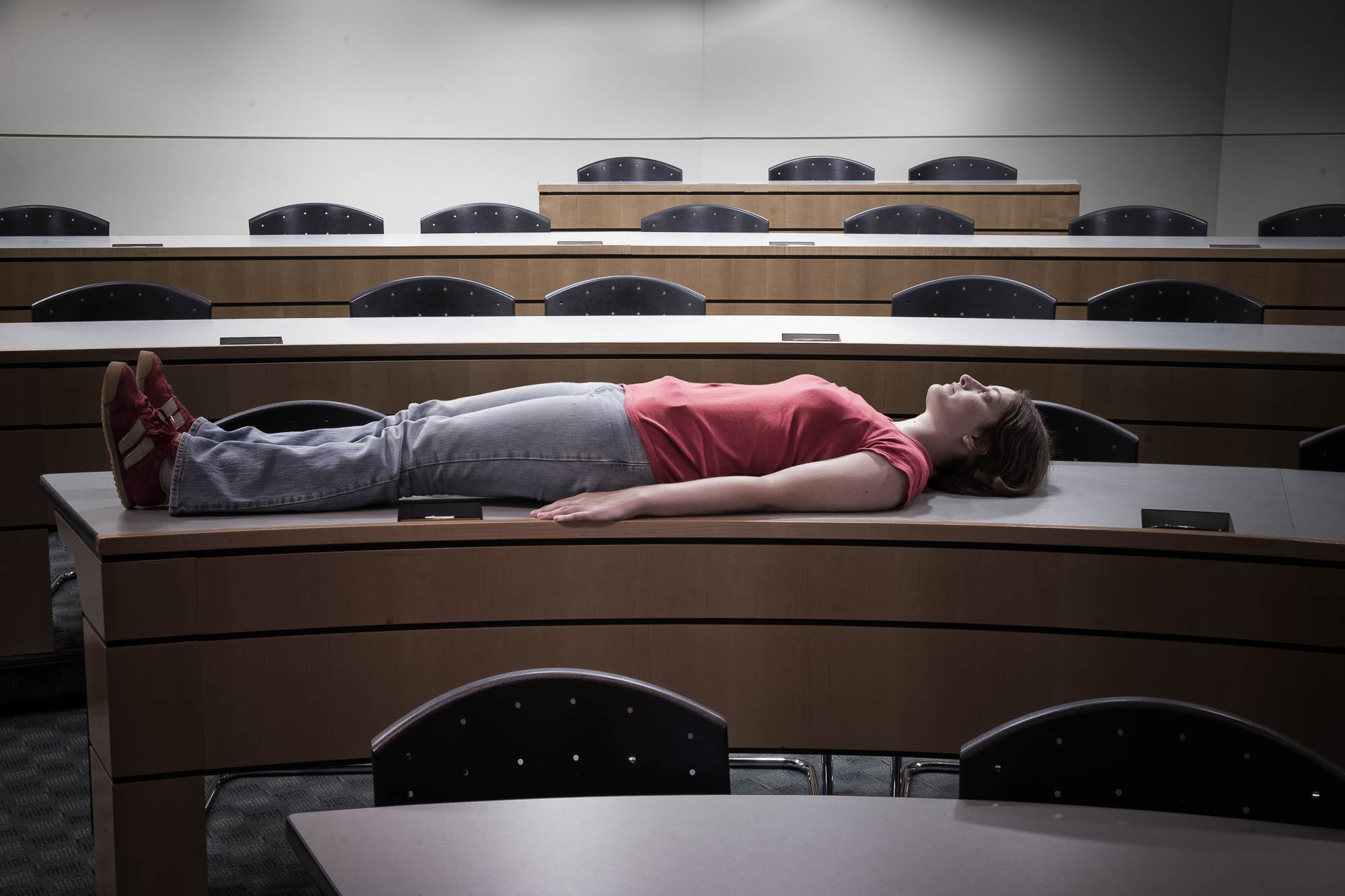
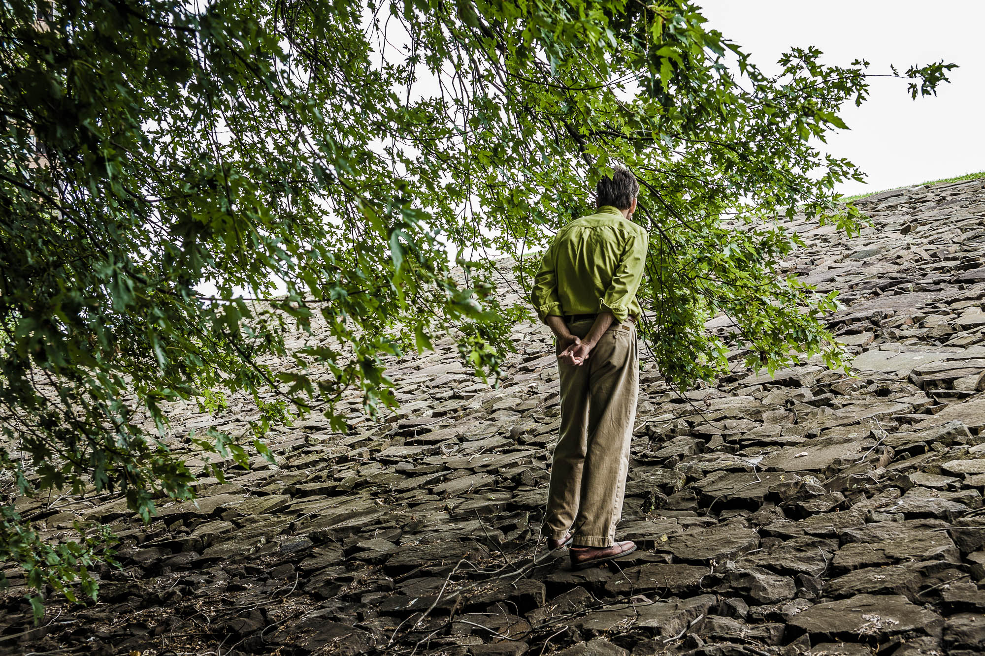
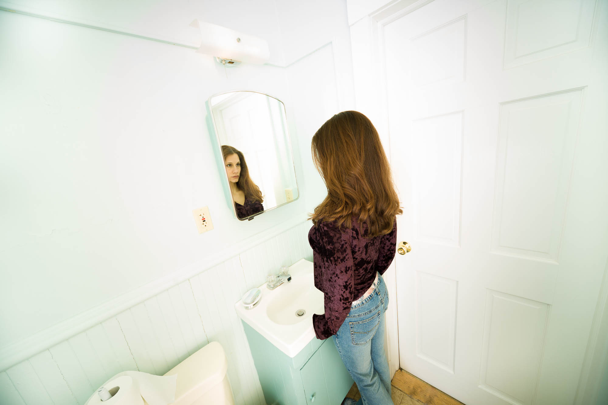
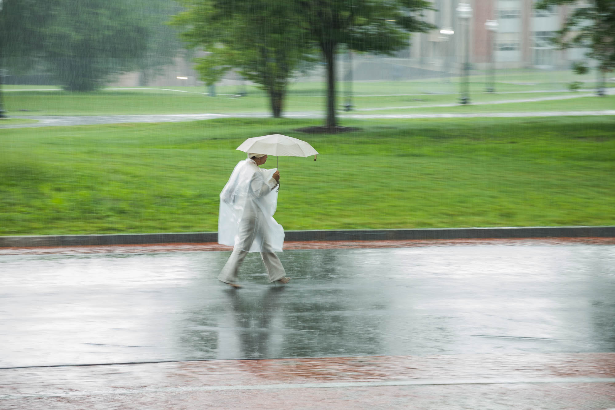
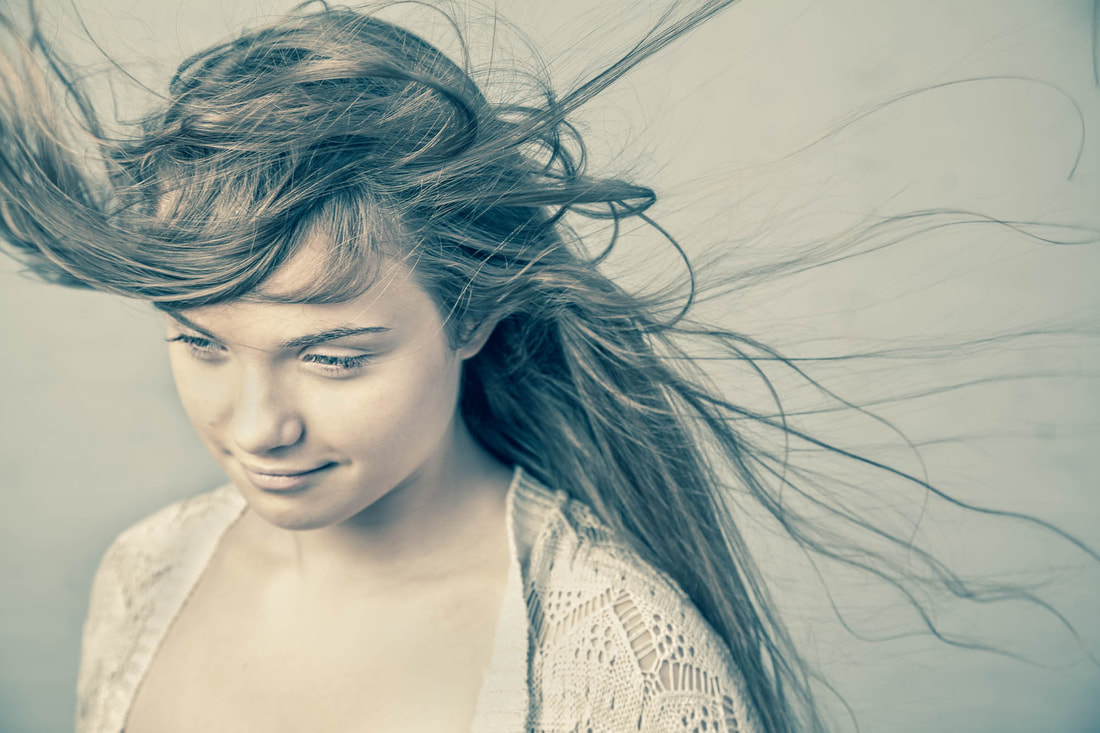
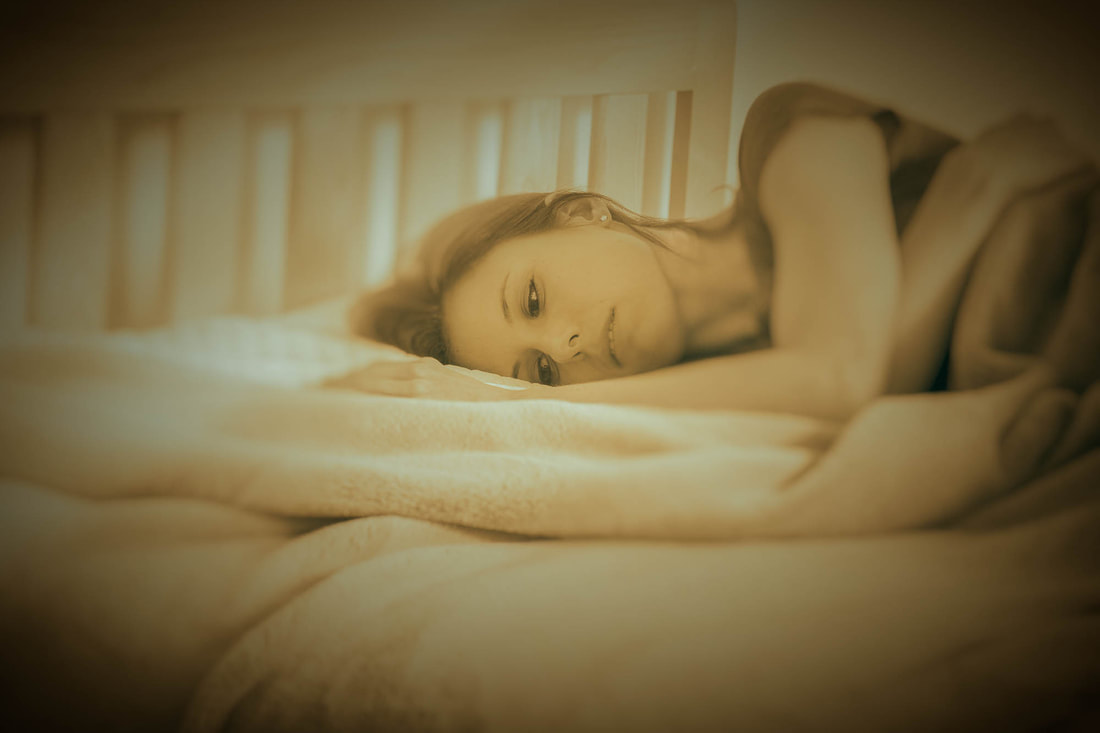
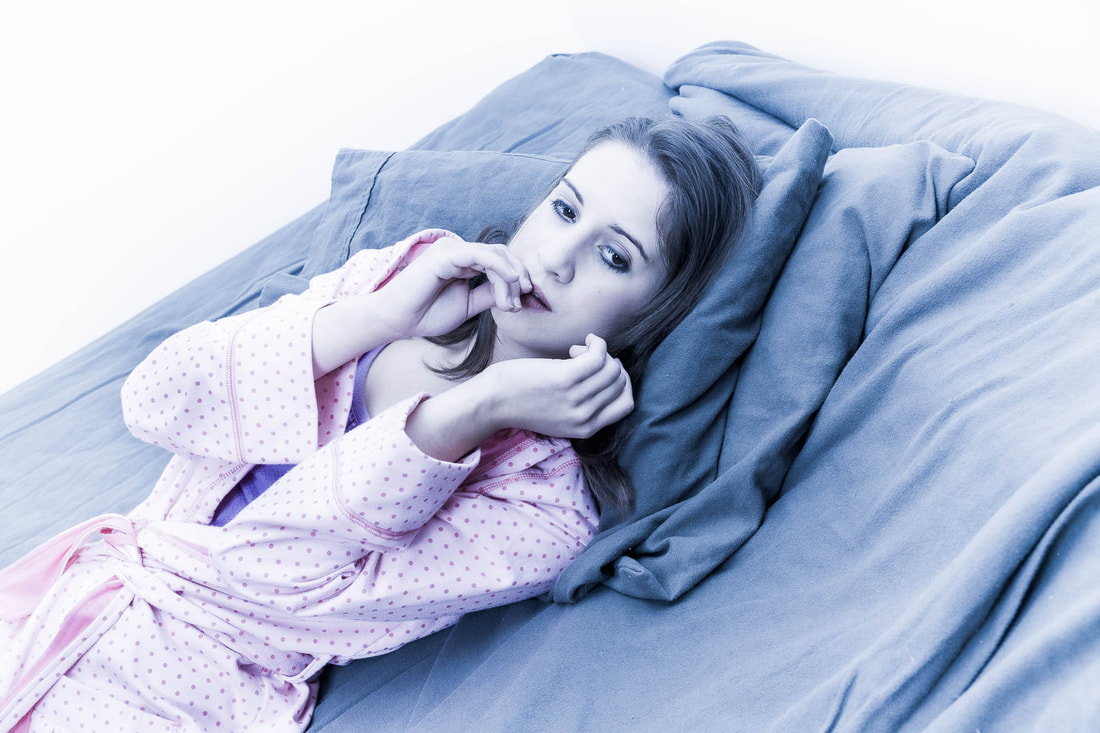
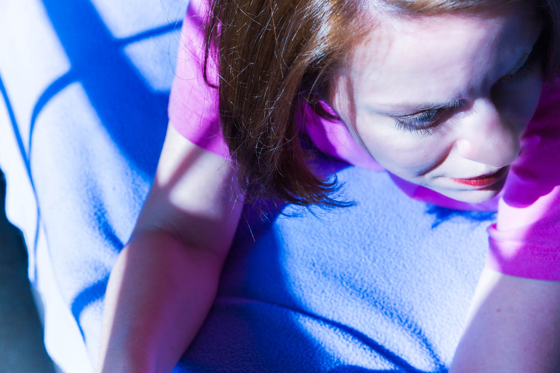
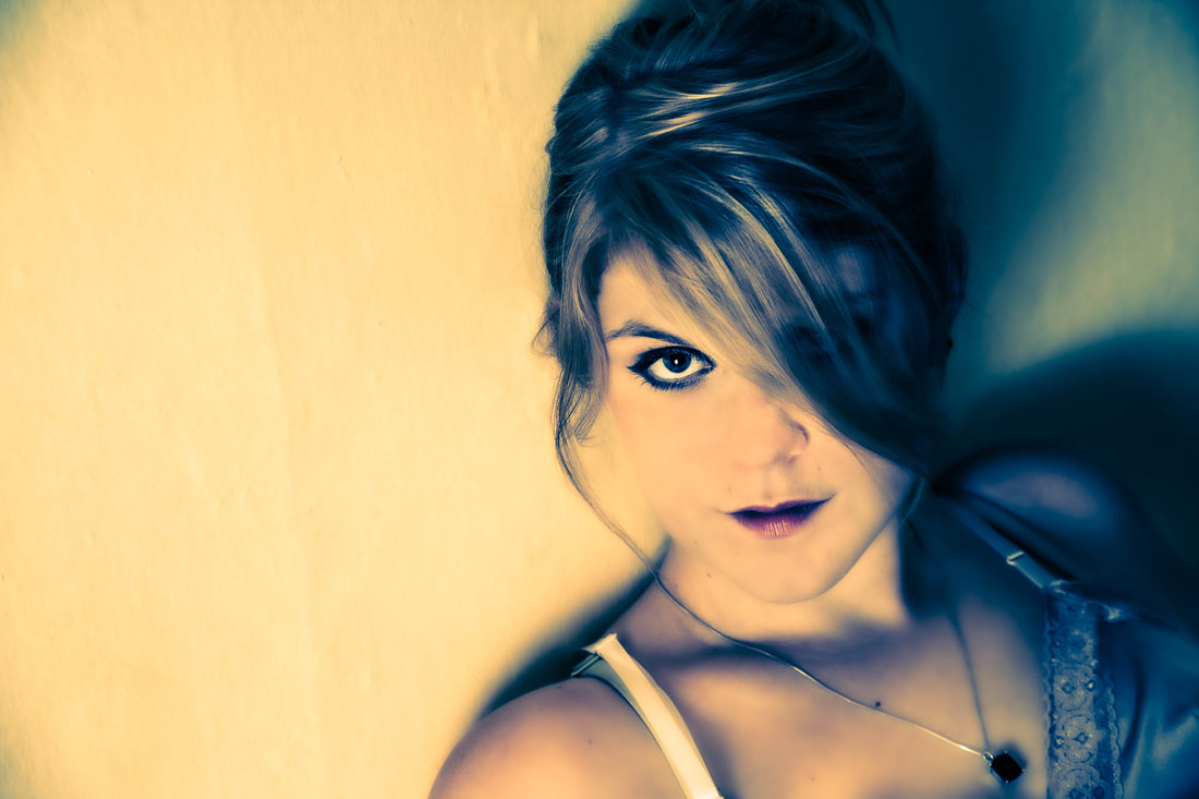
 (Click on photos to enlarge) When photographing models, I try varying the setups so that each group of images has a somewhat unique look. One way to do this is by modifying the hair. That's why I enjoy working with long-haired girls and women. Compared to those with short hair, styling possibilities seem to increase in proportion to hair length. Here are examples of what changes can be made: the hair can be braided, styled into a ponytail or pigtails, piled on top of the head, left hanging loose, or held together with a ribbon or headband. Though I'll make styling suggestions, it's the model who usually comes up with the best ideas. Along with makeup, clothes, facial expression, and body positioning, much of a female’s character can be communicated through her hair. What's interesting is how quickly she can change its look, whether intentionally or unintentionally. In fact, it can be the smallest movement or turn of the head that dramatically alters the hair’s arrangement, resulting in a totally different appearance. Sometimes, there'll be a specific change I’ll want to make to the model’s hair. It may be something simple such as repositioning a few misplaced strands or using it to cover part of the face. However, explaining what the adjustment is so that she can make the change herself can often be time consuming. Since I know what it is I’m trying to do, my preference is to fix the hair myself. With her permission (and the permission of her mother if the model's a minor), I’ll make the necessary changes, which are usually minor and can be done quickly. 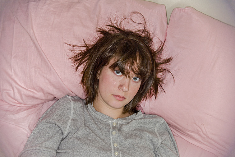 Even though there may be fewer possibilities because of its length, shorter hair can have potential too. 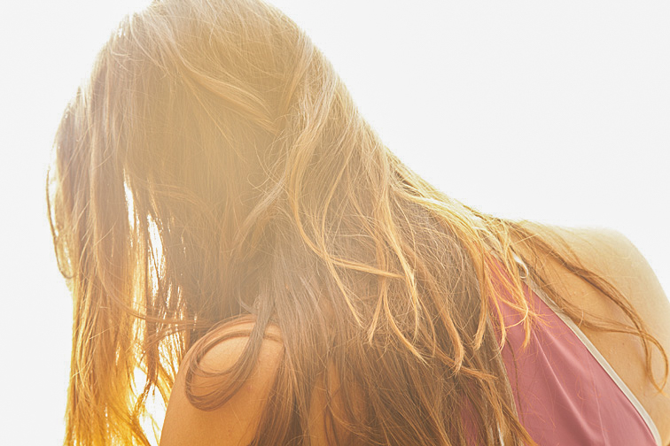 To me, this reads as someone feeling a strong emotion-perhaps unhappiness. 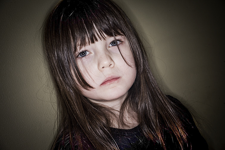 I think the strands dangling over Laurette’s eyes add to her somber expression. To me, they seem like tears streaming down her cheeks. 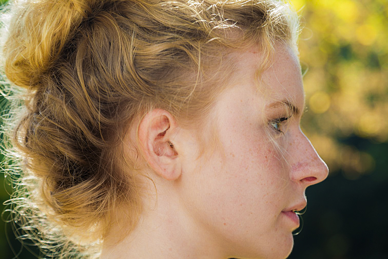 Responding to my request, Olianna put her hair up. It’s fascinating how the strands curve in all directions, with their tones ranging from light to dark. The back lighting, mostly on the left side, beautifully helps to separate her hair from the background. 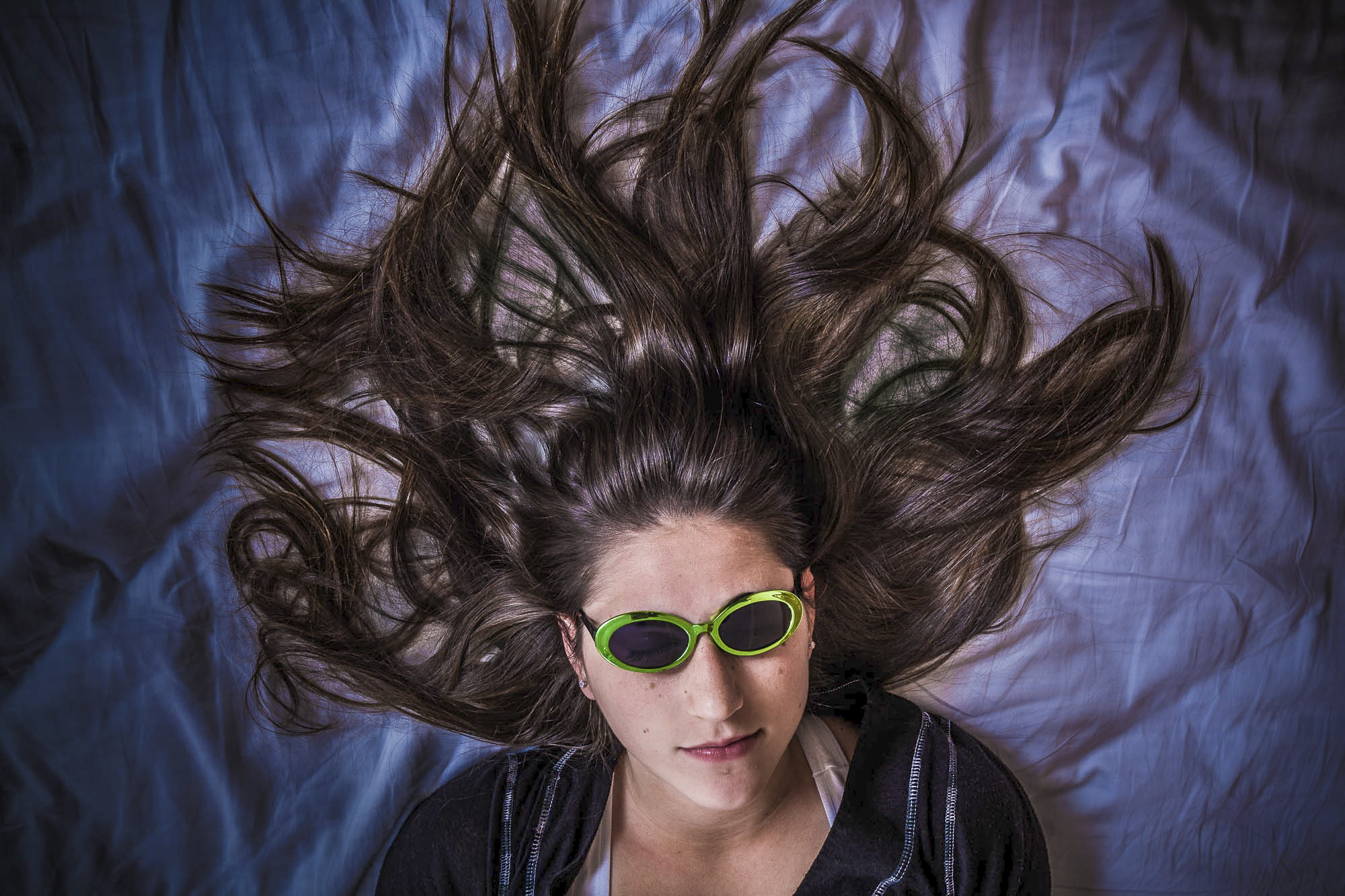 This shot took considerable experimentation. Amelia was patient as I arranged and rearranged her hair. Initially, I disliked the wrinkly sheet, but eventually realized the wrinkles seemed to complement her hair. 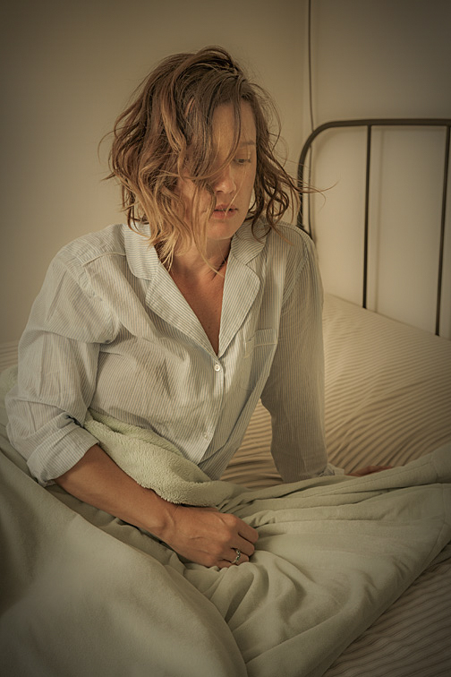 After arriving at Klaryssa’s house and saying hello, I noticed her rather messy hair. I assumed she hadn’t combed it yet but would do so before we started shooting. When she didn’t, and I asked about it, she said that this was now her hairstyle. I considered suggesting that she “fix it”, but then realized saying so might offend her. I figured we could work on improving it as we shot. So, I began the session with her hair as it was. Interestingly, as we were shooting, I came to appreciate how well her hairstyle, with some minor changes, worked with her poses. Though it might have caused problems on other models, on Klaryssa, less “messy” hair probably would have resulted in fewer dynamic and fewer striking images. Blowing the hair It’s great fun photographing models whose hair is being wildly blown about. It’s a sensation many of them enjoy and can be apparent in their expressions. The pictures that result can be really interesting. Previously, I used industrial or house fans to produce the necessary wind. I would position one close to the model’s head, making sure it wouldn’t be seen in the photo. The amount of hair movement depended on the strength of the fan and her type of hair. The best results seemed to occur when the model flicked her head (with her hair obviously following), just before the photo was taken. These days, however, I use an inexpensive leaf blower, which works much better. I have a small, electric unit (you don’t want a gas powered one due to the fumes it produces). It can be clamped to a light stand or held by an assistant. Its low weight, powerful output, and ability to be aimed precisely make it perfect for blowing the hair. 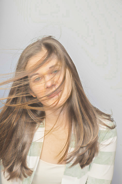 Hanna seems relaxed as her hair flutters across her face. I think the slight head tilt helps emphasize the effect. 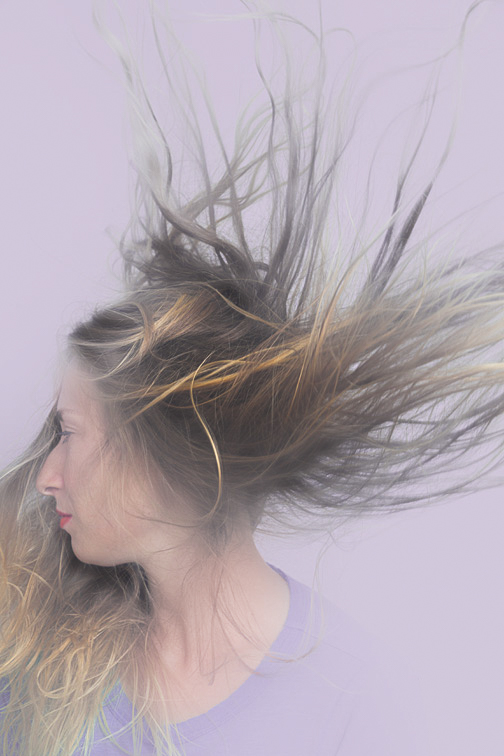 The left portion (from the viewer’s perspective) of Molly’s hair acts as a lovely background for her profile. The right portion beautifully fills the upper half of the frame. 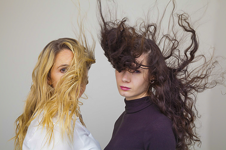 The woman on the left was in her mid-thirties, and the girl on the right was in high school. The girl’s mother was sitting on the floor between the two ladies, pointing the electric leaf blower upward. As mentioned previously, it’s an impressive device for throwing a high volume of air in a well-defined pattern. Problems may arise, however, when the blower is aimed toward the face. With its high intensity, the moving air may make some models uncomfortable. In this case, the girl was hesitant about being subjected to this wind. But after her mother aimed the device at my face, and I explained how much I enjoyed the sensation, she was more than happy to proceed.  (click on photos to enlarge) One of the first things I do when setting up a shot is to place the subject in an area of the frame that I think will work best for the image. That location can be at the top, bottom, side, corner, or even dead center of the frame. Certain composition rules, especially the rule-of-thirds, mandate specific areas for placing the model. Sometimes I agree with that edict, but more often I don't (it's my belief too many photo instructors and photo books spend too much energy pushing this rule as being absolutely mandatory). The bottom line for me is being happy with the composition and feeling that the image is communicating my intent. After taking a few photographs, and with the goal of varying my setups, I'll maneuver the subject around the frame. I do this by looking through the viewfinder, moving around the camera (I usually handhold it when taking these types of pictures), and placing her in various parts of the frame. I'll stop when I’m happy with the framing and then take a few pictures. In addition, I may physically move the model and/or myself, rework the composition, and/or change the camera orientation from horizontal to vertical (or vice versa). 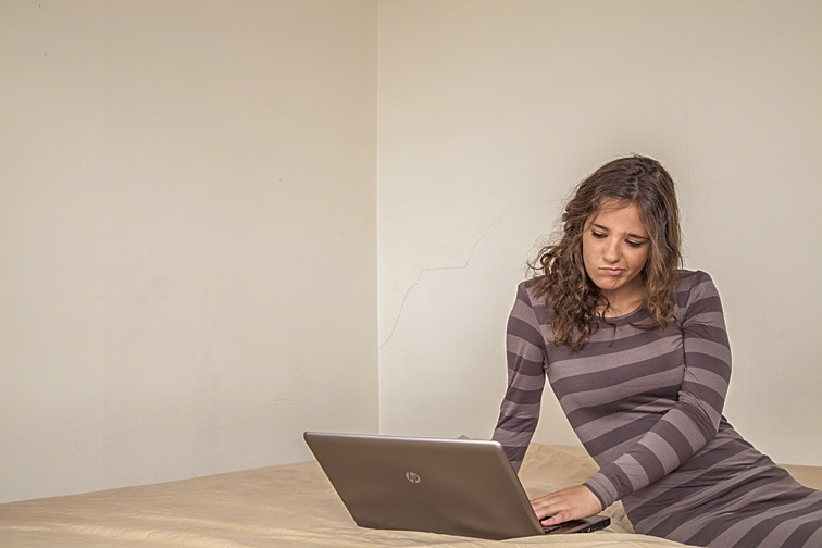 I think Adeline’s placement in the frame and the stark walls surrounding her emphasize her aloneness. We see a melancholy teenager using her computer in a barren, monotone bedroom. 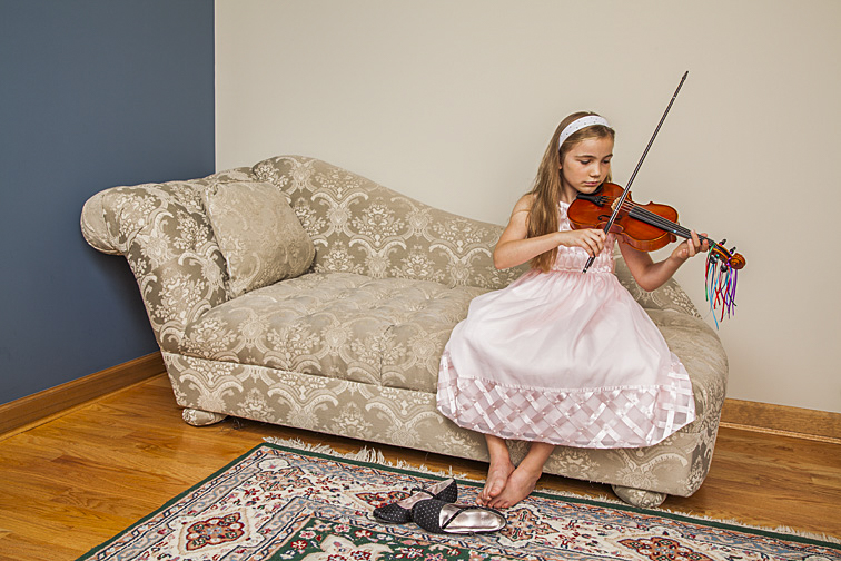 There’s a sense of isolation in this photograph too, though rather than being unhappy, Gretel seems absorbed with her practicing. One type of setup I really find appealing is having the model crowding the frame’s edge, with part of her body missing. (A friend once suggested that the lack of balance I create in these images mirrors the lack of balance in my own life!!). 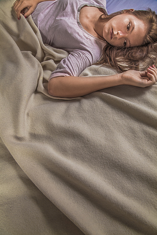 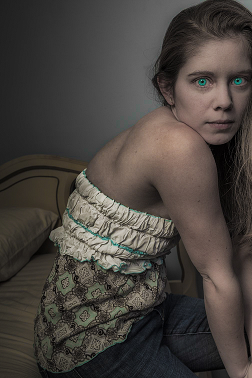 The two photos above show the models at the extreme edges of their respective frames. Moving any more toward those edges would put them out of the pictures. I think both images leave the viewer with an off-balance feeling. The top photo highlights the empty bed. The lower one, with the help of Photoshopped green eyes, intensifies a feeling of mystery. 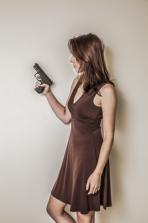 I appreciate almost everything in this photograph - Adalie’s pose, the even illumination of her body, the resulting soft shadow behind her, the hair framing her face while hiding an eye, the rim of light surrounding most of her head, the draping of the dress on her lean figure, her bent knee, and the secure grip on the gun. I wanted all those items emphasized as much as possible. The best way, I thought, would be to simply center her (left-to-right) in the camera frame. I think that puts all the elements, except the gun, on equal footing and deemphasizes the importance of any one over another. 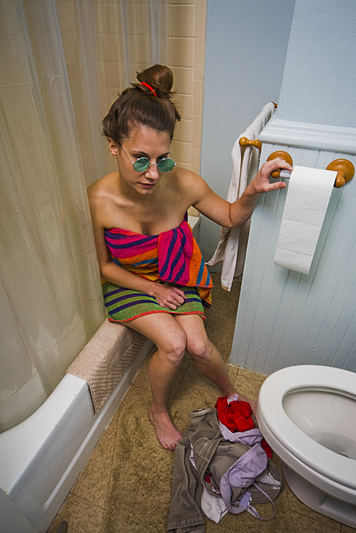 I felt everything in Joanna’s bathroom was interesting and should be shown. To achieve that, I intentionally moved her toward the back of the bathtub’s ledge, allowing the viewer full visual access. 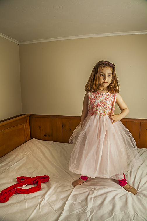 There’s something unsettling (in a positive way) about this photo. Perhaps it was her calmness. She had been a whirling dervish for most of the shoot, but was now absolutely still and looking bored. Further, the framing gives a nearly equal weight to both her and the piece of clothing on the left side of the bed. That may imply an equal importance to both, which should not be. She should be the important one. The viewer may wonder what’s going on in the picture. It’s confusing. But that’s OK. Confusion can be ideal for spicing up an image. 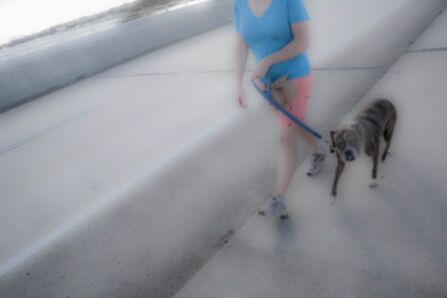 When I’m out wandering through a city with my camera, I’ll often look for busy sidewalks or other pedestrian thoroughfares. What I want are people walking, running, biking, or skating toward me. My goal is to photograph the subject(s) as they are passing or about to pass. I’ll commonly preset the camera settings. Then, as a subject approaches, everything on the camera is ready to go. These are my typical settings, though they really depend on what I’ll be photographing, how far from the subject I'm standing, and how fast the subject is moving: ISO - 100 Shutter speed - 1/15th to 1/60th second Aperture - whatever f-stop necessary for a proper exposure Focal length of lens - in the wide-angle range Focus - set to manual focus and at the approximate distance where I expect the subject to be when I press the shutter button For these sorts of shots, I’m panning my camera as I shoot, so that it’s moving at the same speed as the subject. This makes the subject mostly in focus and only slightly blurry. Where more blur hopefully is prevalent is in the background and/or foreground. The blur helps give a sense of movement to the moving subject as well as hide distracting clutter that may be in the background and/or foreground. When panning the camera, I’m not looking through the viewfinder or at the camera’s monitor. I don’t want the subject to know they are being photographed. The camera remains where I’ve been carrying it - usually at mid-chest level. My camera and chest are actually moving together. At the same time, I’m tilting the camera up or down slightly, attempting to get the best framing possible. I do all this nonchalantly, as though I’m merely looking around. Unfortunately, since I cannot see how the subject is being framed, this technique often causes me to miss part or all of the subject. Sometimes, instead of wandering, I’ll perch myself somewhere, and wait for people to come past me. Depending on where I am, this can be quite productive or quite futile. Here are six examples of people coming past me. By the way, I think there are some really interesting shadows in a few of the photographs. 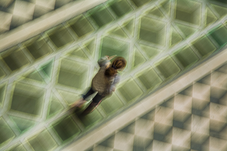 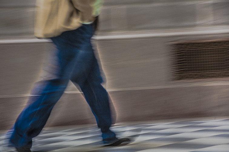 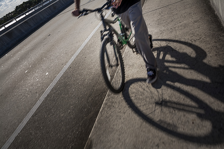 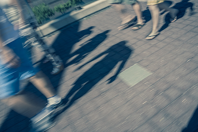 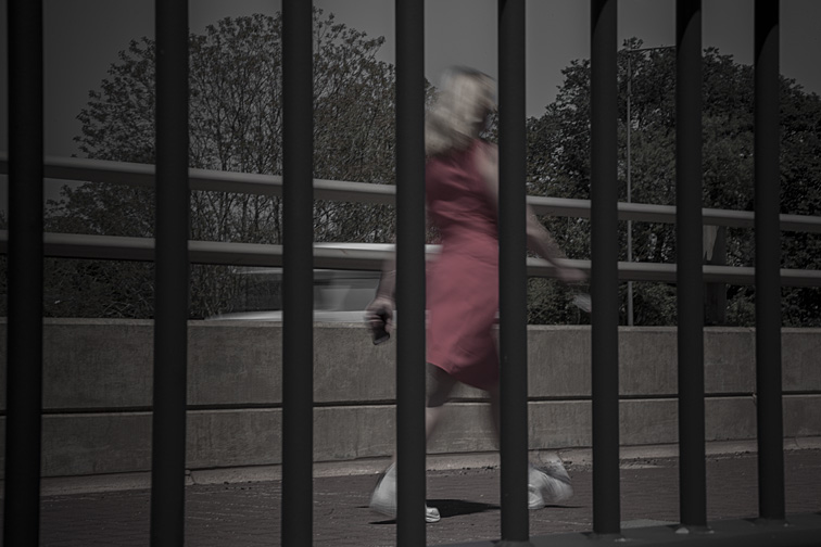 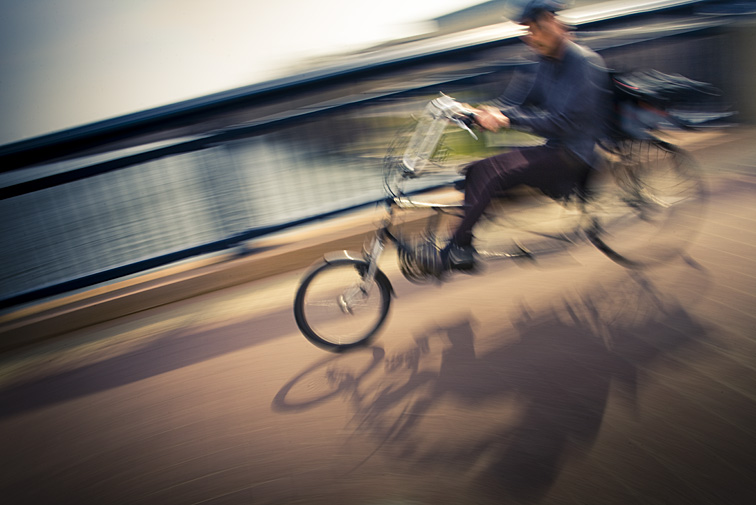 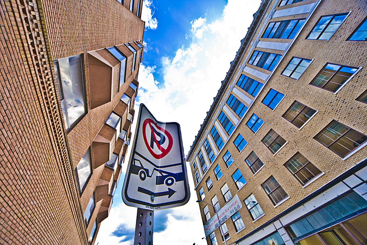 I think it's fair to say that most people take pictures from a standing position, with their camera pointed mostly straight ahead. In other words, they’re rarely pointing their camera significantly upward or downward. I could be wrong, but it’s what I’ve observed over my many decades of viewing photographs. If doing that gives the best results, then that's how the picture should be taken. But the photographer should consider the unique effects possible when shooting up or shooting down, especially with the lens at a wide-angle setting and positioned close to the subject. The following pictures show what I'm proposing. I could have photographed this building and telephone pole from a greater distance by using a more telephoto lens setting. Being farther away would have produced a less exaggerated and more realistic view. But it’s the combination of the extreme angle created by being close to the subjects and the use of a wide-angle lens setting that makes this picture interesting. Specifically, I'm intrigued by the severe tilt of the pole, as if it’s about to fall over, and the odd positioning of the building’s lights. And I think the effect was heightened by the color and contrast manipulation done in Photoshop. 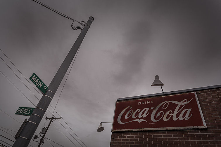 This is an even more extreme example of what happens when photographing very close to a subject and using a wide-angle lens setting. You can see how large and distorted the lower left fence links appear to be and how the fence is rendered as being quite massive. 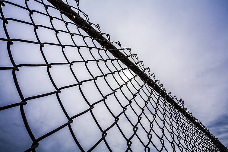 In the two pictures below, what probably are familiar objects to most people appear distinctly different from how they would appear if shot straight on. It’s that up or down camera angle and the resulting mild distortions that make these images appealing. Further, the great depth-of-field on the “Do Not Enter” sign and the shallow depth-of-field on the doll make them, I believe, even more compelling.  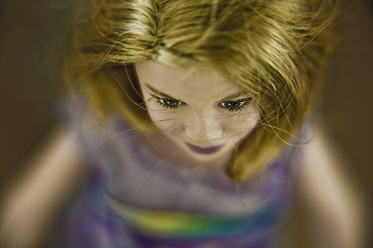 Huge thighs and tiny feet resulted from placing the camera close to my body. I like photographing myself interacting with various types of painted traffic lines. And it’s comforting knowing my legs and feet are always available to me as props! 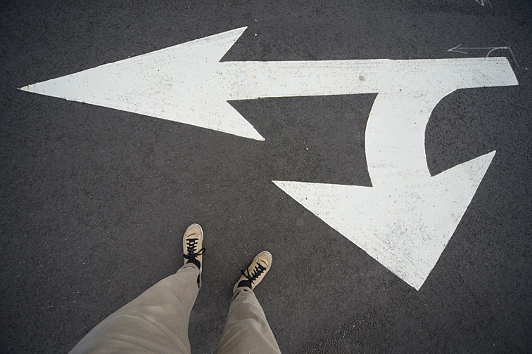 When viewed at an extreme angle, something as ordinary as a metal fence can become a work of art. 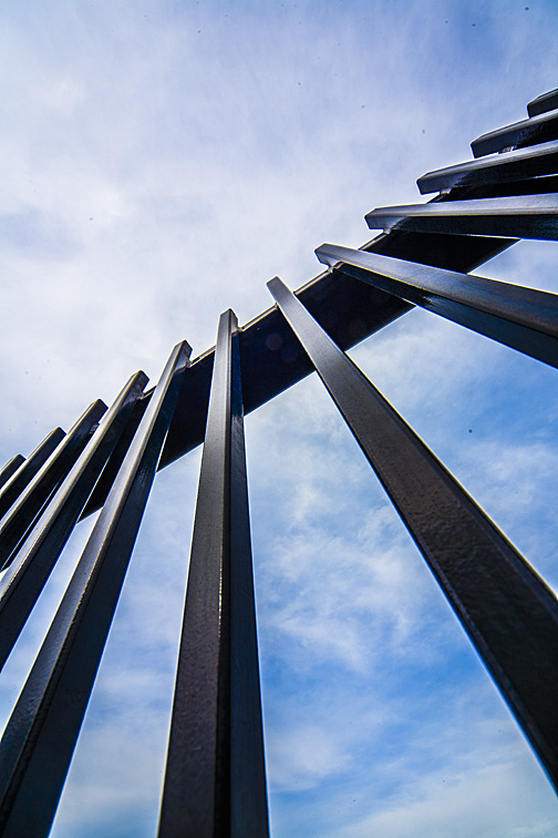 Walking down the sidewalk, you’d easily see this sign and, as in this location, all the clutter around it. But from a low angle, it’s a different story. Now the sign is nicely isolated against the clouds. In addition, the top of the palm tree adds a striking design element to the composition. 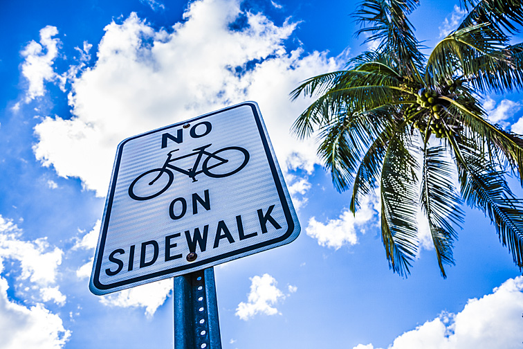 This is not a flattering camera angle for any kind of portrait. But a standard portrait was not my goal. I was in a shopping mall and happened to glance downward over the railing. It was the juxtaposition of the chair and its surroundings, as well as the gentleman's partially bald head hovering over his phone that I found intriguing. Note: I would not have taken this picture had I been able to read what was on his cellphone screen. 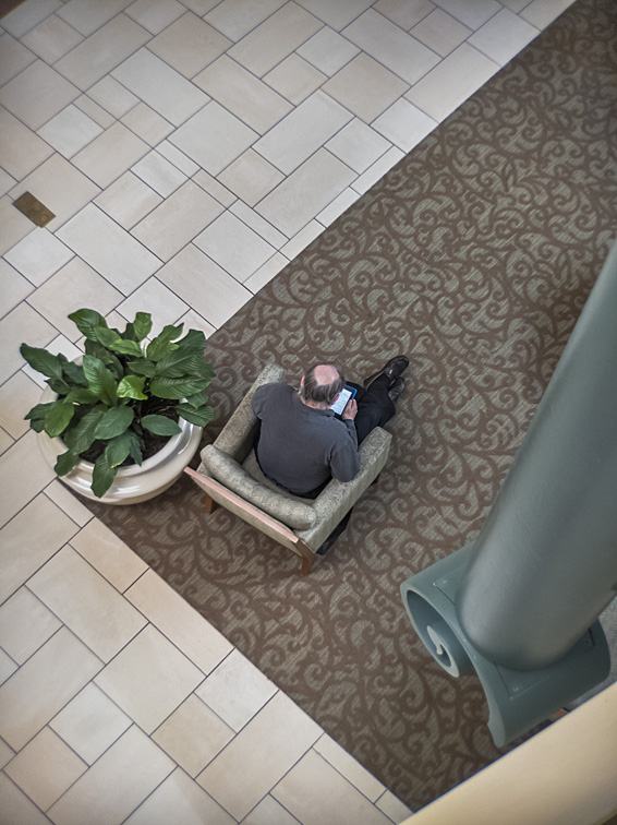  Wonderful unexpected picture possibilities can occur any time during a photo shoot when I'm working with one or more models. I’ve noticed that these possibilities appear while I’m already in the process of taking a picture or while I'm setting up for a new shot. When an opportunity shows itself, this is what comes next:
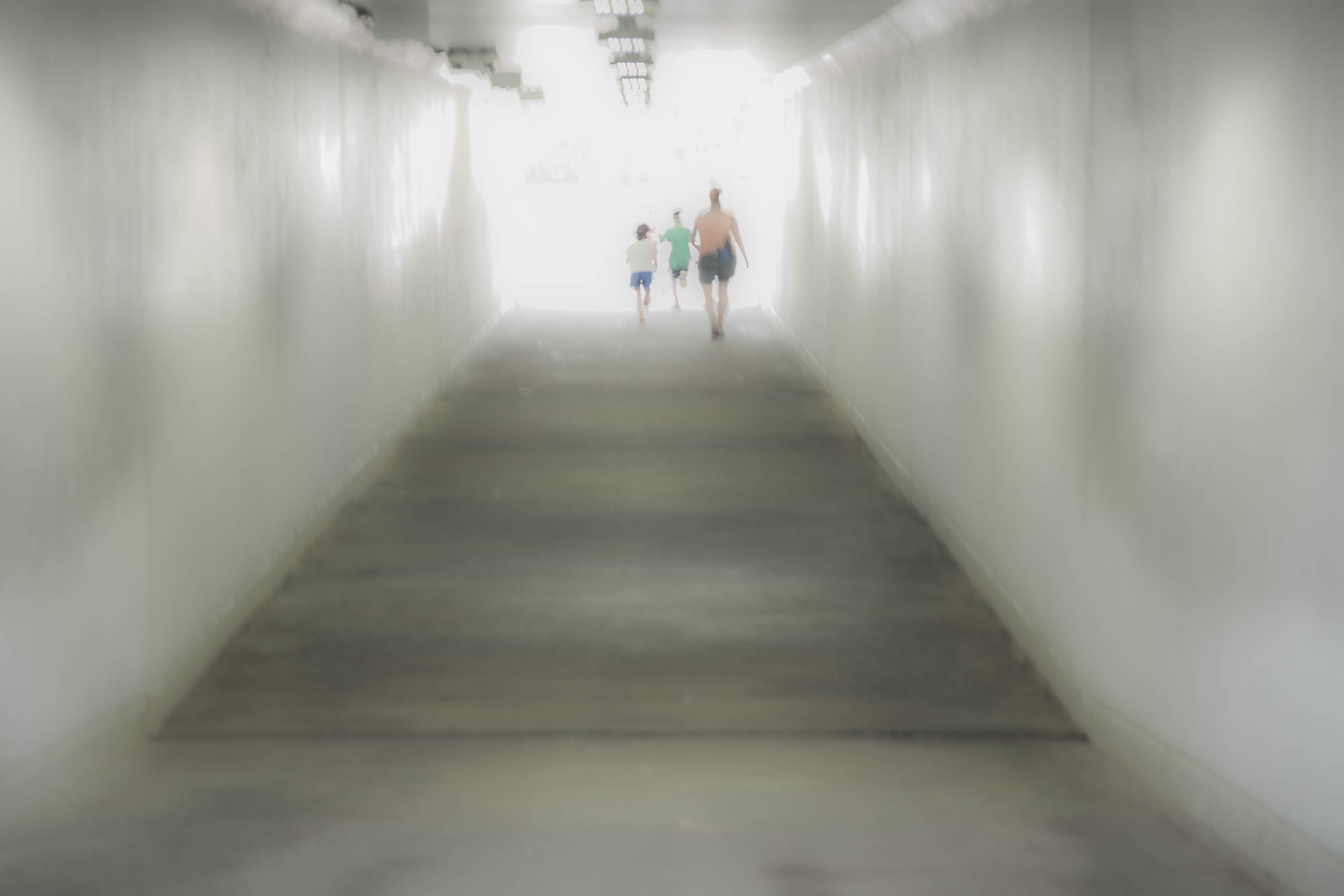
Here are some examples of what I believe to be intriguing shots that came along quite unexpectedly. 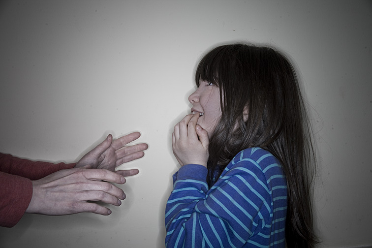 Darla was joking with her daughter, Laurette. Having worked with them before, and knowing how wonderful an actor the girl was, I knew worthy things were on their way. I framed the shot and waited. Laurette was saying that her mother’s nose scared her (I don’t know how serious she was about that). When this interaction happened, I took the picture. Laurette's expression was perfect. It seems to show both fear and amusement. Also, each set of hands seems to show conflicting intentions - one pair reaches either lovingly or threateningly while the other pair emphasizes either anxiety or joy.  I was watching Kelly fix-up her daughter's hair. There was lots of energy flowing between the two. I knew if I paid attention, I’d be rewarded with some good photos. I wasn’t disappointed. The above image was far and away the best of the series. Both faces are vibrant, and the intensity of their excitement is wonderful. A pet, usually a cat or dog, wondering onto the set can cause havoc or great picture possibilities. If the animal is fairly calm, is in an area of the set that works compositionally, and doesn’t have its butt facing the camera, the results can be rewarding.  For this picture of Meredith, I placed her alone against a wall and got ready to shoot. After a few moments, her cat wandered in. I waited to see what it would do. He began rubbing himself against her leg. Combined with the blindfolded Meredith, I think the result was an odd and amusing image. (”odd” and “amusing” - a great combination for almost any picture). The presence of the cat, I believe, significantly improved my original shot idea. 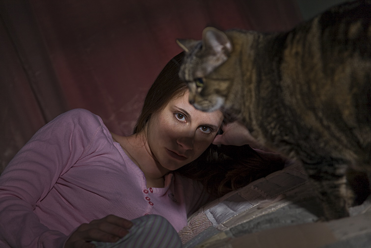 Here’s another photo where the subject’s pet wandered into the shooting area. What’s noteworthy about this image is that we get a decent view of its face. And what’s truly amazing is how the cat’s position blocks part of the strobe illumination perfectly, creating a light pattern that dramatically highlights the model’s eyes.   My plan for the first of these two photographs was to have Anabel on the bed alone, with the “Private Property” sign covering her chest. As I was preparing to take the picture, however, the dog jumped up. I held off shooting for a moment, waiting to see what would happen. I’m glad I did. He ended up looking as if he was reading the sign. Then, as can be seen in the second photo, and to both our amazement, he began crawling under the top sheet. By the way, Anabel’s open-mouth surprise was quite real. 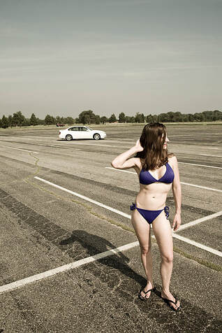 Joanna and I were photographing in an almost empty parking lot at a local beach. During a break, Joanna had turned and was adjusting her hair. Almost at the same moment, a car pulled up. I saw a perfect photo opportunity and quickly snapped a picture. I loved the results: a sparse composition showing a young woman and a car, both nicely positioned in this parking lot. Every time I look at this image, I wonder why the person in the car stopped right where he did. Perhaps to ogle Joanna? When all the elements unexpectedly come together to produce a great shot, and when I had very little or no part in making that happen, I think of that image as a “gift”. I’ve read about other photographers using that same term when they’ve had the same experience. It’s in those moments, when the photographer is completely out of the equation, that the gods above have grabbed the reins and taken charge. In the book “Looking At Photographs”, John Szarkowski writes about the famous photographer Jacob A. Riis: “Suffice it to say that Riis did not, through pride, reject chance; he knew the habits and habitat of the photographer’s luck, and he did his best to make himself available to its gifts.” I would like to address the process of intentionally blurring an image. "Blurring" refers to observable movement in a photograph. Blur is usually created by a slow shutter speed, camera movement, and/or subject movement. 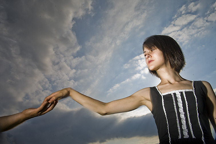 In the photo above, I panned (moved in a horizontal motion) my camera at the same speed Rebecca was walking, resulting in her head and torso being mostly sharp. But since the background was not moving, it ended up being blurry. This technique creates a sense of motion and helps the subject stand out from her surroundings (her dark dress helps too). And there's an added benefit of blurring a background. It can hide an intrusive or unpleasant area - for example, a parking lot behind a field where kids are playing soccer. Panning the camera along with the moving players, the photographer creates a blurred area behind them that may be almost unidentifiable. In this photograph, there was no need for hiding it. The girl's environment is appealing, and being able to identify what it is adds a sense of place to the image. The camera settings were 1/15 sec, f8. (click on photo to enlarge) Occasionally, I’ll blur the whole image. Mentioning this to people often brings looks of bewilderment. I explain that the right amount of blur can produce a photograph that's both interesting and dynamic. It’s having too much blur (making the subject unrecognizable) or too little blur (making it look as if the photographer couldn't hold the camera steady enough) that causes problems. Properly done, the subject will still be identifiable, but rendered more diffuse, with softer tones, and hopefully appear more offbeat. You’ll have to experiment with various shutter speeds and camera movements to determine what the appropriate amount of blur is. A relatively long shutter speed usually is enough to produce an effective blur. If I need more, I’ll use an even longer shutter speed or slightly move the camera up and down, side to side, or in a circular movement while shooting. Again, experimenting is key. In the photos below, each image has been intentionally blurred. (click on photos to enlarge) Maggie is peering out her kitchen’s screen door. The camera settings were 1/10 sec, f4.5.  Kimberly is standing in front of her kitchen window and next to a hanging plant. The camera settings were 1/4 sec, f4.  I asked Danielle to bend slightly forward. The camera settings were 2 secs, f5.6. 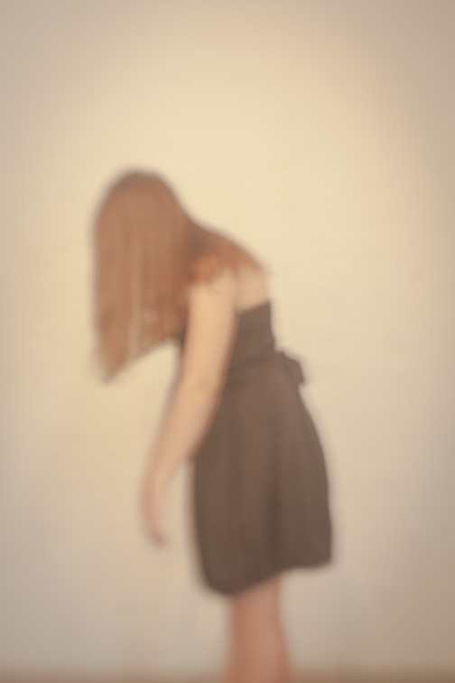 A very pregnant Tabitha is standing in front of her bedroom window. The camera settings were 1.5 secs, f5.6. 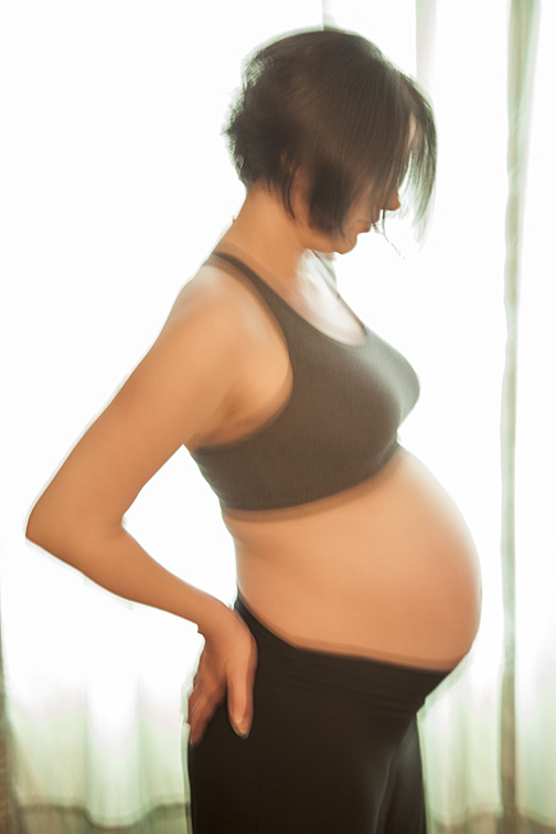 This is Rebecca playing with her hair. It’s somewhat less blurry than the other pictures. The camera settings were 1/2 sec, f4. 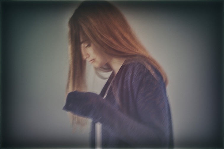 Every once in awhile, some oddball reflection will catch my eye. That attraction might be due to one or more of the following:
The photographs below illustrate different reflection types (click on photos to enlarge). This is a reflection of a skylight inside a shopping mall. Whenever I’m wandering through this mall, I’ll usually pass by this area. Because the reflection appears to have depth, and if I’m not paying attention, I’ll sometimes mistake it for a hole in the floor - something I need to avoid. It’s fun standing near the reflection, trying to see it not as three-dimensional, but as the flat surface it really is. 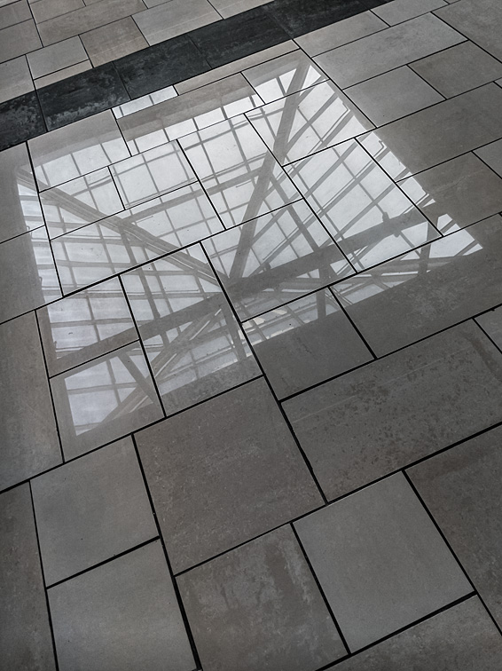 I was drawn to how this relatively new glass building was reflecting a much older building from across the street.  Looking at shiny polished metal like this, you realize that you’re not really seeing the pots themselves. What you’re actually viewing are reflections of everything surrounding the pots. It’s the same phenomenon as looking at yourself in a mirror. You’re not seeing the mirror - only your reflection. 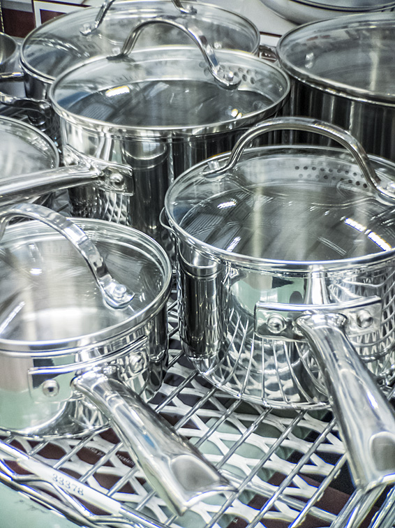 It’s really the reflections that define this school hallway. The exterior light coming in through the doors and windows, given a fairly long camera exposure setting, would provide enough illumination for a picture to be taken. However, it’s the reflections on the lockers, walls, and floors that provide shape to this photograph. Without them, the image probably would be flat and dull. 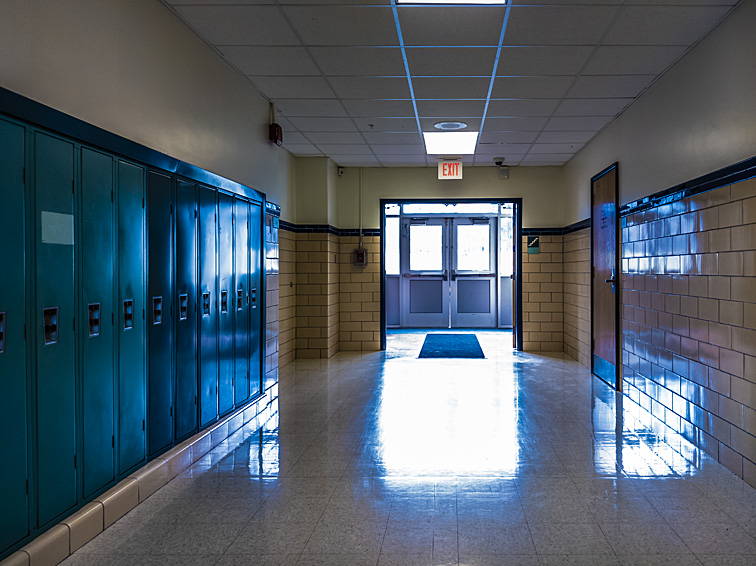 I placed these kids’ blocks on a shiny conference table. It was only after several viewings that I noticed the reflection spells, in upper and lower case letters, “herb”.  (click on photos to enlarge) There are those that might look at the images above and ask why I left so much space around each subject. I often shoot images where the subject, human or inanimate, is significantly smaller than the empty space around them. I define “empty space” as either the absence of everything (for example, a completely white area), or a continuation of the subject’s environment. This uninhabited area can greatly affect how the subject is perceived by the viewer. “Empty space” is not wasted space. I’ve heard it suggested that photographers should crop out the barren area of an image, thereby making the subject more important. For certain pictures, this might be a good idea. But for lots of images, this misses the true intent of empty space. People making suggestions like this, I believe, are unaware of how nothingness can affect an image. Empty space can, for example, emphasize the picture’s location, help define the image’s mood, and lead the viewer’s eye directly to the person or object. To that last point, empty space lets the viewer know precisely where their eyes need to go, thus actually increasing the subject’s importance. The empty space must be set up with the same care that goes into posing the person or setting up the object. One or more of the following must be done to anything found in that empty space that should not be there:
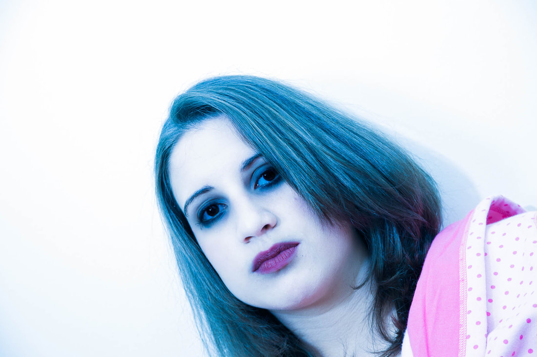
I’ve seen and made pictures where the size of the subject, relative to the total area, is very small - the empty space takes up the majority of the image’s real estate. If done well, having the subject so small in the picture actually delivers a lot more artistic impact. It seems that as the object gets smaller, its importance grows. In the photographs shown above, I believe that negative space greatly enhanced some rather simple setups. (click on photos to enlarge) I believe achieving accurate portrait skin color is not always necessary. In fact, if I’ve taken a few hundred pictures of the subject (which I often do during a photo shoot), I’d find it quite boring if I rendered every image with a “normal” skin color. Changing the skin hue can often dramatically improve even the most ordinary photograph, making it far more interesting. It's one of those transformations that can make an image "pop". Additionally, changing the color can change the photo's mood. For example, blue can imply coolness, sadness, melancholy, or depression; red can denote rage, danger, heat, love, or passion; yellow can symbolize sickness, glory, splendor, or power; green just seems to make the picture weird. My color changes are almost always done in postproduction. I primarily use Adobe Camera Raw, the program included with Adobe Photoshop. In addition, I may make a few more changes to the image using Nik Software. I initially will view the subject with her normal color. This is usually the default hue because I've already white balanced my camera before taking any pictures. However, if I want the color to be more precise, I'll click on something in the picture that’s white, gray, or black, using the White Balance Tool in Adobe Camera Raw. Or, if I’ve taken a few pictures of her holding a gray or white card, I’ll click on that instead. This should produce the most precise (or close to it) hue. It’s at this point that I may consider making changes to the subject's color. The twelve pictures above are just a few of those I've colored over the years. As you can see, the hue change on some is subtle and more extreme on others. I colored them for one of three reasons:
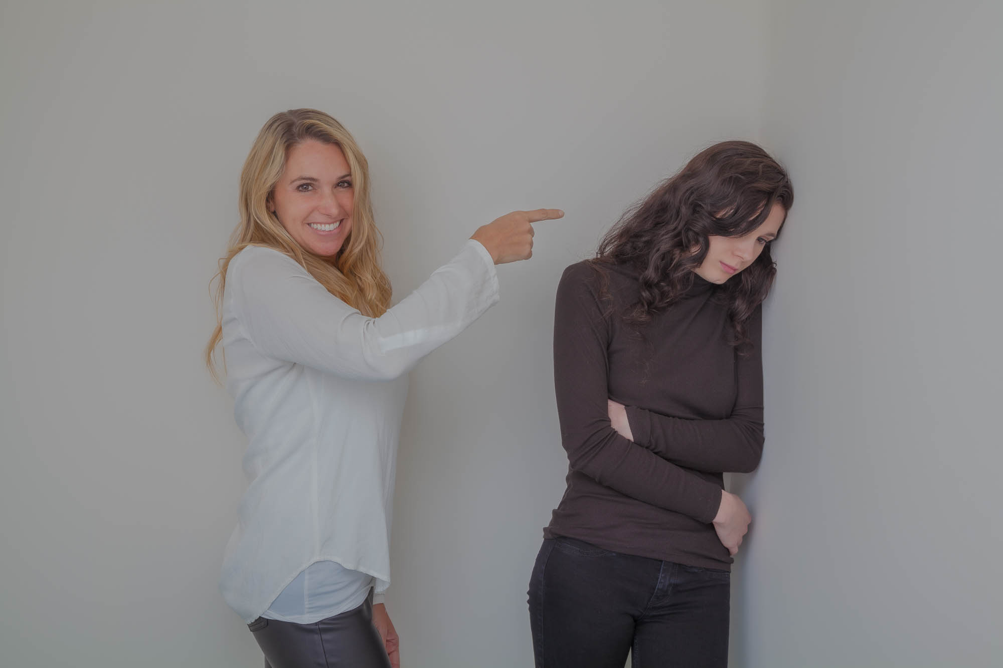 Regarding the model’s mother - I usually enjoy having her on set. The great mother is indispensable. She’s there to support her daughter unconditionally. That may mean pulling a dress out from under piles of clothing and quickly ironing it; braiding hair; applying makeup; wiping a runny nose; offering encouragement. Since I customarily work without an assistant, mothers sometimes take on that role for me. I’ve had mothers happily hold light reflectors and leaf blowers (for blowing the model’s hair), move junk out of the way, and bring us snacks. When discussing an upcoming photo session with a parent, which usually is the mom, I request that she, rather than the father, be present during the shoot. My belief is that the mother will be more in tune with her daughter’s needs, being better able to provide the assistance mentioned above. Sometimes I want someone the model can react to or interact with, and mothers and fathers are perfect for that. I’ve gotten some remarkable expressions when a parent, placed out of the shot, catches their daughter’s attention with their antics. What can work well too is having a parent or the limb of a parent physically interacting with their child. Unfortunately, there is the occasional overbearing mom who wants to control her daughter, often making demands of her that are unnecessary and disruptive. This attitude typically takes the form of telling the girl how she thinks I want her to pose, which frequently is incorrect. When that happens too many times, I’ll patiently explain to the mother what she is doing and how it’s hindering the shoot. That generally solves the problem. If it doesn’t, and if the daughter is not too young, I’ll politely ask the mother to leave the area so the girl and I can photograph alone. She’ll usually agree to this. By the way, the top photo was posed (as were most of the other photos in this blog). People have viewed this picture and become upset that the blond woman was mocking the teenage girl. She was not. In fact, the woman was reluctant to pose this way. It took some persuading by me before she agreed to do so. 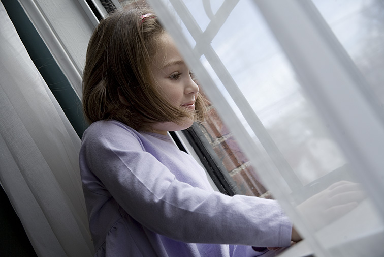 Elspeth’s face lit up when she caught sight of her father working outdoors. If he hadn’t been there, I doubt I could have coaxed such a wonderful expression out of someone so young. I love how her hair and window curtain both frame her eyes, nose, and mouth. 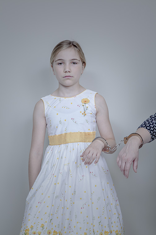 When I suggested this shot to Gretel and her mom, I assumed one or both would say “no”. Neither did. I had Gretel try several expressions - I liked this one the best. She looks utterly defeated, ready to accept her dismal fate. 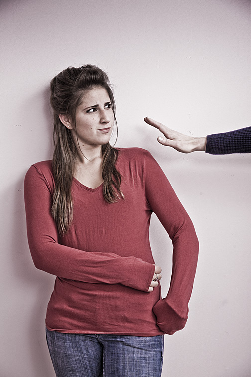 Amelia has lots of wonderful expressions. This one says heaps. The hand belongs to her mother. I also like how Amelia pulled down her sleeves a bit to cover her own hands. Occasionally, I’ll include a parent in the picture if I sense her presence will benefit the photograph. Sometimes her role is as a supporting actor to her star daughter. Other times, both have equally important roles. Either way, they must work together to support one another.  It took time to set up this mother/daughter shot. Their placement in the frame was critical. I wanted Miranda, the daughter, to slightly overlap her mother, to imply a physical connection between the two. But I did not want the crossed arms and annoyed look to be hidden. Though Miranda is off to the side, she is larger and in sharper focus than her mom, making her more important. Their expressions as the smart-ass kid and the annoyed mother are subtle but obvious. 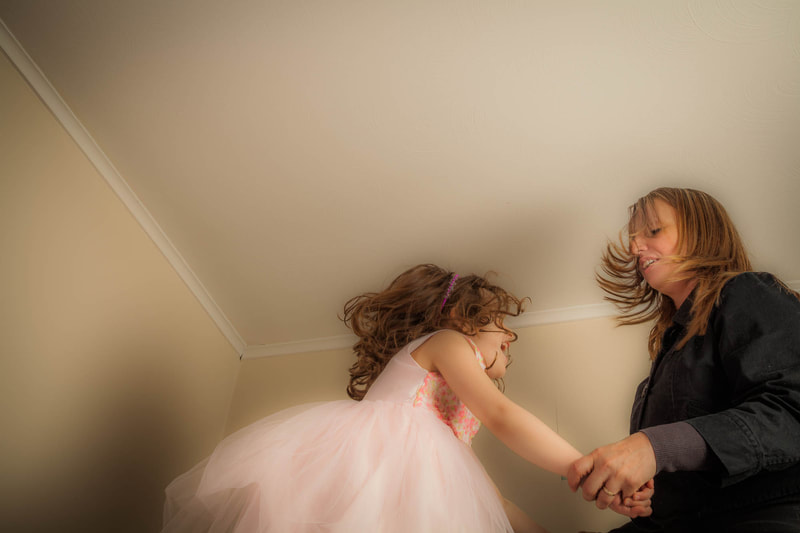 Mother and daughter were dancing madly on top of a bed, causing their hair to fly out in all directions. Each one’s excitement fed the other, helping to create this dynamic image. 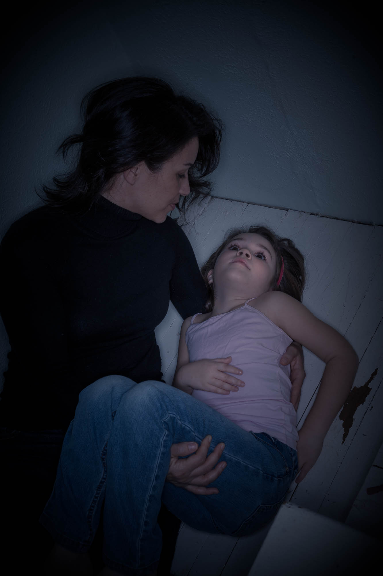 I find this photo REALLY creepy (in a good way) for a couple of reasons. There’s something about how the girl, Elspeth, has her left arm positioned. It looks eerie and unnatural. In addition, her head is bent backward, resulting in no clear connection with her mother. And then there’s Elspeth’s spooky blank stare. Photoshop helped too. 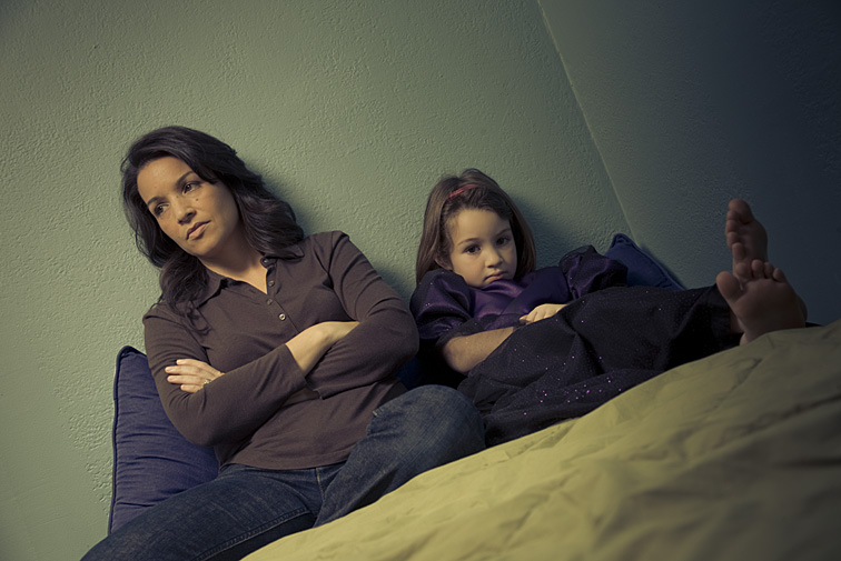 Here’s Elspeth and her mom once more, and again not interacting. Each seems isolated from the other. Arms are folded, and neither one is trying to connect. I think both expressions are marvelous. |
CategoriesArchives
July 2024
ALL BLOGS
Camera Settings Composition Depth-of-Field Finding The Shot Focus And Blur Image Editing Laziness Lighting The Subject Offbeat Ordinary Objects Reflections The Portrait While Shooting |


 RSS Feed
All Images © 2024 by Peter Glass. All Rights Reserved.