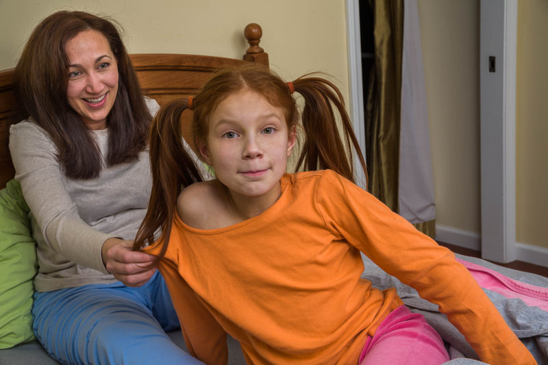
 (Click on photos to enlarge) Arms and hands can work beautifully as props. When properly positioned, their ability to add interest to a photograph rivals that of more traditional props. Some of the models I work with require very little guidance from me when it comes to intriguingly positioning their arms and hands. Whether by instinct, skill, or luck, they create wonderful poses almost completely on their own. Unfortunately, most require more direction-sometimes a substantial amount. However, I'm open to trying almost any pose the model comes up with. I've learned that what I don't like initially may actually look wonderful in the photograph. But it's important that my models refrain from any kind of posing that won’t work for my sort of photography. That means nothing relating to glamor or attempts to be realistic (pointing, gesturing as if talking, hand on the chin as if pondering, etc). Rather, I want “unposed” poses-something more natural. Or something offbeat. I demonstrate this by positioning my hands and arms in those ways. As an example, I might pretend I’m mulling over a problem by arranging my hands and arms into an oddball configuration, mimicking what happens when I’m not consciously thinking about them. I acknowledge the unnaturalness and awkwardness of these kinds of poses, and that they are precisely what I want.  To me, this picture reads as someone who's surprised or in deep thought. I think having her hands positioned at different heights on her face makes the image more interesting than if, for example, one were on each cheek.  Usually, when I ask a model to touch her face as part of a pose, she’ll place an open hand, fist, or finger against her cheek. In this instance, I love what Oliana did (totally her idea). Her fingers are lightly touching her face. They’re spread slightly apart, making each one visible. They’re relaxed. But it’s the curve of her fingers, from index to pinky, that I find most fascinating. And, for whatever reason, her expression and hand seem to complement each other perfectly.  Judy’s task was to act scared, which I think she carried off very well. Her left hand adds to the effect. The way it and her fingers are bent show her tenseness. She’s almost clawing at her face. The hand positioning goes a long way to emphasize her feeling of being frightened. FREE T-SHIRT ...when you sign up for a One-To-One Workshop!! This is a Fruit-Of-The-Loom, 98% cotton shirt. It has my absolutely gorgeous logo (see top of page) printed on the front. Available sizes are men's medium, large, and extra-large. These shirts may also be purchased.  Randi’s checking the sky for her bird buddies before flapping her wings to join them. Not really, but it does look that way to me. Her background as a theater major helped inform her poses, which were quite varied and wonderfully odd. I consider this one the best.  The bend and positioning of Ariana’s fingers are unusual. Using her last three fingers, without the first one, to pull the blinds downward is interesting.  I’m not sure what Esther is doing, but it is theatrical and wonderful.  Once in a while, I'll ask a model to hold her hands this way. As you can see, one hand is gripping the other hand’s finger. The pose is probably less common than the more usual hands-folded-together pose, which is why I like it. It’s not necessary that the hands and arms belong to the model. Anyone nearby can provide one or more appendages. I find disembodied limbs within the frame appealing.  Laurette’s smirk! That, along with the tilt of her head and the grasping of her legs, seems to show total contentment. It’s fun wondering what the hand just inches above her is about to do (it belongs to her mother).  Here they are again. I find the gentle and soothing grip Mom has on Laurette to be quite satisfying.  I think this is some wonderful acting. Adeline seems absorbed in thought, oblivious to her arm being yanked by her mother. Adeline not acknowledging that fact helps make the image work.
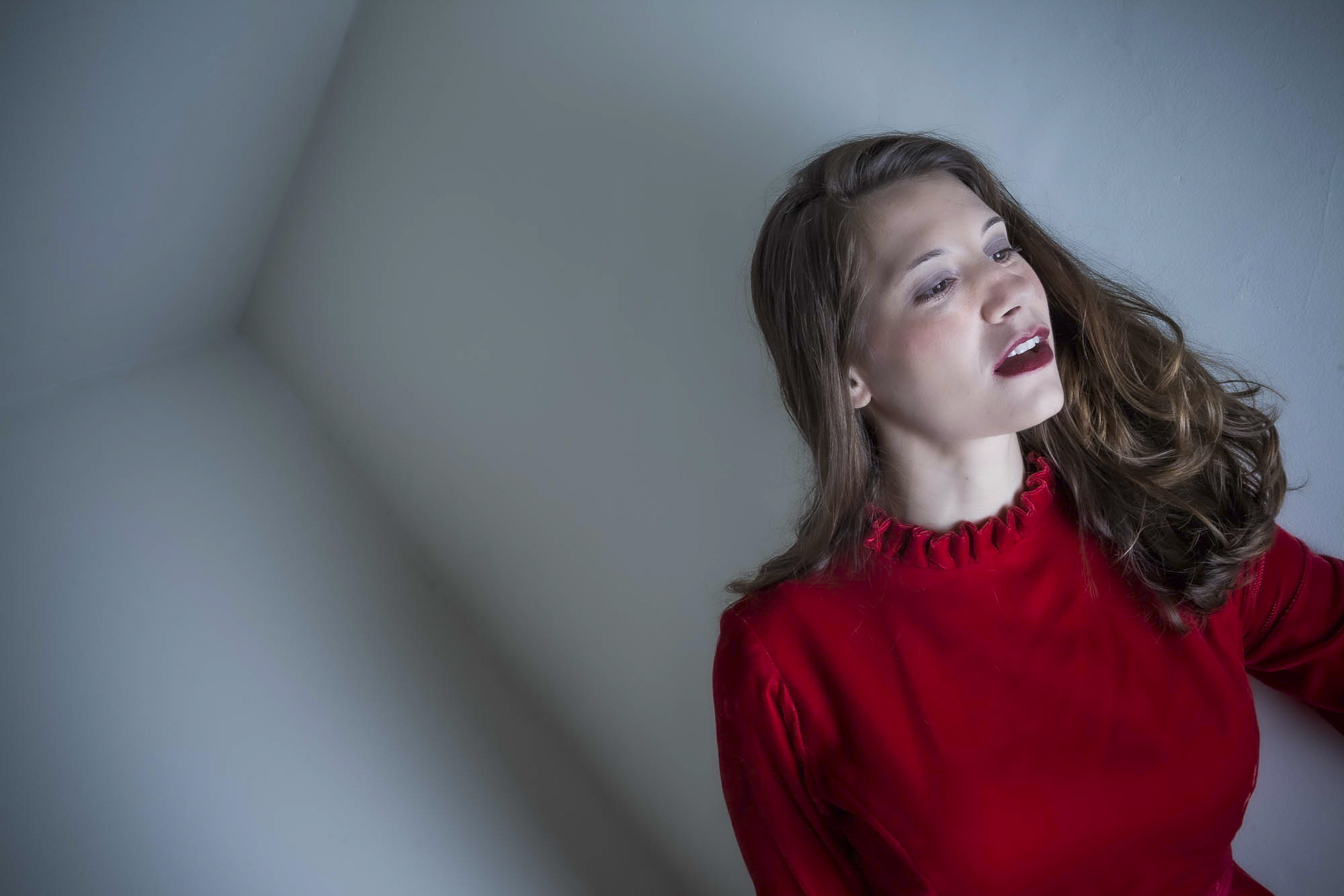
 (Click on photos to enlarge) For a photoshoot, I'm usually fine with what the model selects for clothing as long as no patterns, lines, or logos are present (unless they're something easily removable in Photoshop). Patterns and lines may draw the viewer's attention away from the model, while logos are usually copyrighted, possibly causing issues if the images are sold commercially. However, there are some clothes that especially interest me. I love almost anything that’s vintage or a vintage reproduction. I’m also partial to lacy and seriously feminine garments. Offbeat costumes are great too. I’m crazy about big gowns that seem to envelop the wearer. Perhaps most importantly, if the model's excited about a specific outfit, I'm usually happy with her wearing it for at least one setup.  Astrid's fancy costume contrasts nicely with her mother's simple shirt. Then there are white clothes and black clothes. I think white clothing can sometimes create an ethereal feeling, while something black can produce a mystical or sensual vibe, depending on the context. While I love their extreme tones, lighting them may be tricky. I don’t want to blow out the whites or block-up the blacks. However, since even fairly extreme tones can be easily modified in Photoshop, this is rarely an issue. A warning - black or very dark clothing can highlight unpleasant things such as hair, dust, or other crud. It’s not always apparent to the naked eye, but can be painfully obvious when opening the image in Photoshop. When a model is wearing something dark, I keep a clothes brush nearby, trying to remember that it needs to be used regularly. No matter what she's wearing, however, I request that her tops and dresses have long sleeves. This is for three reasons: Long sleeves don’t suggest any specific season which, if it did, could limit how the image might be used; they add a slimming look to the arms; they cover things I don’t want visible such as scars, cuts, and tattoos. In addition, I’ll request that nothing elastic be worn, especially on the sleeves, since cinch marks may appear where the elastic contacts the skin. FREE T-SHIRT ...when you sign up for a One-To-One Workshop!! This is a Fruit-Of-The-Loom, 98% cotton shirt. It has my absolutely gorgeous logo (see top of page) printed on the front. Available sizes are men's medium, large, and extra-large. These shirts may also be purchased.  I wanted to show a woman having just arrived home after an exhausting day at work. I liked the idea of her being too tired to even remove her coat. I don’t want the model feeling physically confined by her clothes. This can happen with tight garments that restrict movements or short clothing, such as skimpy tops and skirts, that may inadvertently show her underwear or body parts she’d rather keep private. If this is a constant concern for her, it will negatively affect her posing. For getting the great shots, it's critical she wear clothing that will allow for free movement and keep the body parts she wants covered, covered. 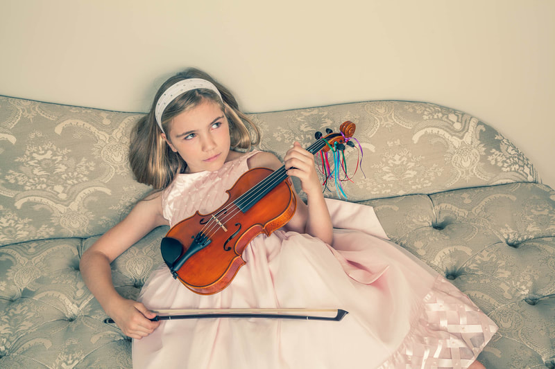 I had just told Emmy that she looked like a giant pink cupcake. The effect of certain undergarments can have a huge effect on an image. For example: Bras - Visible bra straps, for certain photos, may work well. They can add an interesting design element to the image if they complement the rest of the outfit. An example would be an exposed bra strap with clothing that’s generally disheveled. However, there are situations where a visible bra strap may look sloppy and ruin the look of an outfit - for example, when one sneaks out from under a strap on a formal dress. If there’s a chance one or both might become visible in an untidy way, a strapless bra is a must. Pantyhose - Hose is wonderful for covering cuts and bruises, and to smooth out the legs. Having the model wear a pair often saves me significant Photoshop time. On the other hand, certain types produce a distracting sheen, making the legs look unnaturally shiny. In addition, I've found that many models hate the feel of pantyhose. So, I let them decide whether or not they'll wear a pair. Sliming Underwear - I'd never suggest to a model that she wear this type of underwear, but having some on under her clothes does create a nice slimming effect on the body. If I photograph at the model’s house or apartment, I’ll usually select clothing by going through her closet and bureau (with her permission, of course), pulling outfits and setting them aside. Other than previously mentioned, I’m not looking for anything specific, just whatever catches my eye. Determining which clothes will work depends on where the shot will take place, the props, the lighting, the concept, and, most importantly, whether or not she wants to wear what I've selected.  Along with the patterned shower curtain, her dress adds some flavor to an otherwise boring location. With girls and teens, I want their clothing to be age appropriate, according to my standards. I want nothing that may be suggestive. At times, I’m the one who must tone down what they want to wear. On the other hand, according to more than one mother, what I may find inappropriate actually is what “all the girls her age are wearing these days”. Accessories can be important for almost any outfit. Her look can be improved significantly with the right adornment. I’ll often ask to see the model’s hats, shawls, veils, scarves, and anything else she thinks might work well with what she's wearing. In addition, I’ll bring a variety of props that can be used as accessories. I rarely mention anything about shoes to the model. Unless I want to feature them in a picture, they’re not really important to me. If she asks, and especially if there’s a pair she’d like to wear, I’m happy to show them off in a few shots. 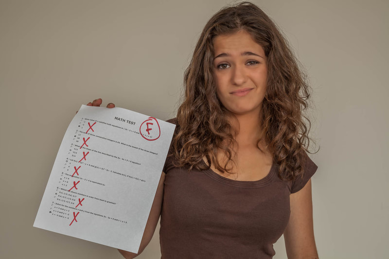 I wanted Jannie to wear something earth tonish - to pretty much match her skin - to set her apart from the failed math test she's holding. The three pictures below show Kira wearing a few of the wonderful outfits she and her mother brought to our photo shoot, which was at a rented studio. I always ask the model to bring a variety of clothing and accessories if we’re shooting away from her house or apartment. They don't always do that, however. But Kira and her mother brought several beautiful and distinctive items to wear, allowing for a variety of shooting possibilities.   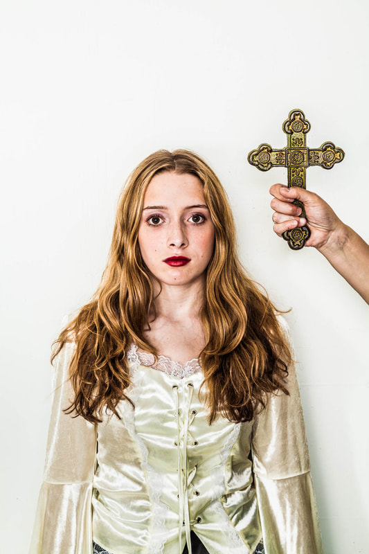 Ariana, below, always brings great clothes and accessories to our photo shoots. In this shot, I love the contrast between her very feminine dress and stockings and her boyfriend's tough-guy leather jacket. Also, I think the addition of the little girl’s doll being held haphazardly adds an interesting element to the setup. 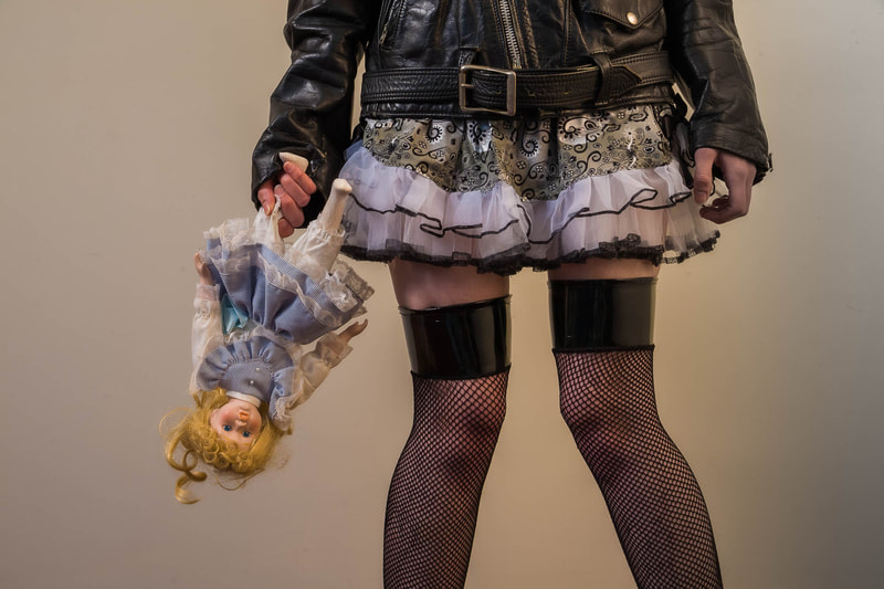 And now for hoodies. Boy, do I love hoodies! I carry a few shirts-with-hoodies in my prop bag. It’s perfect for quickly changing the entire look of the model. This is especially true if it fits loosely, since it can cover and therefore hide whatever she’s wearing without having to first remove the clothing. To me, and maybe to the model, wearing a hoodie can provoke an air of mystery and disquiet, feelings I often want displayed in her poses. It’s interesting seeing what the model does with the hoodie once it's on her body. For that reason, I’ll wait before making any posing suggestions. I'll watch carefully as she puts it on and adjusts it - ready to bark out a request to hold her position so I can take a picture. Finally, it’s fascinating how the model quickly realizes the prop potential of the hoodie’s drawstring. Many times she'll grab each end and begin playing with them, using both as posing aids that will often add more interest to the shot. Having the drawstring gives her more confidence, I believe, since she now has something to do with her hands.         (Click on photos to enlarge) (Each pair of images shows "before editing" and "after editing") As a professional photographer, I’ve created hundreds of portraits for commercial, corporate, editorial, and magazine clients. However, it’s the magazines – mostly the business ones – that often are most open to unusual and offbeat images… the type I like to shoot. A typical assignment from them is to create an “environmental portrait” of the person being featured in a particular magazine article. My definition of an environmental portrait is a picture where the background and foreground are just as important (or maybe even more important) than the subject. Whatever is needed to create an arresting portrait is fair game. Making the subject look attractive is not the photographer’s main intent. Instead, the goal is to create a truly inventive and compelling photograph where the subject, though certainly important, is just one element of the final product. The magazine requests this sort of portrait because it wants something to make readers pause and actually read the article the picture accompanies. The job of the photographer, therefore, is to take often ordinary faces and locations and transform them into something wonderful.   For many years, I shot these portraits using a medium-format film camera (it produces 2¼” x 2¼” images, a size considerably larger than the standard 35mm film format). I primarily shot transparency film, which is made from the same material used for 35mm slides, but larger and without plastic or cardboard frames to encase it. The photo shoots usually took place where the subject worked. My assistant and I would arrive with bags of strobes, light stands, and supporting equipment. After finding a shooting location, we’d often spend up to four hours composing the shot and precisely lighting the location and the area where the subject was going to be placed, taking test Polaroids along the way to check our progress. When finished, we’d call in our subject and spend thirty to sixty minutes taking pictures. When done, we’d bag up our equipment, drop the exposed film at a photo lab to be processed, and head home. Since we were using transparency film, that was the end of our work. Retouching to enhance or improve the images required the services of a professional photo retoucher and, due to their high fees, was rarely an option. FREE T-SHIRT ...when you sign up for a One-To-One Workshop!! This is a Fruit-Of-The-Loom, 98% cotton shirt. It has my absolutely gorgeous logo (see top of page) printed on the front. Available sizes are men's medium, large, and extra-large. These shirts may also be purchased.   During the photo shoot, we’d use from one to six strobes (flash units). Providing enough illumination for a proper exposure was certainly one of our goals. But just as important was creating lighting that was dynamic and interesting. For almost any portrait, I think it’s the lighting that ultimately determines how successful it is. The lighting process was the primary reason for the lengthy setup time. We’d experiment with various strobe placements, strobe heights, and strobe intensities. In addition, we’d try out all manner of light modifiers on the strobes. It was an arduous task, but one that allowed me to begin the photo shoot with a well thought out lighting design. There was another issue as well. The lights usually were aimed at very specific areas of the subject, foreground, and background. The subject moving around even slightly could throw off the entire lighting scheme. This meant that he/she was pretty much locked into that one position. Changing it required repositioning the lights at least somewhat.   My shooting methods changed considerably after moving from film to digital, and especially when editing programs such as Photoshop became available. The lighting that took so long to set up using up to six strobes can now be done much faster in postproduction – and with almost unlimited possibilities! Further, since it’s postproduction, I can spend all the time I want experimenting with various lighting arrangements without inconveniencing the subject. So now, for an indoor portrait shoot, I’ll quickly set up two or three strobes and simply bounce their beams off bright colored walls and ceilings. When shooting outdoors, I'll use the ambient light while sometimes adding additional illumination with a portable strobe or handheld reflector. Whether shooting indoors or outdoors, I usually end up with soft and even lighting on the subject. It’s often flat and uninteresting, but allows for a greater area of coverage. This means the subject has a larger area to move around in while still remaining well lit. It’s then in postproduction that the images can be edited and relit to my heart’s content. The added benefit is that specific shot setups and modifications during the photo shoot are much faster now. We can do many more setups in the same amount of time it took to do a single setup using my half-dozen strobes.   This new shooting method also led me to stock photography. A stock photographer shoots a variety of images and then sends them to their stock photo agencies for display on their web sites. When magazines, businesses, ad agencies, textbook companies, etc. need photos, they often will purchase existing images from one of these stock photo agencies, thereby saving the expense of having to hire a photographer to shoot new images. When the stock photo agency sells a picture, the payment for that sale is shared between the photographer and the stock photo agency. Most of my portrait work these days is done for my stock photo agencies. I love doing this because no photo editor is telling me what to shoot, how to shoot it, and how to edit the results. Every part of the photography process is now almost completely under my control (“almost” meaning that my stock photo agencies have some minor shooting parameters I must follow).   I’m also having fun working with an assortment of models – the subjects for my portraits. Most are not professionals, but rather friends, students, and others who answer modeling ads I post online. With my updated way of working, I can set up and shoot quickly. Over the three or four hours we’ll spend together on a photo shoot, I’ll often finish with up to fifty different shot set-ups and a few hundred pictures. Of course, it’s then hours and hours I'll be spending in post-production!! Under PORTFOLIOS on my website are three portfolios showing some of my stock portrait images. They are entitled: COLOR ADDED, PAIRS OF FOLK, and ON THE BED. These titles, hopefully, are self-explanatory. The photos above also are stock images. 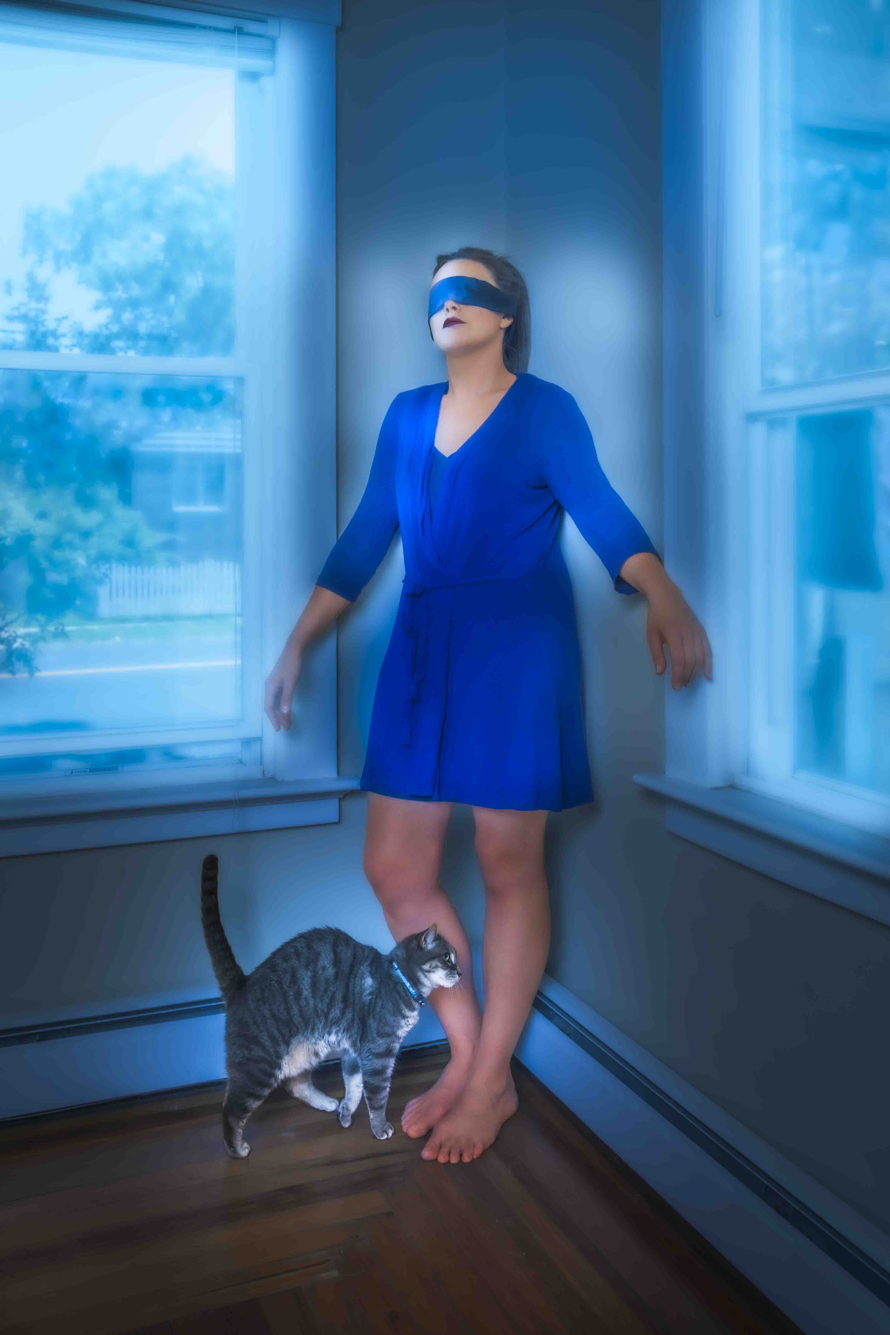 (Click on photos to enlarge) Finding a wall that a model can use for posing is rarely a problem. Indoors or out, there’s usually one nearby. I’ll sometimes ask that she lean her back or side against it. Doing so can be quite liberating for actors or models. Because it’s a physical support, the wall can offer more freedom for someone trying to work out a pose. She’s able to avoid the awkwardness that people often feel when standing by themselves, unsupported. What I find useful too, on occasion, is having the model lean head or chest first against a wall. The results are akin to the above, but since it’s her head or chest that’s now touching the wall, the dynamic is different. It’s probably not something she does regularly, so this novel position can make the experience more interesting and liberating for her, leading to some engaging images. 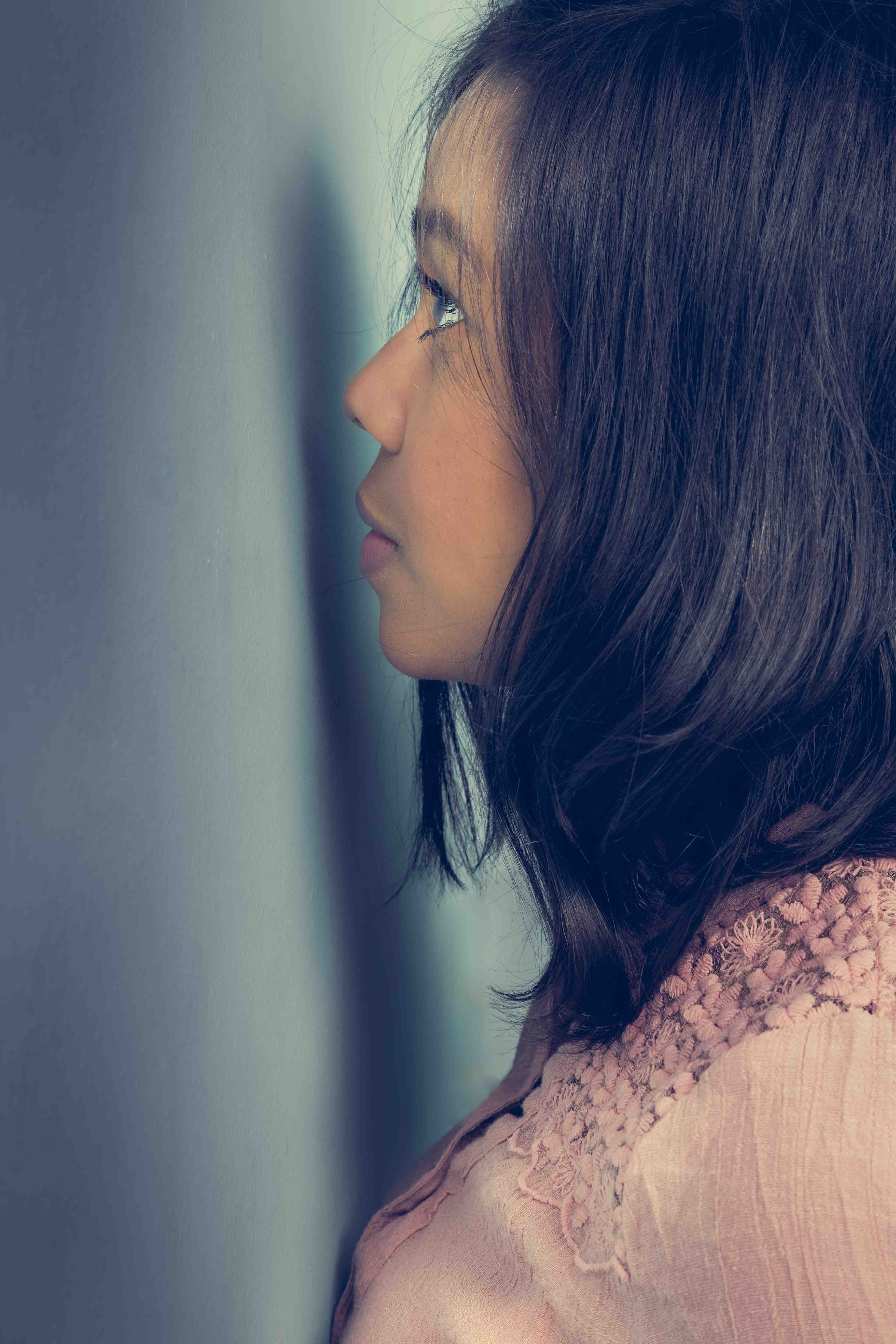 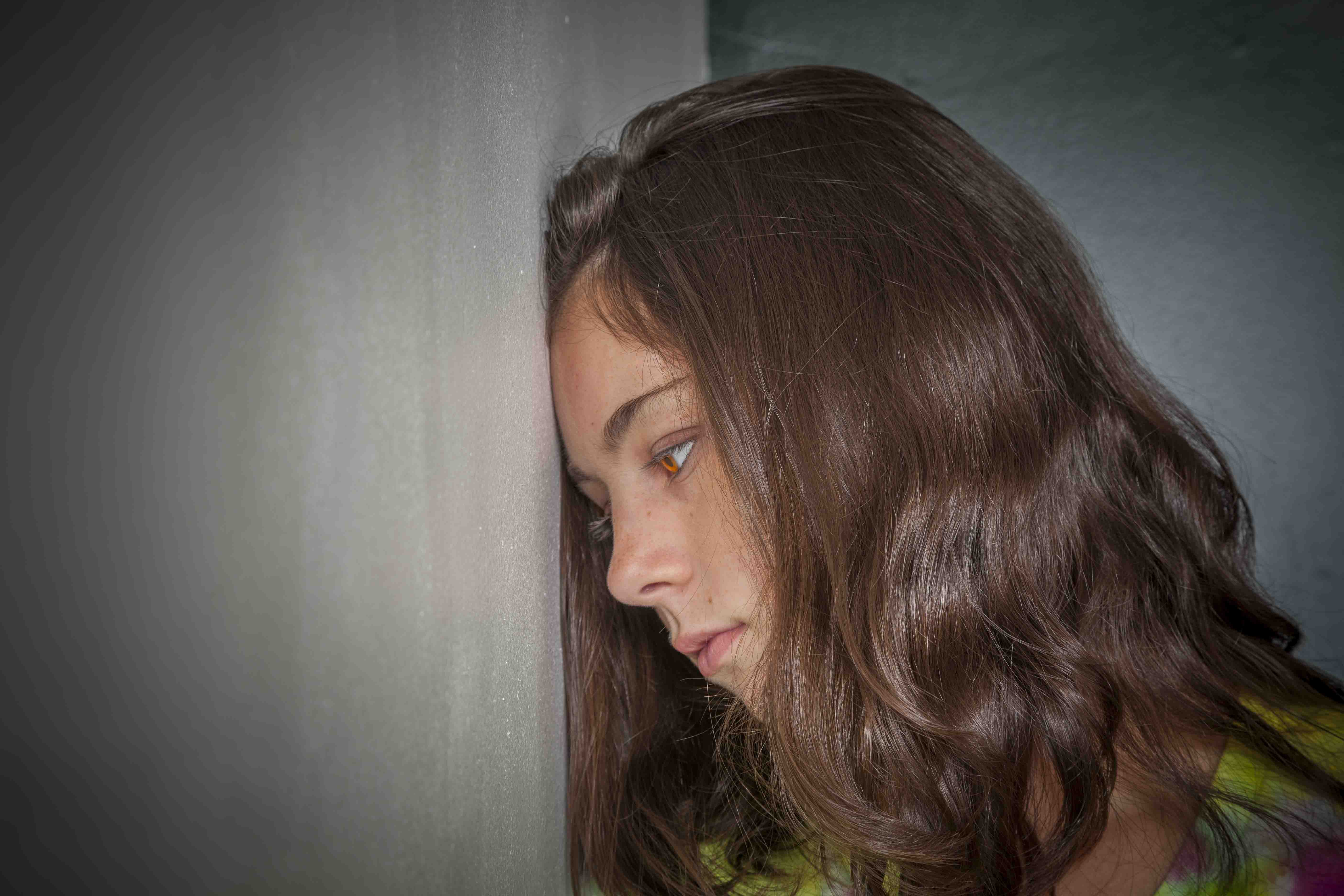 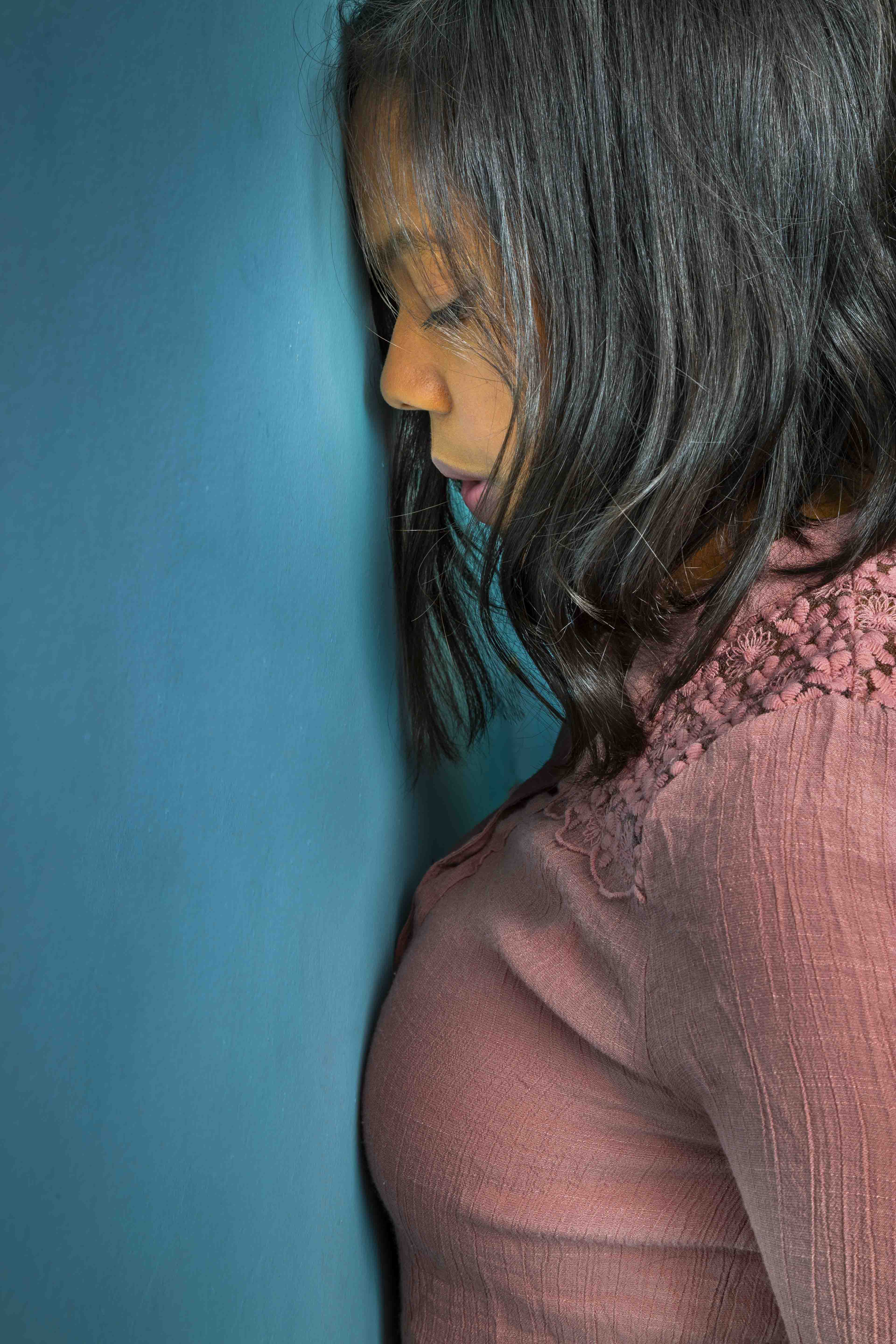 The three photos above show two models with their heads either against or very close to a wall. The first image shows Jaida staring at the wall intently, as if in deep thought. The following two pictures show Ginny and Jaida with their heads solidly touching the wall. To me, it almost seems the wall's blocking them from moving forward, both physically and mentally, making them appear rather depressed. FREE T-SHIRT ...when you sign up for a One-To-One Workshop!! This is a Fruit-Of-The-Loom, 98% cotton shirt. It has my absolutely gorgeous logo (see top of page) printed on the front. Available sizes are men's medium, large, and extra-large. These shirts may also be purchased. 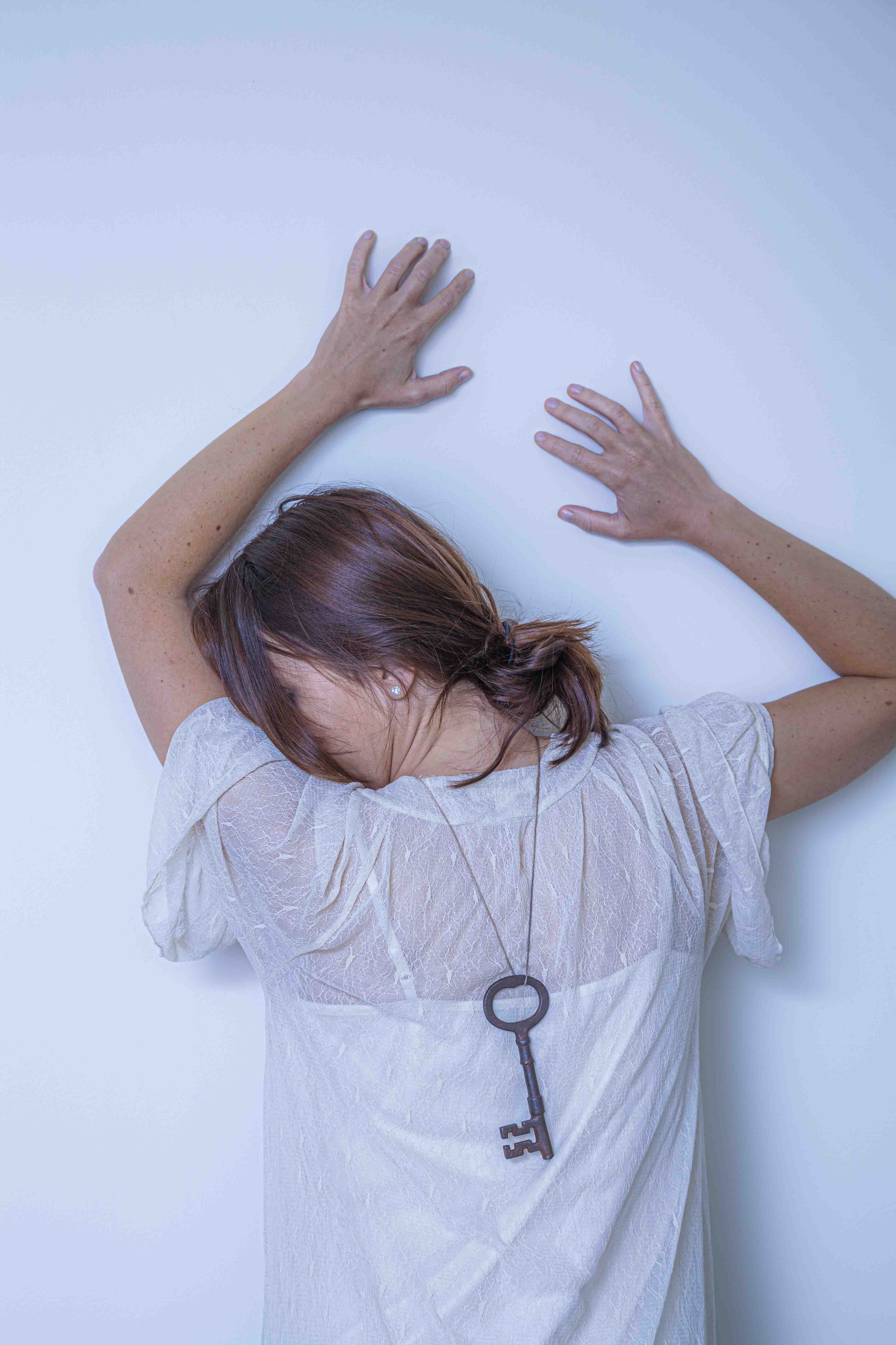 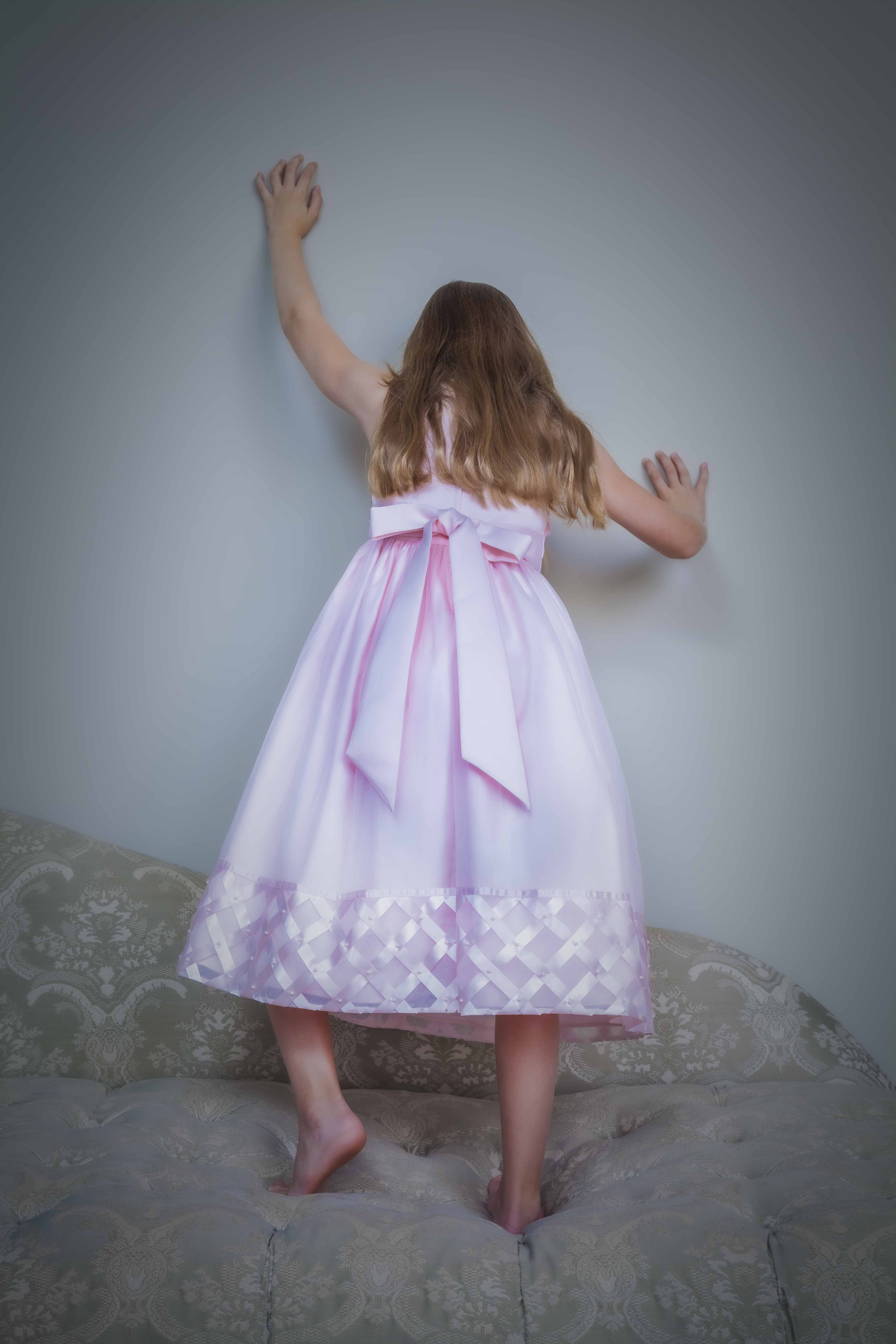 Another variation is having the model touch the wall with both hands, as in the two photos above. Again, this physical support allows for a wide variety of bodily contortions. The appeal of these specific poses for me are the odd angle of the young woman’s head (as well as the hair-covered face) in the top picture and the apparent climbing effort of the girl in the bottom picture. 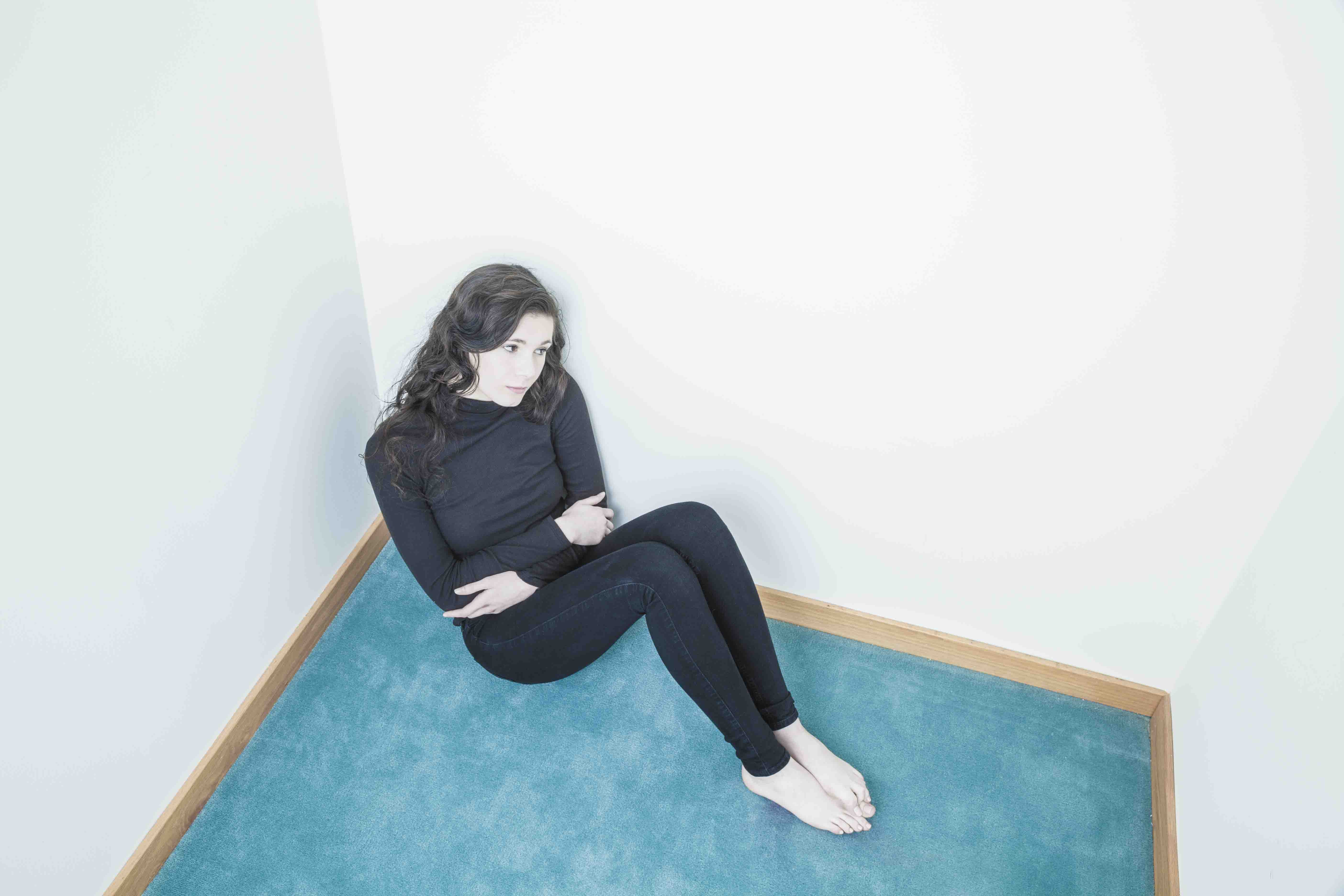  In the above two pictures, it appears the teenage girl is trying to retreat into the wall from a couple of uncomfortable situations. It's as if she hopes it will magically open and whisk her someplace far away.
 (Click on photos to enlarge) Taking pictures outdoors may be a delight or a nightmare! Assuming I’ve found a suitable location, the success of the shoot depends on lighting, wind, rain, and temperature. Bad lighting, too much wind, continuous rain, and high or low temperatures can all be disastrous. Let me begin with a discussion of lighting (wind, rain, and temperature will be addressed later). LIGHTING - A too dark day frequently translates into slow shutter speeds (even with the camera lens set to its widest aperture) - sometimes too slow to capture even a motionless model. A higher ISO setting could be used, but for most of my clients, the added picture noise and image degradation are not acceptable. I carry a medium size circular reflector with me on outdoor shoots. It’s matte white on one side (producing soft, diffuse illumination) and shiny silver on the other (producing hard, defined illumination). It pops open for use and easily folds for storage. The great thing about it is its hand grip. I can grasp it and position the reflector with my left hand while holding and firing the camera with my right hand. A note of warning when using it, however. If the shiny silver side is to be pointed at the model, give her a heads-up first. The silver intensifies the reflected light (especially sunlight) to the point that the model may find it blinding and painful. If I want to use the shiny silver side for a shot, I’ll briefly aim it at her as a test, asking if she finds it too intense. If she does, I’ll suggest she close both eyes as I set it up for the shot. Then, after telling her to open them on the count of three, I’ll wait a moment and take the picture. I wait that extra time so I’m not talking when pressing the shutter button, which may cause the camera to shake, resulting in a blurry image. If the brightness from the reflector is too much for her, I’ll do one of the following: have her look slightly away from the reflector, have her put on sunglasses, or use the reflector’s less extreme matte side.  Jenna is being backlit by a strong sun (some sun rays hit the lens, causing the effect visible on her hair). I’m using the portable circular reflector described above. 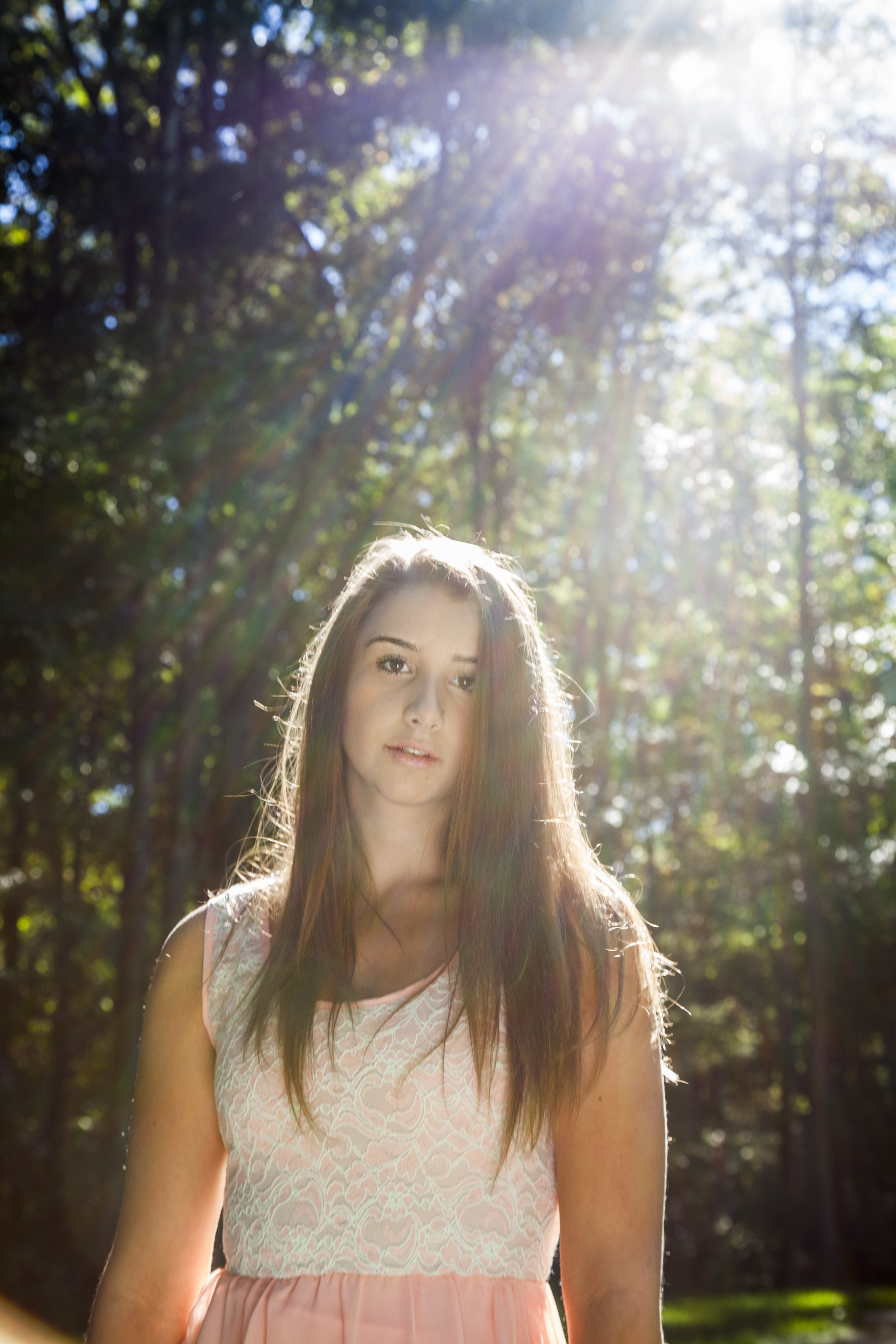 Here’s Jenna again. This setup was almost identical to the previous shot except for allowing rays of sunlight to enter the camera. Most of the time I’ll use a lens shade or a portion of my hand to block them. This time I wanted to see how the extraneous light would affect the shot. It’s interesting how some people view this type of effect as a sloppy mistake while others find it to be artistic. In this case, the more I look at the image, the more sloppy it appears to be! I also carry a small portable flash unit that can be hand-held or attached to the camera’s hot shoe. However, because it’s so small, it can create dark, defined, ugly shadows on the subject (which actually might be what you want, depending on your intent). So if a flash unit is needed, I’ll regularly attach a small softbox to it or bounce the flash’s output off a white reflector. That enlarges the size of the illumination, diffusing the light and producing lighter, less defined, and more pleasing shadows. FREE T-SHIRT ...when you sign up for a One-To-One Workshop!! This is a Fruit-Of-The-Loom, 98% cotton shirt. It has my absolutely gorgeous logo (see top of page) printed on the front. Available sizes are men's medium, large, and extra-large. These shirts may also be purchased. 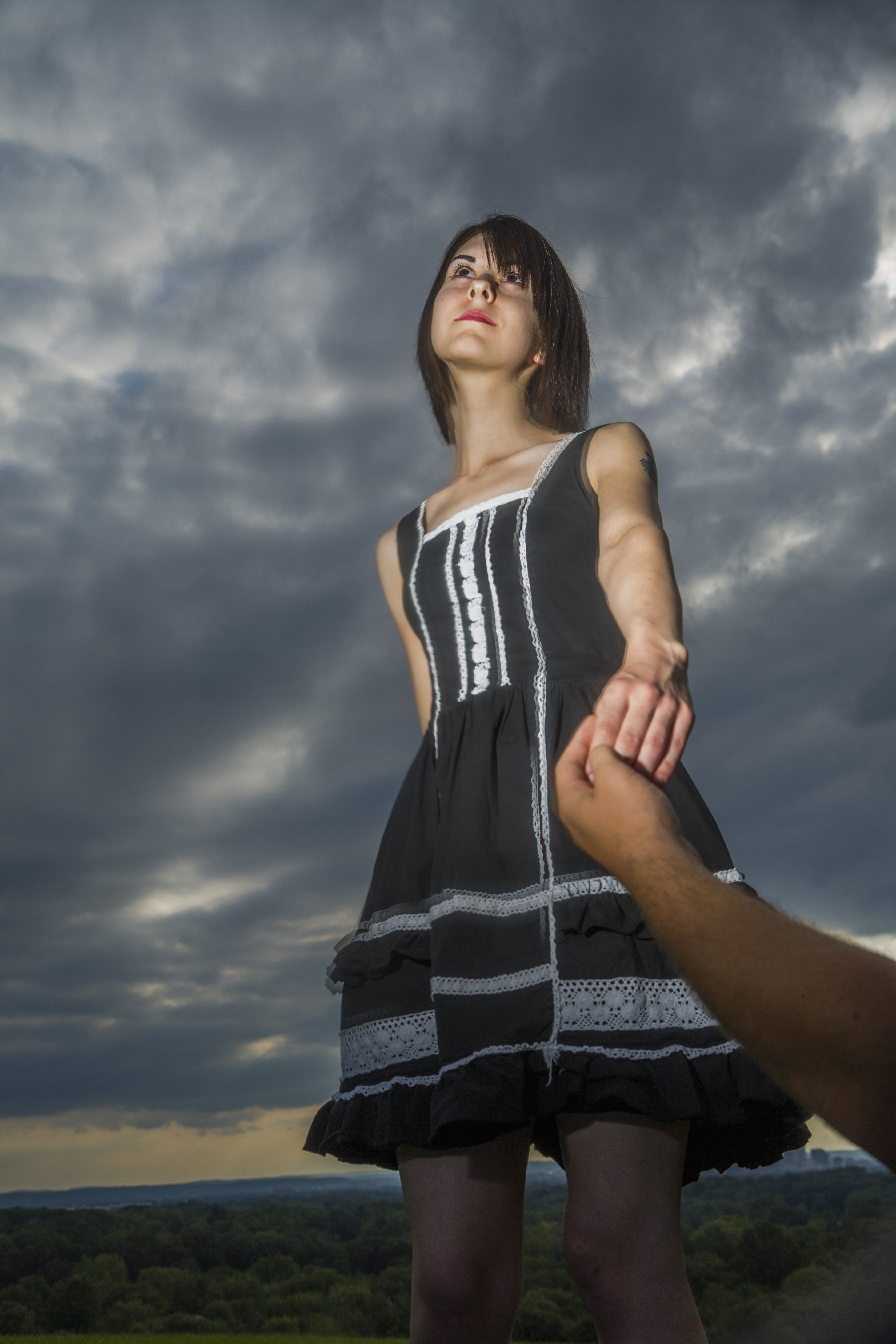 I shot this photo with a small portable flash being held in my left hand. There was nothing modifying its output. But even without bouncing the light off a reflector or using a softbox, the illumination isn’t bad, except for a too defined and too dark shadow appearing above her nose. On the other hand, the shadow’s not too noticeable. 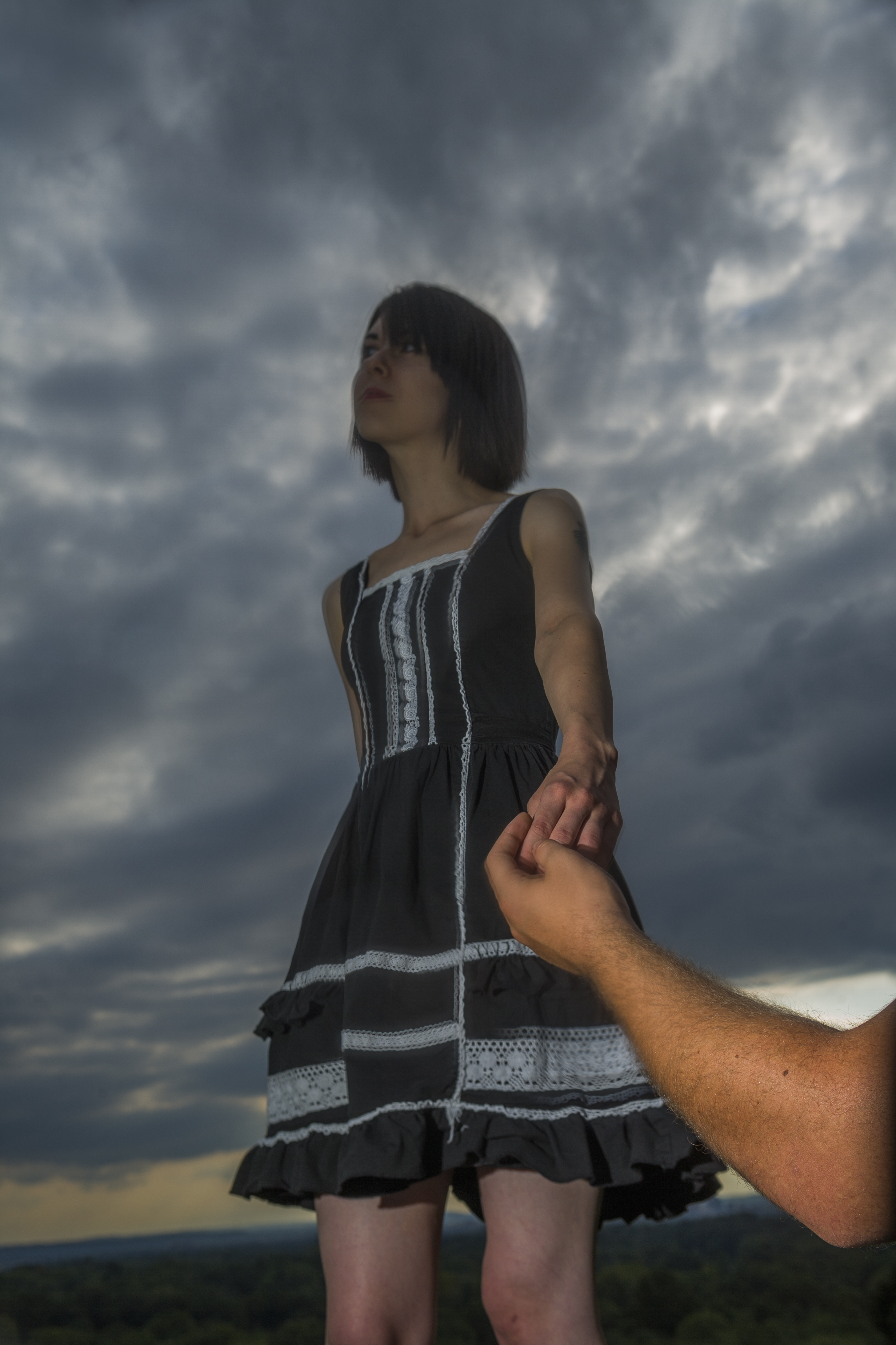 This is what happens when the flash is aimed incorrectly (unless that's the intended effect). If stronger lighting is needed, I’ll use a very simple portable setup I first assembled some years ago. It begins with a plastic trashcan - the kind with two back wheels, used by homeowners in many towns and cities. A normal light stand, with its legs extended, is placed inside of it. Attached to the stand is a studio monobloc, which is a combination strobe and power supply. A sandbag is placed on the stand’s horizontal section to increase stability. A softbox is secured to the front of the strobe. A portable battery pack for powering the strobe is positioned inside the trashcan as well. The whole unit can be set up quickly, is easily pulled or pushed (even on grass), and illuminates the subject as it would in a studio. Photographing outdoors under the sun often makes it difficult to avoid out-of-control highlights or reflections on the subject. These bright areas may appear on the forehead, nose, under the eyes, as well as in other areas. Exposing for them can render the rest of the photograph considerably darker - something that probably cannot be fixed in Photoshop. It’s important, therefore, that the shot be set up to minimize this problem. (The exception would be if the highlights are relatively small and not bothersome, or if they add interest to the picture). If unwanted highlights or reflections are going to be unavoidable, be sure they can be removed in post-production. These are the types of illumination usually found outdoors: - Direct sun with no clouds - Direct sun with light cloud coverage - Clouds with no sun visible - Shade Each type has its own advantages and disadvantages. But whichever sort of lighting it is, I will, if it won't negatively affect the picture too much, shoot without a strobe or reflector. As mentioned above, they’re both exceedingly useful tools. But dealing with them can confound the shooting process, especially when the lighting is constantly changing from one type to another. Using a strobe or reflector could involve lots of positioning, adjusting, repositioning, and readjusting of the model, strobe, and/or reflector. Using just the available light means I can spend more time setting up shots and taking pictures. I’ll do the best I can with the illumination present and, if needed, tweak the lighting later in Photoshop - hopefully solving the problems created by not using a strobe or reflector.  It was a bright sunny day. The harsh sunlight is behind and slightly to Esther’s side. Actually, with the way Esther’s head is turned, the sun is almost directly behind it. This makes for wonderful highlights on her hair, top of her forehead, shoulders, and arm. Her front side, on the other hand, is gently illuminated by the softer skylight. 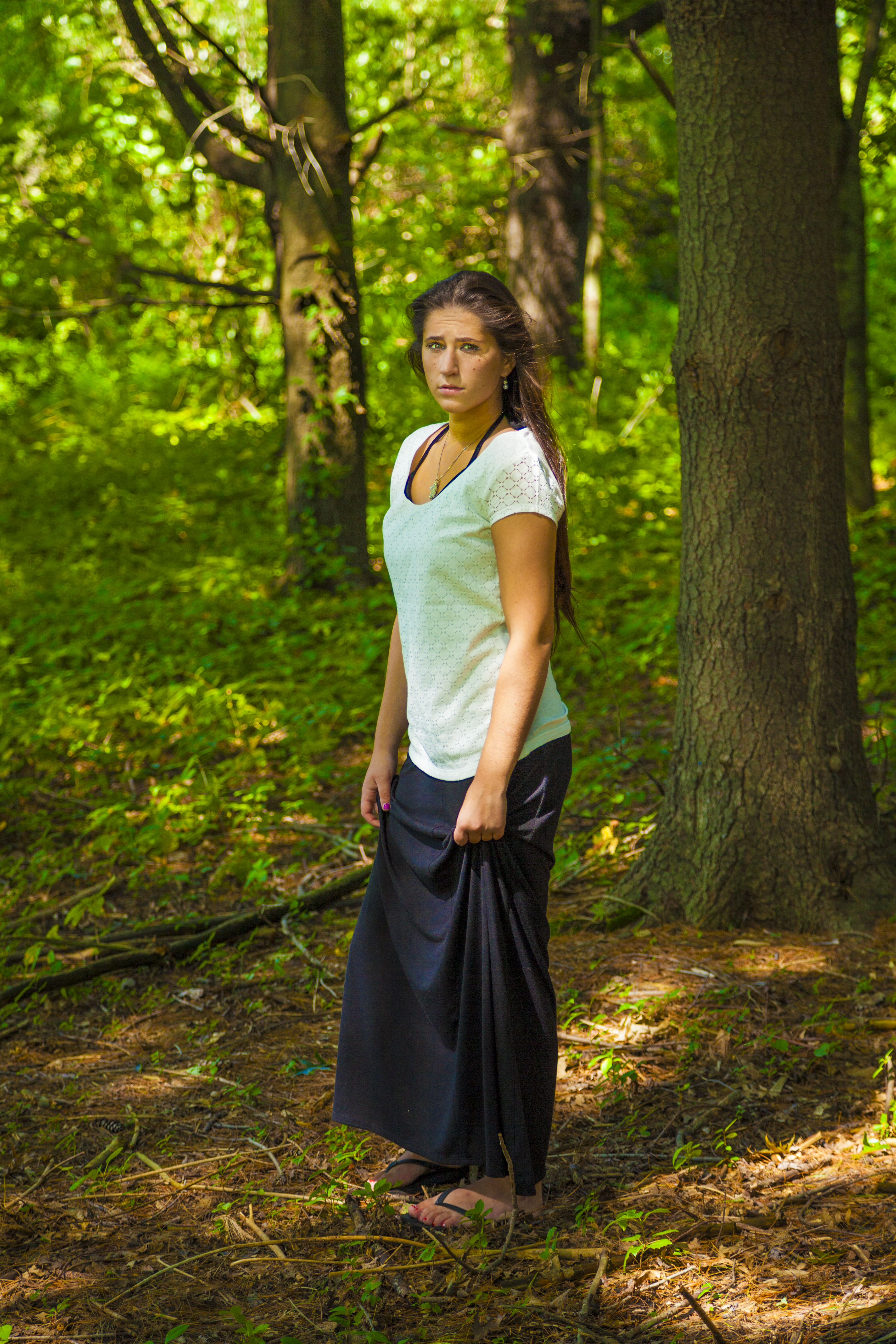 We were working under a bright, mid-afternoon sun. Being beneath trees and branches meant attractive patches of light were surrounding Amelia. Because of our careful posing and positioning, one of those light patches fell on her face... nicely illuminating it (I lightened her shadowed eyes in Photoshop). 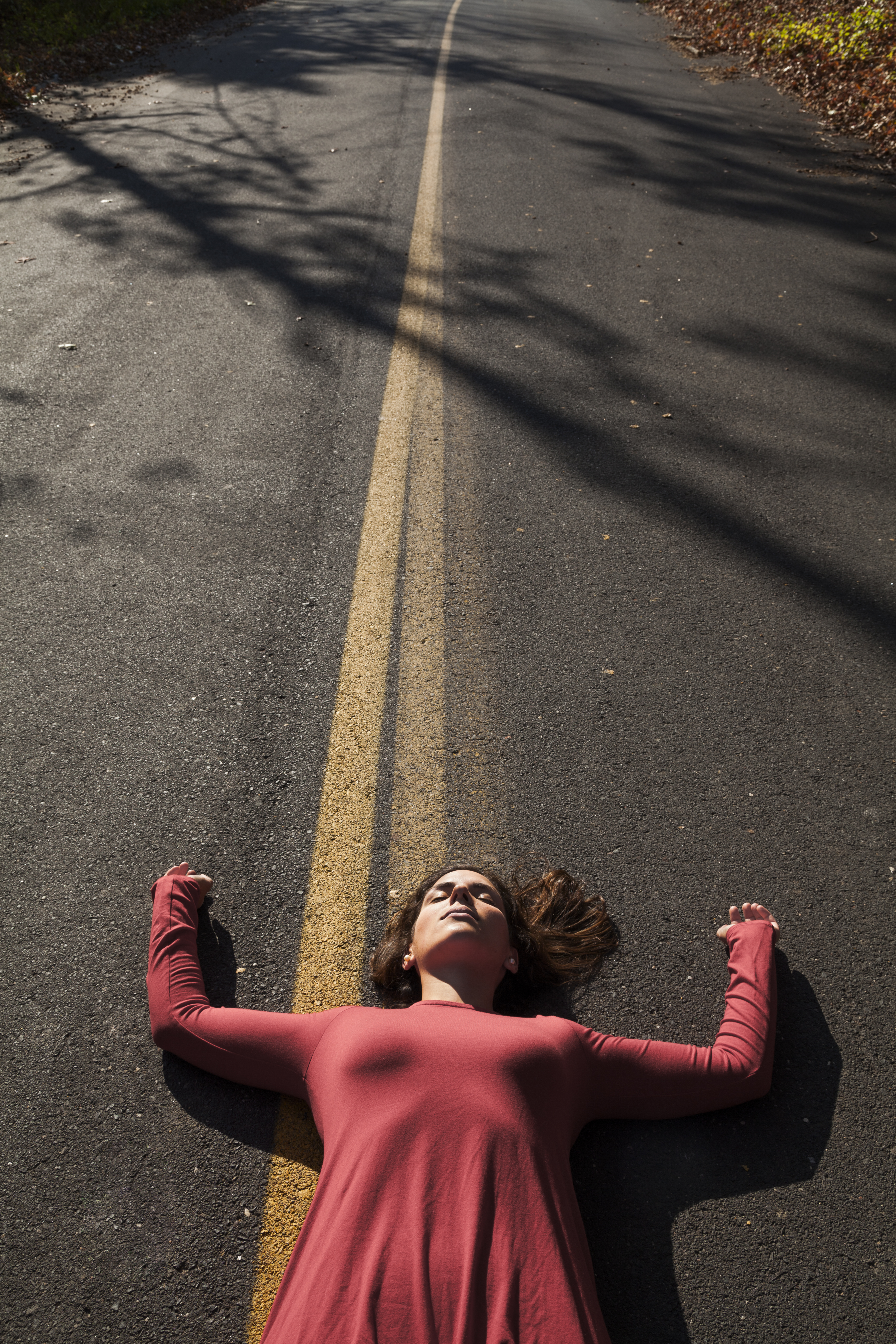 I photographed Makenzie under a cloudless late-afternoon sun that created a low angle, high contrast side light. I loved the trees’ long shadows, so I left room in the shot for them. The wrinkles on her dress were pleasantly highlighted too. Being on her back, her face was illuminated with no shadows hiding her eyes. I suggested that she keep them closed because of the light's intensity. I was amazed how relaxed she was (or appeared to be) despite lying in the middle of a street.  Kathleen was posed under an overcast sky. This resulted in even illumination throughout the image, including her face. The high reflectivity of her dress and its intense color really make it pop, despite the flat lighting.  A model standing under an overcast or partially overcast sky usually means she’ll be evenly illuminated, but her eyes may sometimes end up somewhat dark (which luckily didn’t happen in the previous photo). Lying on one's back solves that problem, while still allowing for some striking poses. 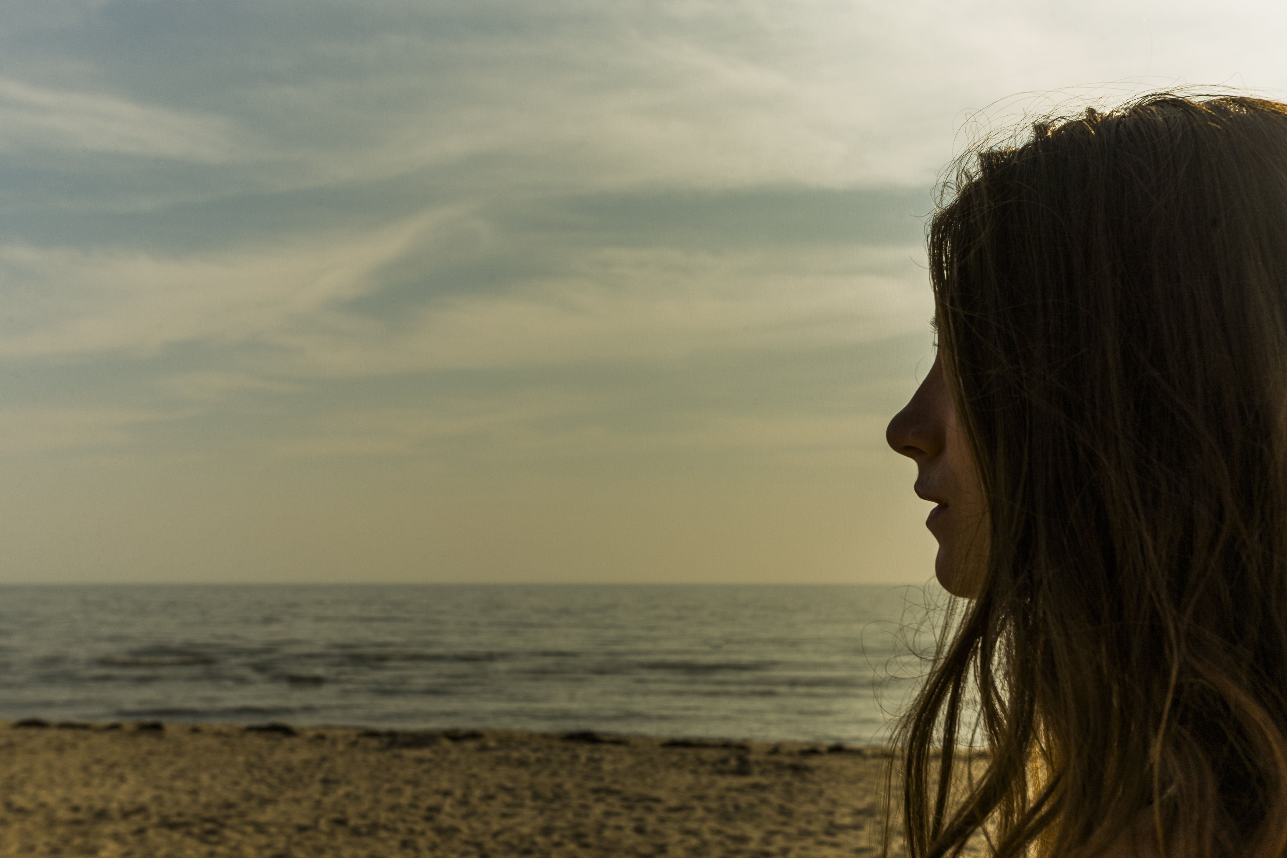 It was an overcast day at the beach. Joanna has a beautiful profile, and I liked the way her somewhat messy hair was hanging. I felt that underexposing the image would emphasize her profile while still allowing for a portion of her face to remain visible. I positioned her off to the side to add emphasis to the depressing gray sky and ocean.  I wanted both the subject's face and the background to be slightly overexposed. Without her dark hair separating the two, I think her face would have unappealingly blended into the background. WIND - A good stiff wind has possibilities. Indoors, a leaf blower or a fan can create fascinating changes to a model’s long hair. An outdoor wind can do the same and, in addition, rearrange the model’s clothes, blur the greenery, and pick up and swirl dirt in every direction. These can add interest to the image or seriously muck it up. It’s tough to know what the outcome will be until it happens. RAIN - A few minutes of rain can have creative theatrical possibilities. There’s a lengthy history of using rain to further dramatic moments in photography, movies, and on the stage. I think even a glimpse of rain draws some emotion from most viewers. But it’s important to keep the model dry, unless the shot calls for her to get wet. In that case, a towel and dry clothes should be nearby. A soggy model is an unhappy model! TEMPERATURE - What can be said about the temperature? If it’s too hot, everybody sweats, and it sucks. If it’s too cold, everybody shivers, and it sucks. When searching for outdoor locations, my goal is finding places with multiple shooting areas nearby. For example, there’s a large, well-maintained city park I’ve used several times. In the park, and a short drive from one another, are a steeply angled white bridge, a hill with a view of the city, a sparsely furnished open wall hut, a children’s playground, an expansive and beautifully kept lawn, areas with densely packed trees, and multiple walking paths. I also photograph at colleges, universities, and downtown areas in various cities.  This is what I consider to be a glorious sky and a wonderful background. However, there are times when the sky may not be so extraordinary. It can be overcast or the sun might be too much of a presence. Intense blue skies certainly aren’t bad. But there's something really special about a magnificent cloud pattern. One last thing…
I have a small suitcase-on-wheels that either the model or I will pull around with us during the photo shoot. It’s filled with her clothing, accessories, makeup, props, and a lighting reflector. The suitcase itself can be a great prop too.  (Click on photos to enlarge) When photographing a model, including a prop can make the shot far more interesting. I can think of two reasons why this is true:
When first arriving for a photoshoot, I'll show the model the prop bags, explaining that she's welcome to pull out anything she'd like to work with. In addition, I’ll mention that the props are all inexpensive (even if they're not) and not to worry if any break. Whatever she selects, I’ll try incorporating at least one or two of them into one or two of our setups. I want her to realize that her prop selection is as important as mine. It’s amusing how the props fascinate many of the young girls I photograph. Their faces often light up as they pull items from the bags. They’ll make a pile and gleefully show their parent and me their cache. I’m also interested in things the models own that could work effectively as props. In the past, I’ve used their laptop computers, cell phones, dolls, sporting equipment, musical instruments, scarves, hats, and artwork. I feel the models’ connection with them might help with their interaction-maybe allowing for more unique setups than if they used my props only. FREE T-SHIRT ...when you sign up for a One-To-One Workshop!! This is a Fruit-Of-The-Loom, 98% cotton shirt. It has my absolutely gorgeous logo (see top of page) printed on the front. Available sizes are men's medium, large, and extra-large. These shirts may also be purchased. When I hand a prop to the model, she may ask, “What do you want me to do with this?” I’ve found the less I say, the better. In fact, I'll often respond coyly with, “Uh, I don’t know”. I want her to realize that almost anything she does with it can produce interesting results. A hat, for example, can do more than simply sit on a head. It can be pressed tightly against the chest, gripped in a nervous fashion with both hands, placed to partially cover a face, or dropped slowly from the fingers. Sometimes, nothing exciting develops between the model and the prop. It’s then that I’ll step in and offer suggestions. We’ll play with it and see what happens. If nothing works, I’ll put it aside and pick up another one. I store my props in large plastic drawers. Before a shoot, I’ll search through them, pulling the ones I want. I select them based on who the model is, where we’ll be shooting, the shots we’ll be taking, and how excited I am about the particular prop (if it’s a new one, I’m usually very excited to work with it). Props I’ve used previously or those that have not worked out successfully in earlier shoots are left behind. I then gather them up in three or four cloth or heavy plastic shopping bags. I’m always on the lookout for new props, which I generally find at garage sales, second-hand stores, online, and around the house. It’s curious that when I’m not looking for a new prop, I’ll frequently find one. It then goes into one of those large plastic drawers mentioned previously. Occasionally, I’ll cull through my props, removing the ones I don’t want anymore. Here are a few of my favorites: glass crystal ball, playing cards, my grandfather’s old pocket watch, ribbons, pearl necklaces, reading glasses, goofy glasses, thick glasses, sunglasses, dolls, rubber duckies, nonworking pellet gun, handcuffs (with extra keys), religious crosses, books, masks, veils, clocks, small signs, and fairy lights. 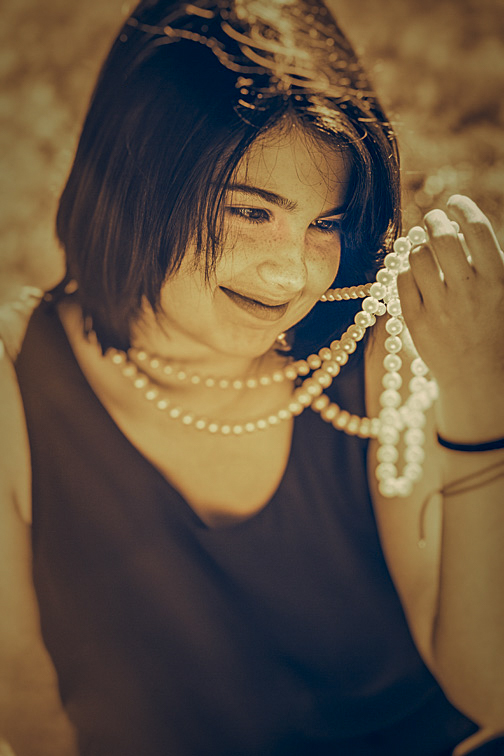 I always keep a few strings of white pearls with me. They are my emergency go-to props when having difficulty coming up with a shot idea, as was the case here. The portion of the necklace held by Leanna is being nicely illuminated by the sun. But more importantly, the necklace motivates her vibrant intense gaze and smile, which together create a wonderfully warm image. 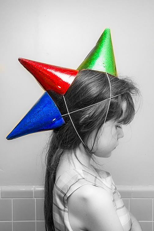 Laurette found these three party hats in my prop bag. I’d been setting up my strobes in the bathroom when she strolled in looking like this. I was amazed by her cleverness. I positioned her quickly and started shooting. I wanted to emphasize the hats, so I Photoshopped out the color from everywhere else in the image. Frequently, photo ideas from the models are much more clever than mine. 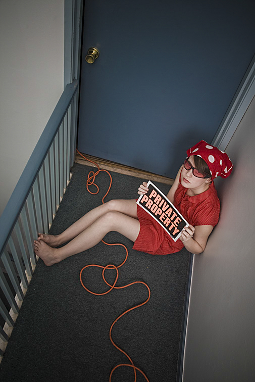 The extension cord was there to power my strobes. Being too lazy to reroute it, I rationalized its presence as a design element. After several viewings of the picture, I believe my laziness helped make this image work. 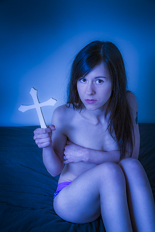 Crosses are fun props. They're available in countless sizes, shapes, and designs. I prefer larger ones but not so large that they can't be easily grasped by the model. In this shot, I had Ariana hold the cross so that most of it was in front of a plain portion of the wall, thereby making the object stand out. By the way, I love the blue against the blue (blue cross - blue wall). Using the same color for both only worked because there's enough variation in the tones to prevent them from blending together. I think the combination of a fearful expression, tightly held arms and legs, a near naked body, and a plain wall behind her result is a stark, somewhat threatening image.  These glasses are a favorite prop of mine. They're from a package of five colored glasses that I bought at a party store for $3. I think their bright color integrates well with the photo's other hues. 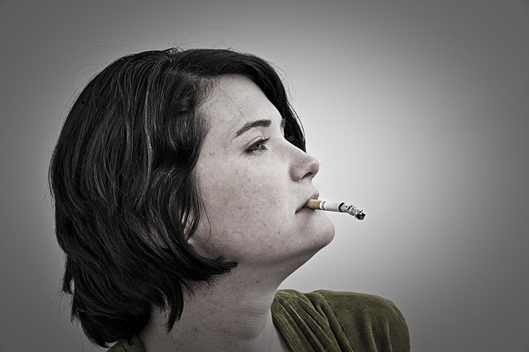 This could have been a very ordinary photograph. What makes it work, I think, is the cigarette’s ash. Rather than there being a small amount, its length is equal to that of the unsmoked portion of the cigarette. Further, the ash is listing downward, creating tension as to when and where it might fall. 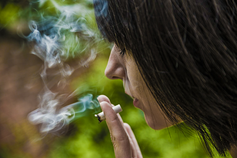 This cigarette photo differs from the previous one in that its emphasis is on the smoke. And there's lots visible. The out-of-focus background helps to emphasize both the smoke and the cigarette. 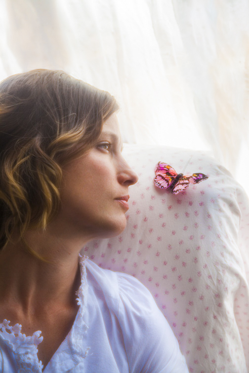 Strong illumination poured in through the living room window, located behind Klaryssa, creating a soft light throughout the image. In addition, the muted colors surrounding the butterfly help to make its pink tones stand out a bit. I'm hoping the viewer will look at the image and wonder what the connection is between her and the butterfly. 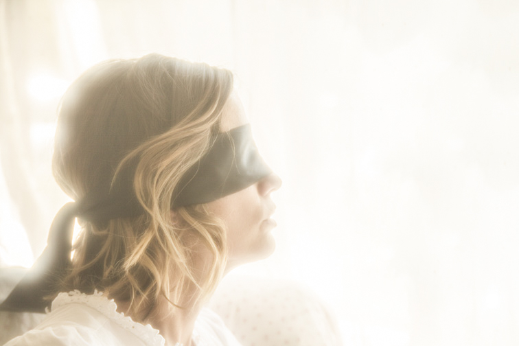 Here’s Klaryssa a few minutes later in practically the same location and position, but now wearing a blindfold. Besides adding mystery to the picture, hiding the eyes means one less thing to worry about in post-production. The photo was greatly overexposed, providing the following benefits: enough light to illuminate her face and hair, hiding the jumble of outdoor activities, acting as a clean background for her head and neck, and creating a soft, diffused image. I love it when a model uses a prop in a wholly unconventional manner. To help her come up with something unorthodox, I’ll often give her an object that has no specific use, explaining that there are no right or wrong ways to pose with it. Further, I'll emphasize that what may feel weird to her may actually result in a wonderful photograph. My goal is for her to feel relaxed posing with the prop, knowing she’s free to do with it as she pleases. One of those props that has no specific use is a wide red ribbon. I have several lengths I keep in my prop bag. It’s fun seeing the model’s joint amusement and befuddlement when I present it to her. I usually photograph whatever she comes up with, though I’ll sometimes suggest a few ideas of my own as well. Below are a few ribbon shots that I thought came out fairly well: 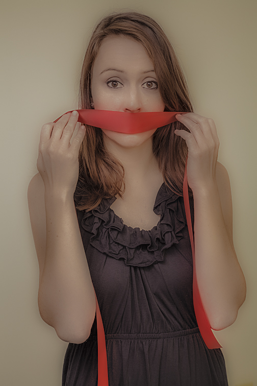  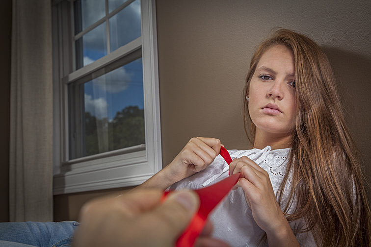 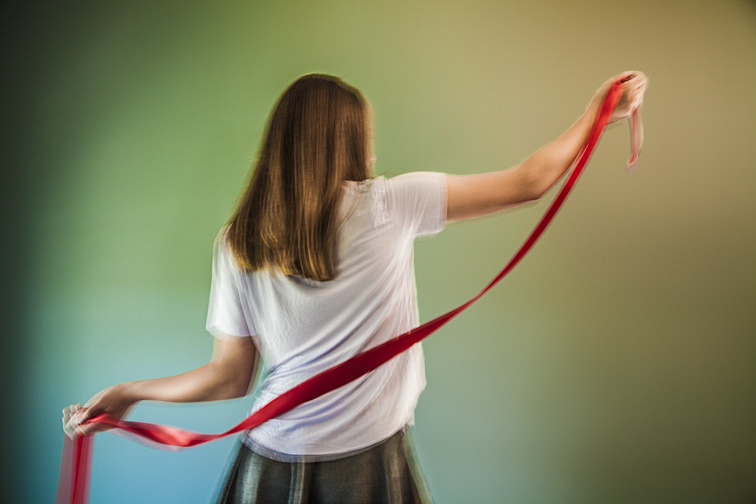 There are times when the prop itself is more the subject of the shot than the model. In these situations, her pose is there to support and enhance the object. It's important she not upstage it since it's the prop that is the focus of the shot. For a setup like this to work, there must be something compelling about that prop-either the prop itself or how it is presented. Here are a couple of examples: 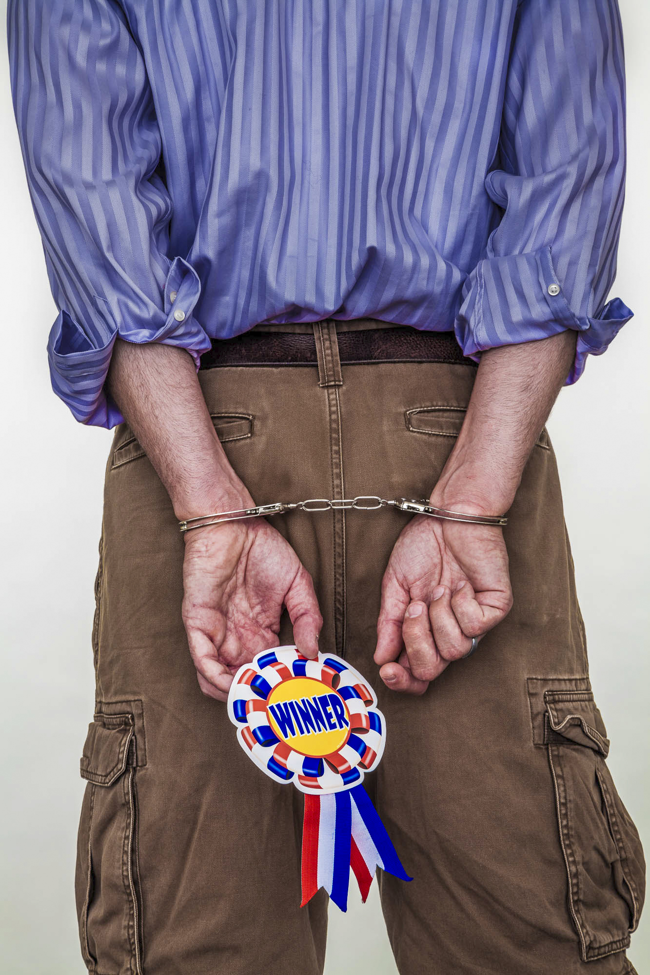 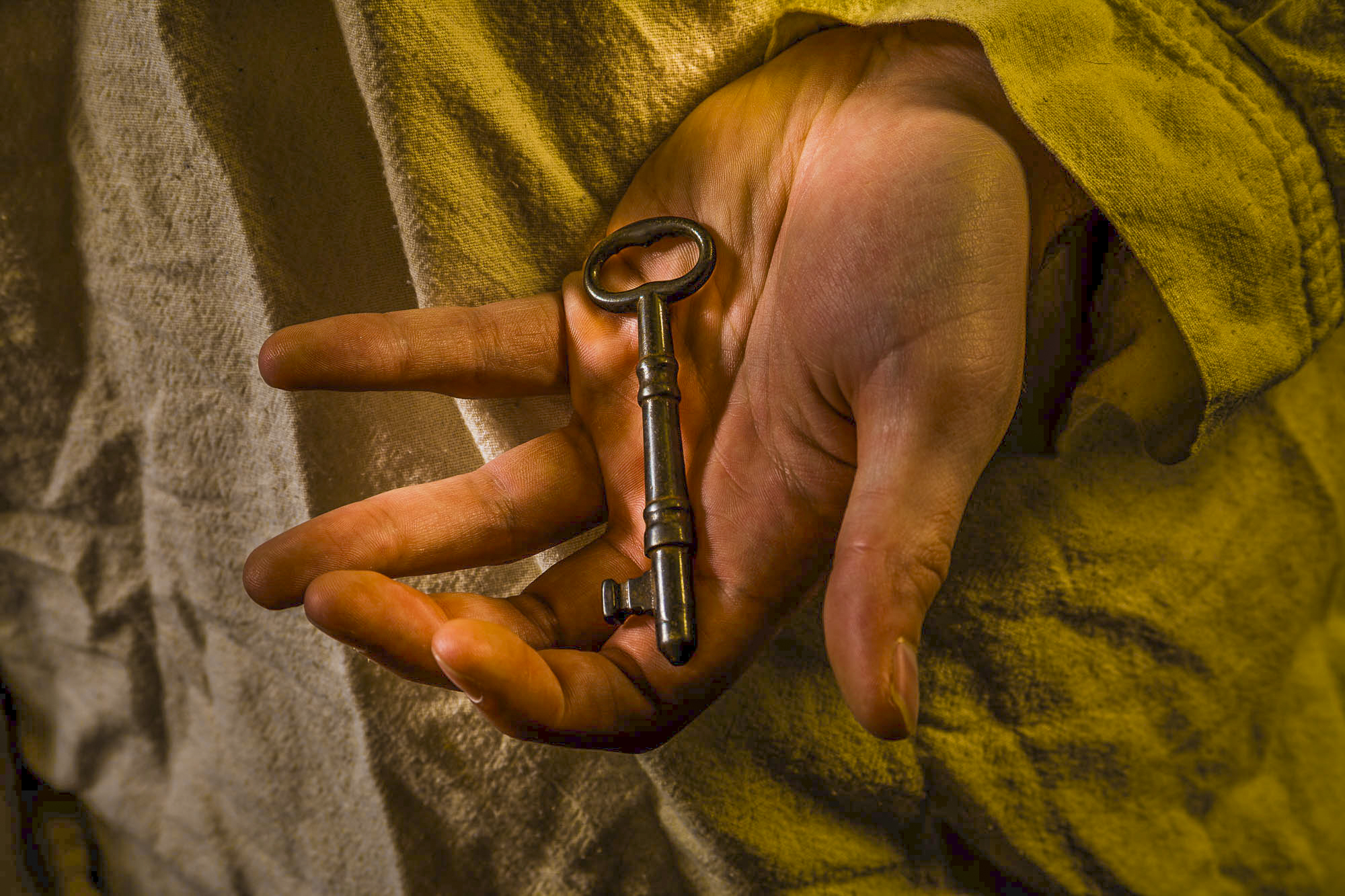  (Click on photos to enlarge) Choosing between photographing a subject on location or in a studio, I'll invariably go with location shooting. That's because there are rarely any issues finding setup possibilities. My two favorite locations are the subject's house or apartment. Both are normally filled with plenty of places for posing. Finding the next place to shoot is usually little more than walking into another room. But a studio can be appealing too (rather than having my own, I rent one for specific photo shoots). Even when relatively small, a studio can feel more spacious and less cluttered than a house or apartment. Studios also offer more areas to set up lights and for the model and me to maneuver. And, compared to photographing outdoors, there’s no worry about bad weather or inhospitable lighting. FREE T-SHIRT ...when you sign up for a One-To-One Workshop!! This is a Fruit-Of-The-Loom, 98% cotton shirt. It has my absolutely gorgeous logo (see top of page) printed on the front. Available sizes are men's medium, large, and extra-large. These shirts may also be purchased. In addition, there are fewer distractions. For example, pets or extraneous people won't be wandering about. Also, because of a studio’s sparseness, there are not as many unwanted objects lurking about that might inadvertently creep into a photo. But the sparseness can mean starkness as well. The studios I rent require that almost everything needed for creating and dressing the set be brought in. That includes furniture, props, backgrounds, and the like. Not much is available initially to suggest ideas for shot setups - the opposite of shooting on location. Therefore, I rely on the jumble of stuff I bring and the ideas of the subject and myself. Coming up with quality setups requires a lot more work. 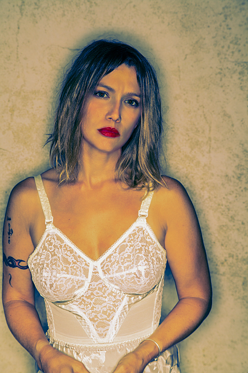 Whenever I rent a studio, I always bring a few backdrops. This is one of my favorites. It has random, subtle patterns in warm earth tones. By playing with the camera’s depth-of-field and the backdrop’s distance from the model, the backdrop can be kept in-focus, thrown out-of-focus, or left somewhere in between. In this shot, the model’s only illumination was from a ring light strobe. This is a circular light that attaches to the camera, completely encircling the lens. It creates a continuous shadow around the subject. 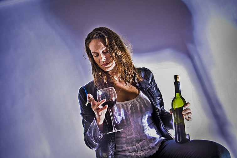 White background paper was unrolled and hung behind Linda. For lighting, I placed a single strobe, with a metal reflector, on the floor to the right of the camera. In front of the flash, I placed a simple metal stool. The strobe was aimed up through the stool’s legs, lighting Linda and creating the pattern seen on the paper. Because I was using only one light and wanted to illuminate the bottle, glass, cigarette, face, and body, and to make the smoke visible, everything had to be carefully positioned. The image had serious high-contrast problems from the single light, but these issues were reduced considerably with the help of Photoshop.  We were shooting in a studio that was formerly a mill. I asked Danielle to make a funny face. No backdrop or background paper was added behind her - it’s just a rough textured wall thrown out-of-focus. The image was softened in Photoshop. 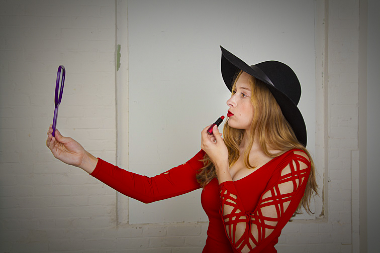 This was shot in the same old mill as the previous photo, but on a different floor with a different model. Here, again, nothing was added in the background. I love the contrast of elegantly dressed Kira against the rough brick wall. By the way, she probably wasn’t seeing her reflection in the hand mirror, since it was turned slightly towards the camera. If it hadn’t been, the mirror may not have been recognizable as a mirror. 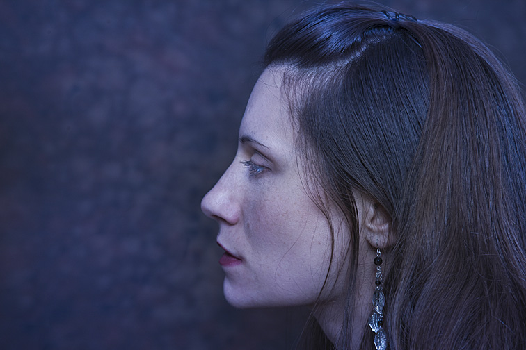 Behind Joanna is a mostly out-of-focus backdrop, though a little detail is still visible. This setup helped emphasize her face and hair. We’re able to see the hair’s subtle styling - some parts softly curve and others hang loosely. The single long earring adds a nice design element to the photo. 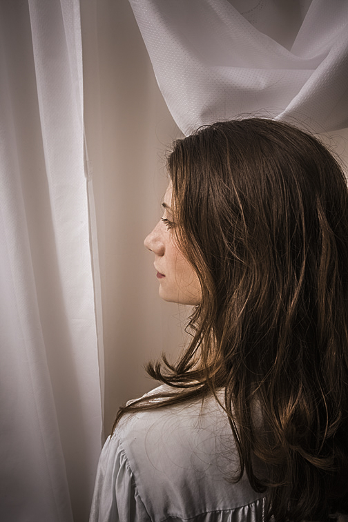 Here’s Joanna again. She’s now in front of an ordinary shower curtain. As in the previous picture, there’s something interesting about her hair. It’s less styled, but the part lying unarranged on her shoulder works well, I think, for drawing the viewer’s eye. I selected the shower curtain to prove that even a $3.00 piece of plastic can work well as a backdrop.
 (Click on photos to enlarge) After arriving at the model’s house or apartment and spending a few minutes chatting with her (and/or her parent if she’s a minor), I’ll request a quick tour. I'm usually asked what sort of areas I’m looking for. Further, I might be told she won't show me certain areas because they'd probably hold no interest for me. To both statements, I’ll respond that I’d prefer to see everything. That's because places she assumes I wouldn’t like might actually be perfect. If we come across rooms I like but that she’d rather not use for the photo shoot, I won't push to change her mind, though I may gently prod a little, hoping she'll reconsider. FREE T-SHIRT ...when you sign up for a One-To-One Workshop!! This is a Fruit-Of-The-Loom, 98% cotton shirt. It has my absolutely gorgeous logo (see top of page) printed on the front. Available sizes are men's medium, large, and extra-large. These shirts may also be purchased. During our tour, it can be disheartening finding rooms I particularly like but probably cannot use because of the following:
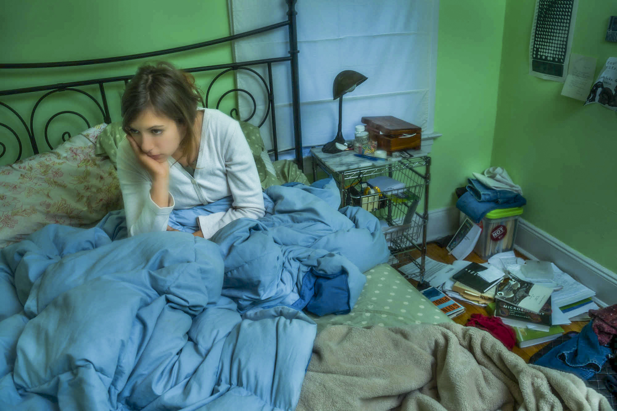
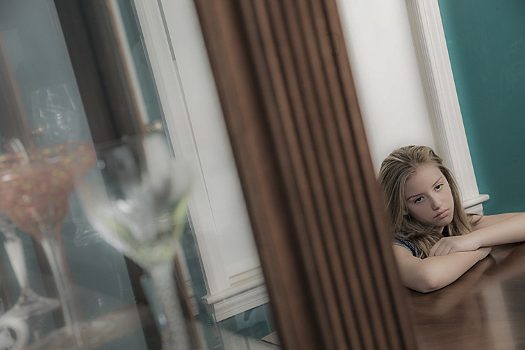 I was trying for both an odd angle and offbeat composition. The left side of the frame resulted from me shooting through a large display case filled with crystal and dishware. Marcie is leaning on the dining room table, creatively emoting. 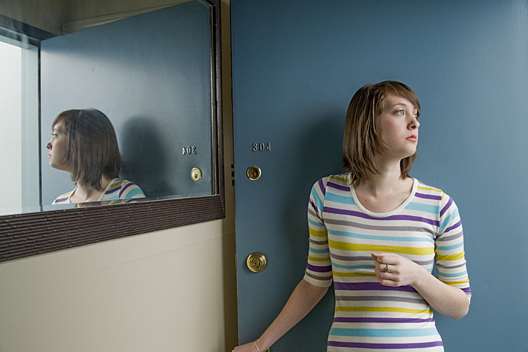 Randy is looking out her opened front door. It’s remarkable how the mirror affects this picture. First, we see her from two different angles, giving us a more complete view of her face. Second, the mirror adds a significant increase to the apparent depth of the picture, becoming a virtual window to another room. 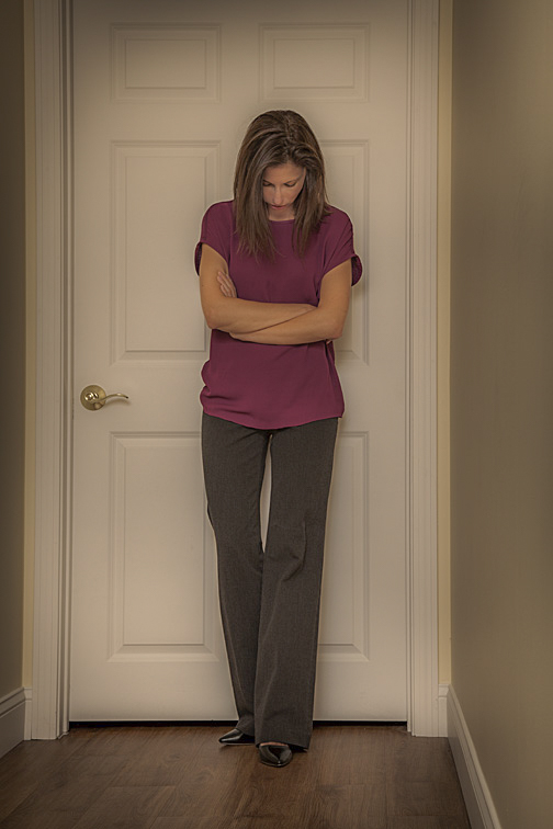 Here’s Elizabeth standing outside a closed bedroom door. Her pose could imply a number of emotions - annoyance, boredom, waiting, or perhaps exhaustion. Some places in a home or apartment work better as shooting locations than others. Bedrooms are one of my favorite spots, though it’s the beds I’m more drawn to. A bed provides lots of posing possibilities. It's usually very comfortable, allowing for a variety of body positions and oddball contortions. Likewise, it's easy for the model to interact with one or more props, thereby adding more interest to the setup. The model can do more than just lie on the bed. She can stand on it, hang part of her body over the side, or bury herself under the covers. As the photographer, I can shoot down at her while I stand on the bed, kneel on the floor and photograph her from eye level, lie on the floor and shoot up at her, zoom-in tight on her face or feet or hand, or zoom-out to show her and everything else in the room. Several times our photo sessions have begun and ended in the bedroom without having shot anywhere else in the house. 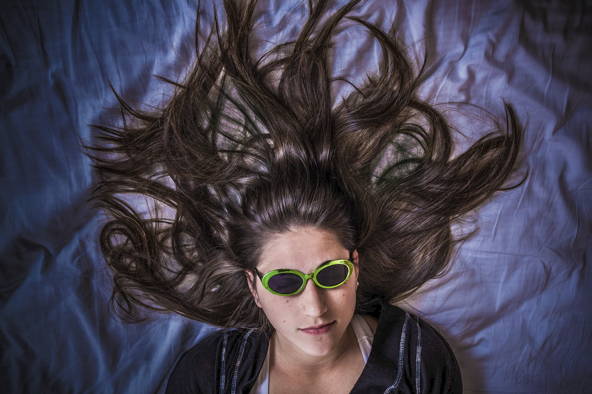 Anna has beautiful long dark hair, and I wanted some way to feature it. I thought the obvious thing to do was to shoot straight down on her. I carefully arranged her hair and asked that she wear these sunglasses, hoping they'd take the emphasis away from her eyes. I added the blue color in post-production. 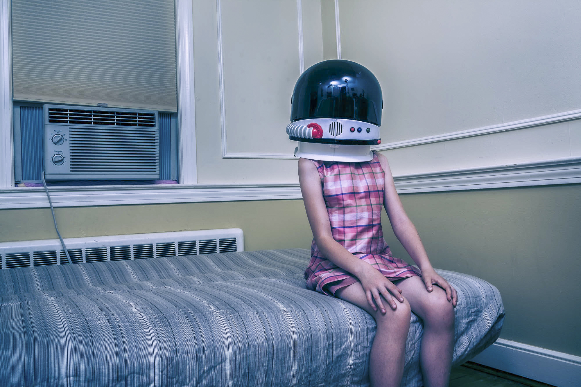 I think it's the out-of-context, overly large space helmet on what is obviously a little girl sitting on the corner of the bed in an empty but normal-looking bedroom that makes this image interestingly out-of-balance and nicely weird. 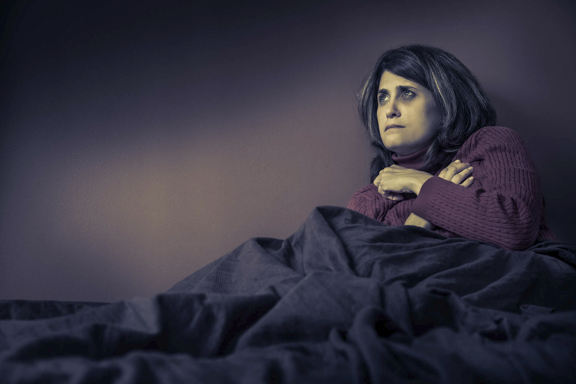 I positioned Carol on the bed and asked for various expressions as I photographed. This is one that I found interesting. I relit it in Photoshop, creating areas of dark and light from what was an evenly illuminated bedroom. My goal was to match the lighting to her rather apprehensive demeanor. 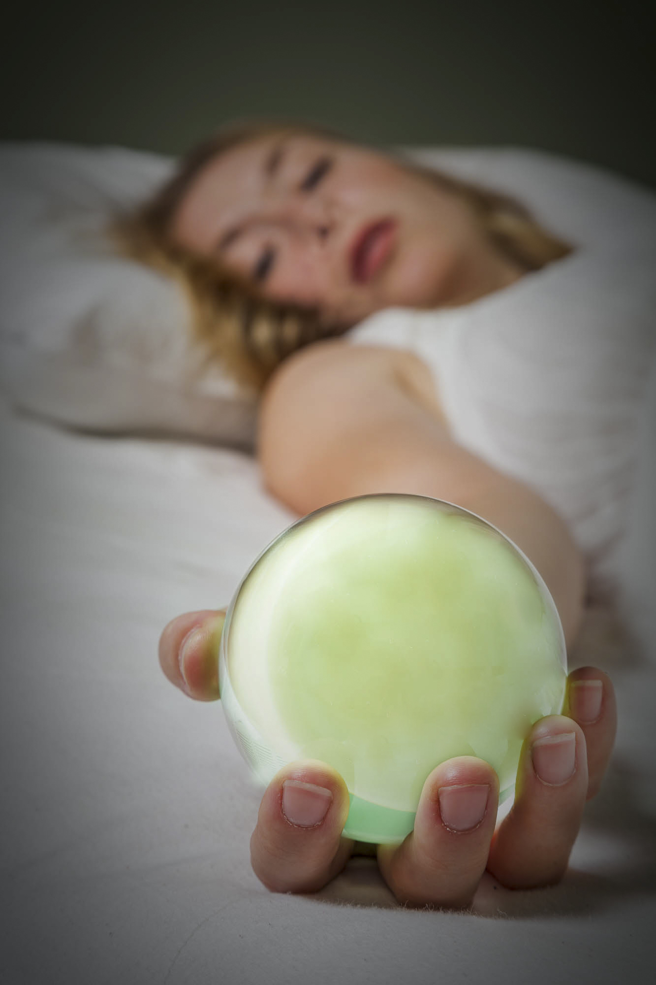 As Mandy was getting onto the bed, I pulled out a bunch of items from my prop bag, including this glass ball. In the process of lying down, she happened to extend her right arm. It seemed obvious that something needed to be in her hand. I picked up the glass ball and asked her to hold it. It took time deciding on the exact positioning of her hand and arm, and on the placement of the camera, but I think we came up with something interesting. 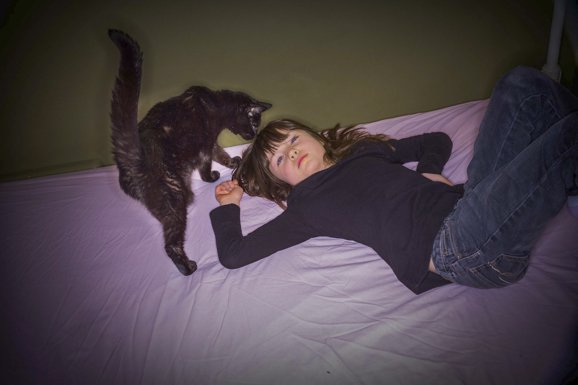 This is Laurette on her bed. We were working out a pose when her cat suddenly jumped up. I didn't say or do anything but waited to see what would happen. When I saw a composition I liked, I began photographing. I thought this shot was the best of the group. 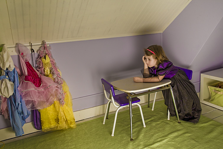 Obviously, there are other places in a bedroom for posing the subject. What I like about this setup is Elspeth’s pint-size table - a perfect fit and a perfect prop for supporting her upper body. It allowed her to try a variety of poses and expressions. In this picture, I think there’s an interesting connection between her costumes - those hanging and the one she’s wearing - and her rather gloomy expression. Bathrooms (clean bathrooms!!), because of what's available in a relatively small space, are another location I really like. The sink, shower, bathtub, toilet, and mirror all lend themselves to unconventional poses. in addition, models I’ve worked with really seem to enjoy the outlandishness of posing in such an odd place. 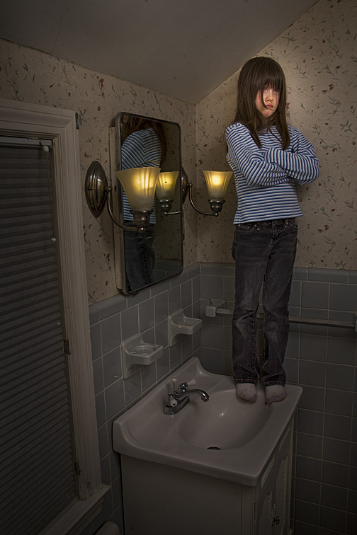 I consider this a really weird picture. That it makes little sense is why I find it so appealing. 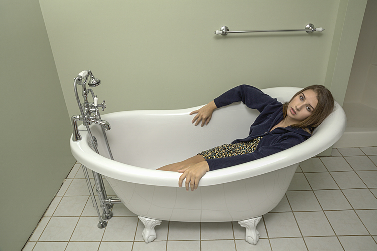 This pose was the idea of Jenna’s mother. I removed nearly everything in the bathroom so nothing would clash with the tub or the young lady. Incidentally, I didn't realize how interesting the weird positioning of her right arm was until I saw the photo on my large office monitor. Hindsight: Maybe something hanging on the wall or a towel on the rack behind her would have made the photograph a little less stark. 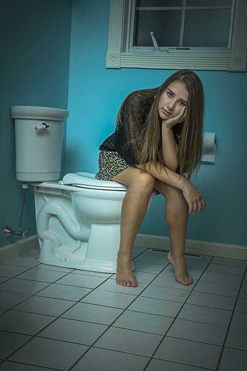 Here’s Jenna again. My intention was to throw things off kilter somewhat. To that end, I got low to the floor, had her sit in a rather awkward pose, slightly tilted the camera, framed the shot to show a good portion of the floor, and, in Photoshop, darkened the edges. 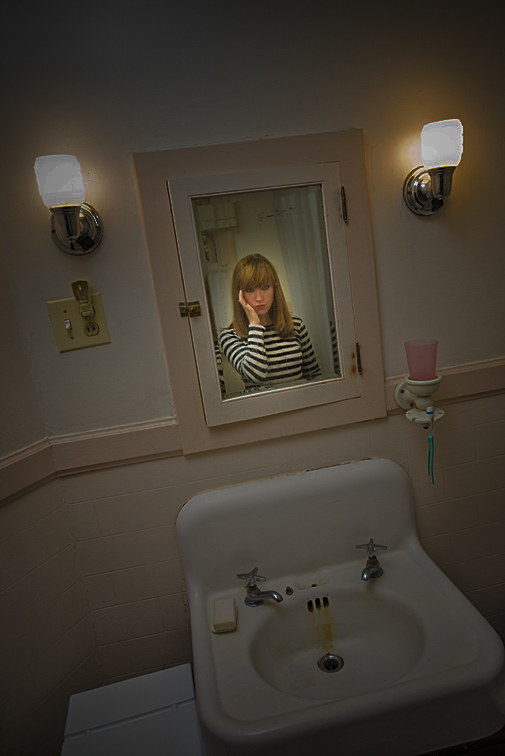 As it's probably obvious, this bathroom needs some serious updating. Because we’re not seeing any part of Julianne’s back, it seems as if she’s standing behind the mirror, looking outward. There are times, however, when it’s impossible to find or create a desirable shooting area. As mentioned, the walls may be all marked-up or covered with objects that can’t be removed, or there might be too many things strewn about the house. But there are solutions for this.
 I was photographing in a cluttered bedroom. Being too lazy to remove all the junk, I asked Hannah to stand on her bed. Photographing from below hid everything, thus creating a very clean background of walls and ceiling. 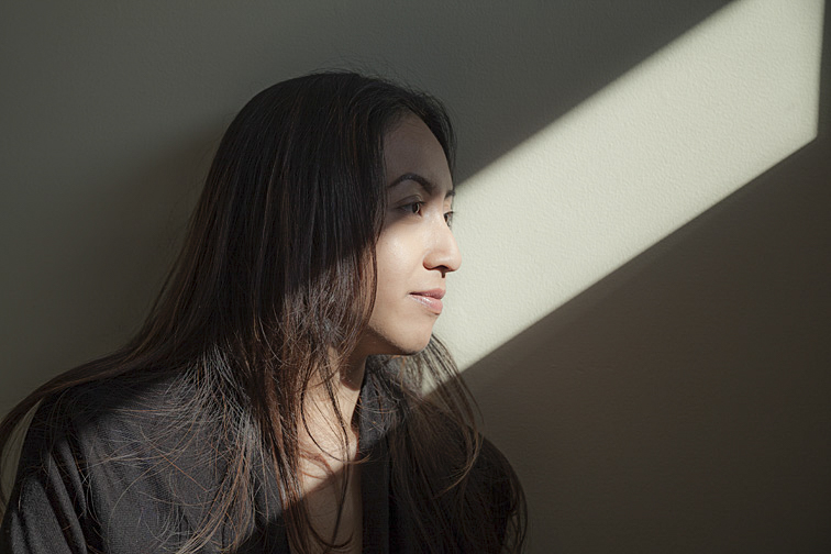 (Click on photos to enlarge) The beauty of natural light that’s been altered by the windows, skylights, and open doors it passes through cannot be easily duplicated with strobes, tungsten, or LED lights. But the position and quality of this light can change quickly. So, if I’m going to be shooting in a model’s home or apartment, the first thing I’ll do when arriving is to check how and where the outdoor lighting is entering the house. If I find an area with interesting possibilities, I’ll begin the photo shoot there. I’ll photograph quickly, doing as many setups as possible before the light changes. FREE T-SHIRT ...when you sign up for a One-To-One Workshop!! This is a Fruit-Of-The-Loom, 98% cotton shirt. It has my absolutely gorgeous logo (see top of page) printed on the front. Available sizes are men's medium, large, and extra-large. These shirts may also be purchased. The sun coming through the window illuminated the five photos below. No light modifiers were used. Therefore, dark, well-defined shadows were created. When setting up a shot for this type of lighting, I’m thinking: “How should the model interact with the sunlight?” Usually, I’ll position the subject so the sunbeam is on or near her eyes. It seems to make sense that the eyes are where the viewers’ eyes will go initially. I believe they are the starting point for reading a portrait photograph. Positioning the subject like this establishes the light’s presence and, had there been any question before, vigorously shows the viewer where to place their gaze. 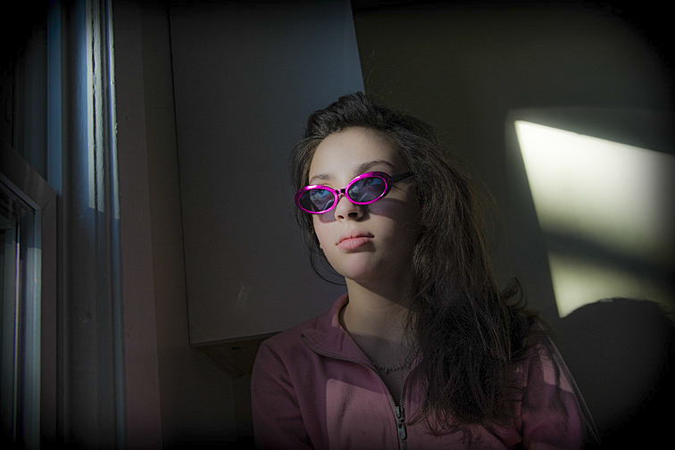 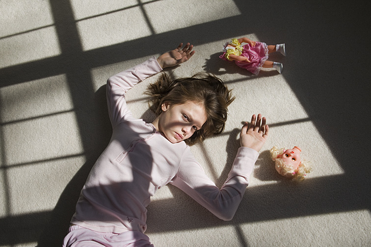 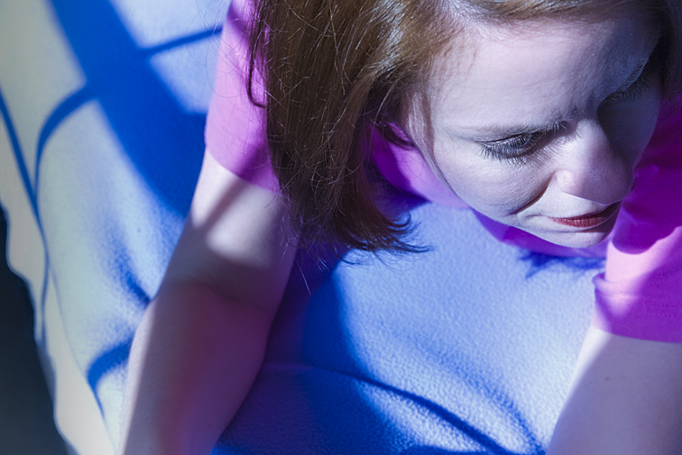 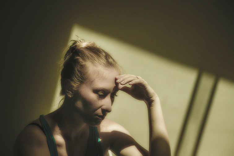 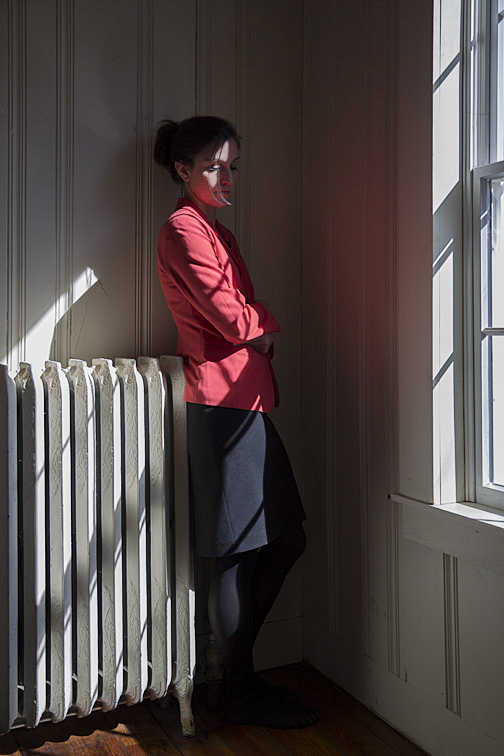 The photo below shows Julianne posed by a railing, directly across from a window that has late afternoon sunlight streaming in. Her pose and positioning had to be precise for the shadow to be sharp. The bright light on the wall (and the dark areas beyond it) frame her shadow, helping to emphasize its shape. The sunglasses were added primarily to protect her eyes, though they add a nice touch to both her and her shadow. I have mixed feelings about how pointy her nose looks on the wall, but that does make the shadow more of a caricature, which I like. 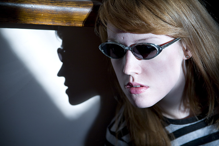 It’s important to monitor the sky when shooting with outdoor illumination. Large clouds rolling over the sun can quash even the most spectacular light. If that happens, the question is how long to wait for the clouds to pass before moving on to another setup. If the lighting has been good up to that point, I’m willing to wait a while (perhaps several minutes). Then again, there have been many times when the break in the clouds never materialized. An alternative solution would be to move on, but be ready to quickly reset and continue shooting should the sun reappear. Occasionally, indoor illumination will produce the same interesting effects as exterior light entering a window. If it does, and if the light is bright enough, I may use it as the light source for a picture. This type of illumination can come from fluorescent lights, bare bulbs, and spotlights located on ceilings or toward the top of walls. A single overhead source lit the young woman below. Because the illumination was from above, the model’s eyes are dark, though I did brighten them slightly in Photoshop. Also, the light's dimness made a slow shutter speed necessary, resulting in a soft, blurry photograph. Despite these shortcomings (or actually because of them), as well as the depth created by the long hallway, I think the result is quite appealing. The picture was shot at 1/4 sec, f5.6. 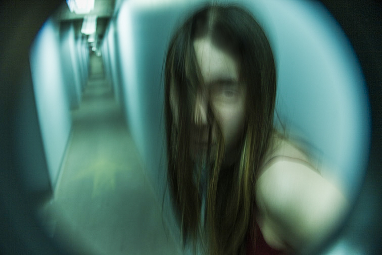 If the desire is to illuminate these dark areas, a strobe or reflector can be used. It can be positioned to light areas where the available light doesn’t reach or to enhance the illumination already there. Another alternative is to forgo adding additional lighting and to solve the underexposure issues in post-production with Photoshop, as I partially did with the eyes in the above photo. The image below was shot just a few seconds after the one above. The setup as well as the shutter speed and aperture settings were identical (1/4 sec, f5.6). The only difference between the two was the addition of a flash from a small handheld strobe. It added a small amount of fill light primarily to her face, therefore brightening it. It also removed the blur. Because a strobe releases its light very quickly (for example, 1/250th of a second), it's similar to setting the camera's shutter speed to 1/250th of a second. Nevertheless, I’m not sure this image was an improvement. I think it's interesting, but less so than the first picture. 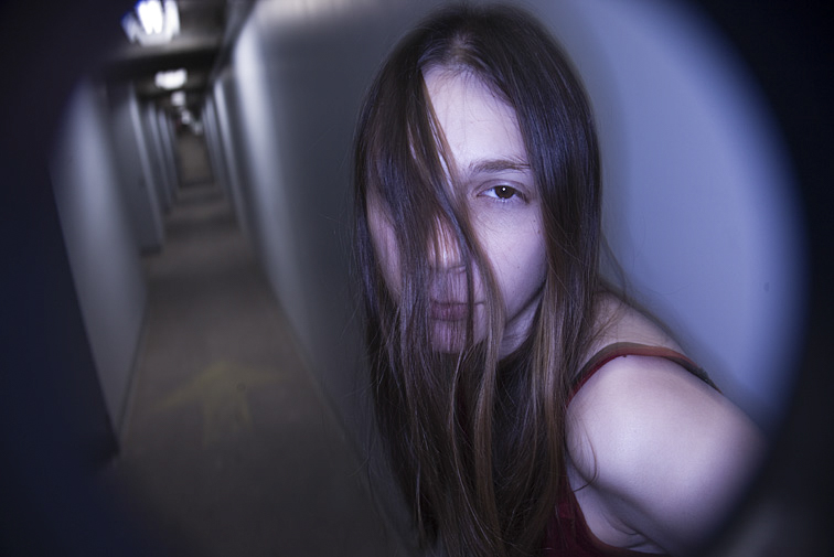 Aubrey, below, was lit by a bare bulb hanging high above. The illumination was faint, necessitating a slow shutter speed. But, instead of handholding the camera, as I did previously, I secured it to a tripod. In addition, I had her lean against the wall for support. The result was a mostly sharp image. The picture was shot at 7/10 sec, f5.6.  Something I find exciting about windows, spotlights, bare bulbs, and the like is that they are already present in the environment without me having to set up any of my own lights. Furthermore, this kind of lighting often creates illumination possibilities I undoubtedly would never have thought up or been able to easily construct on my own.  (Click on photos to enlarge) If a picture setup includes the model’s face, a great expression is critical, though it doesn’t have to be intense or overly dramatic. Most times, subtlety is best. And, of course, the expression must work well with everything else in the photograph. When shooting with an inexperienced, non-actor model, getting the expressions I want sometimes involves a concerted effort for both of us. This can happen when I ask for different looks from shot to shot, but they unknowingly repeat the same expression each time. In that case, I might walk them up to a mirror and have them try a few expressions, making sure that each is different. If that doesn’t work, I’ll try talking them through specific expressions. For example, if I want “surprise”, I may say “Try raising your eyebrows” or “Open your mouth a bit”. This can be time-consuming, but it usually solves the problem. Sometimes, the model will go overboard with an expression, making it too big and too obvious, especially for a close-up. If this is an issue, I’ll gently mention it and ask them to reduce its intensity. By the way, it’s usually easier to tone down a model’s expression than to try building it up. Many times, a shot I’m doing is not that dependent on the model’s expression. In terms of the whole image, their face may be of minor importance. This frequently is the case when other elements, such as props or setting, are more important. In fact, sometimes having a neutral or bland expression is what the photo calls for. Anything more could take away from what I’m trying to show with the rest of the picture. 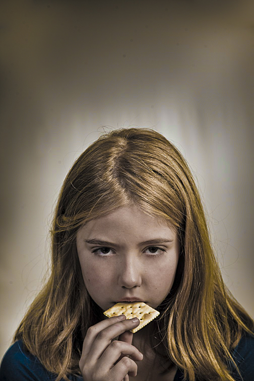 She’s merely eating a cracker, but I think her expression oozes pure evil. There’s nastiness brewing. 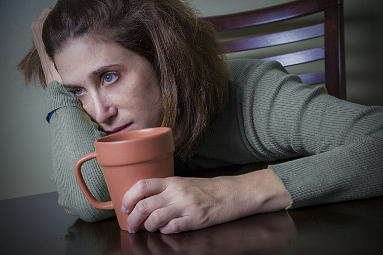 This pose was all Judy’s idea. For me, everything in this photograph screams “Monday morning” - her head resting on her arm, the extreme leaning, her grip on the coffee cup, the far off and empty stare. 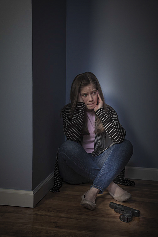 This expression shows lots going on in Hannah’s mind. Her forehead is furrowed, her mouth pursed, and her eyes fearful. Combined with her body being pressed into the corner, the narrow slit of light, and a gun nearby, it’s obvious something is terribly wrong. 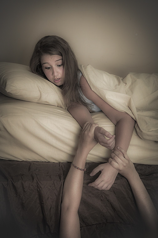 Jenna is reacting to her sister pulling on her arms. I felt this was an excellent piece of acting; Jenna’s expression is realistic and therefore believable. 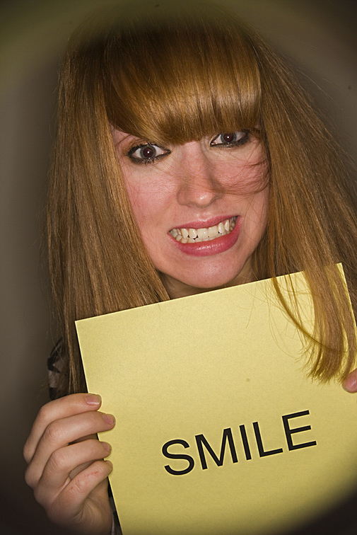 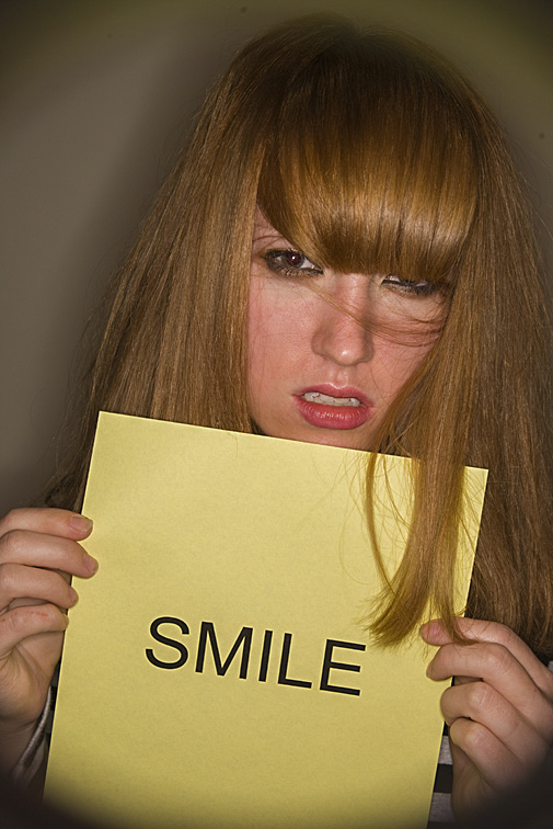 Julianne had tried numerous expressions. I liked these two the best. The first has an intentionally forced smile. The second has an expression that probably would not elicit what she’s requesting. Her hair on the sign adds a nice touch too. |
CategoriesArchives
July 2024
ALL BLOGS
Camera Settings Composition Depth-of-Field Finding The Shot Focus And Blur Image Editing Laziness Lighting The Subject Offbeat Ordinary Objects Reflections The Portrait While Shooting |
 RSS Feed
All Images © 2024 by Peter Glass. All Rights Reserved.